Simple Methods of Using Font Styles in CSS: To begin, first refer – know-what-font-styles-are-in-css
Working with Font Families
In web design, font families define the kind of font that should be used for text in an HTML document. These font families are specified using CSS (Cascading Style Sheets).
Types of Font Families
Generic Font Families: Browsers will use the predefined default fonts from these categories if a particular font is unavailable.
- serif: Fonts with decorative strokes (e.g., Times New Roman).
- sans-serif: Fonts without decorative strokes (e.g., Arial, Helvetica).
- monospace: Fonts with equal-width characters (e.g., Courier New).
- cursive: Fonts that resemble handwriting (e.g., Comic Sans).
- fantasy: Decorative fonts with unique styles (e.g., Papyrus).
Specific Font Families: These are groups of font names installed on the user’s computer or made available online (e.g., Roboto, Open Sans).
Syntax
The CSS font-family property specifies the font stack. A font stack includes:
- Specific font names (e.g., “Arial”).
- Generic font families as a fallback.
font-family: "Font Name", generic-family;Example
<!DOCTYPE html>
<html lang="en">
<head>
    <meta charset="UTF-8">
    <meta name="viewport" content="width=device-width, initial-scale=1.0">
    <title>Font Family Example</title>
    <style>
        body {
            font-family: "Arial", sans-serif;
        }
        .serif {
            font-family: "Times New Roman", serif;
        }
        .monospace {
            font-family: "Courier New", monospace;
        }
        .cursive {
            font-family: "Comic Sans MS", cursive;
        }
        .fantasy {
            font-family: "Papyrus", fantasy;
        }
    </style>
</head>
<body>
    <h1>Font Family Examples</h1>
    <p>This text uses the default font (Arial or sans-serif).</p>
    <p class="serif">This text uses a serif font (Times New Roman).</p>
    <p class="monospace">This text uses a monospace font (Courier New).</p>
    <p class="cursive">This text uses a cursive font (Comic Sans MS).</p>
    <p class="fantasy">This text uses a fantasy font (Papyrus).</p>
</body>
</html>
Explanation
Body Rule: Sets the default font for the document.
Class Rules: Each class (serif, monospace, etc.) specifies a different font family.
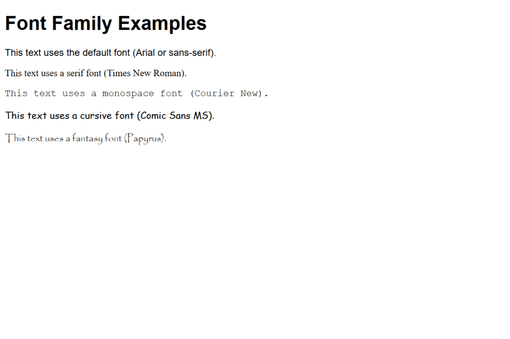
Figure 1 – Displaying the output of using font families
Output
When viewed in a browser:
- Arial or a sans-serif font will be used to render the h1 and first p elements.
- The specified fonts will be used to render the following paragraphs.
- When a user’s computer cannot support a particular font (like “Times New Roman”), the browser falls back to a generic font (like serif).
Using Absolute Values
Absolute values are used in web development to make precise specifications about the lengths, widths, and placements of items. These values establish precise, definite amounts that are independent of any parent element or viewport.
Common Absolute Units in CSS
- Pixels (px):
- The most commonly used unit.
- Defines a fixed size in screen pixels.
- Points (pt):
- Common in print-based designs.
- One point is approximately 1/72 of an inch.
- Centimeters (cm):
- Defines size in centimeters.
- Used primarily for print.
- Millimeters (mm):
- Defines size in millimeters.
- Inches (in):
- Defines size in inches.
Syntax
property: value unit;- property: The CSS property being modified (e.g., width, height).
- value: A numeric value.
- unit: An absolute unit (e.g., px, cm).
Example
<!DOCTYPE html>
<html lang="en">
<head>
    <meta charset="UTF-8">
    <meta name="viewport" content="width=device-width, initial-scale=1.0">
    <title>Absolute Values Example</title>
    <style>
        body {
            font-family: Arial, sans-serif;
        }
        .box-px {
            width: 150px;
            height: 100px;
            background-color: lightblue;
        }
        .box-cm {
            width: 5cm;
            height: 3cm;
            background-color: lightgreen;
            margin-top: 20px;
        }
        .box-in {
            width: 2in;
            height: 1in;
            background-color: lightcoral;
            margin-top: 20px;
        }
    </style>
</head>
<body>
    <h1>Using Absolute Values</h1>
    <div class="box-px">150px x 100px</div>
    <div class="box-cm">5cm x 3cm</div>
    <div class="box-in">2in x 1in</div>
</body>
</html>
Explanation
- Pixel Box:
- .box-px uses 150px width and 100px height.
- Fixed size regardless of screen resolution.
- Centimeter Box:
- .box-cm is sized in centimeters.
- Useful for print designs where exact dimensions are crucial.
- Inch Box:
- .box-in is sized in inches.
- Also commonly used in print or specific design contexts.
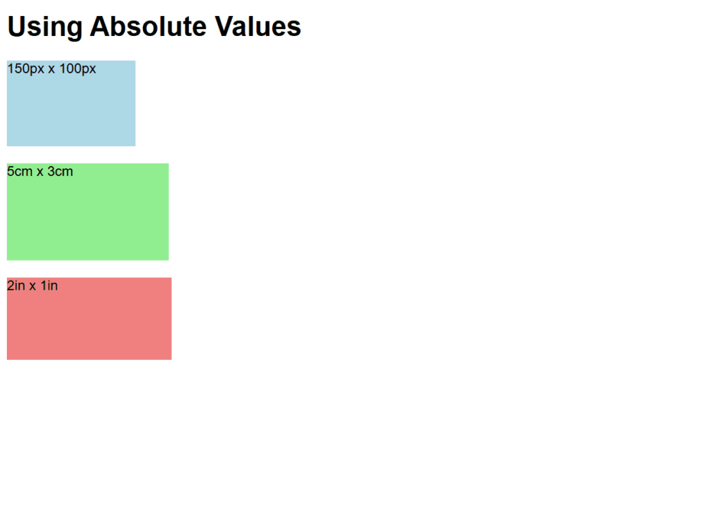
Figure 2 – Displaying the output of using absolute values
Output
When rendered in a browser:
- A light blue box of size 150px x 100px appears.
- Below it, a light green box with dimensions 5cm x 3cm appears.
- A 2in x 1in light coral box is shown at the bottom.
The absolute size of each box is displayed, guaranteeing uniform measurements on various devices.
Using Relative Values
Relative values are used in web development to specify sizes, locations, or other attributes in relation to another element or context, like the viewport, the parent element, or the root font size. Relative units are perfect for responsive design since they are adaptable to changes in parent element characteristics or screen size.
Common Relative Units in CSS
- Em (em):
- Relative to the font size of the parent element.
- Example: If the parent font size is 16px, 1em equals 16px.
- Rem (rem):
- Relative to the font size of the root element (html).
- Example: If the root font size is 16px, 1rem equals 16px.
- Percentage (%):
- Relative to the size of the parent element (e.g., width, height).
- View Width (vw):
- 1vw = 1% of the viewport’s width.
- View Height (vh):
- 1vh = 1% of the viewport’s height.
- Viewport Min (vmin):
- 1vmin = 1% of the smaller dimension (width or height) of the viewport.
- Viewport Max (vmax):
- 1vmax = 1% of the larger dimension (width or height) of the viewport.
Syntax
property: value unit;- property: The CSS property being modified (e.g., width, height).
- value: A numeric value.
- unit: A relative unit (e.g., em, %).
Example
<!DOCTYPE html>
<html lang="en">
<head>
    <meta charset="UTF-8">
    <meta name="viewport" content="width=device-width, initial-scale=1.0">
    <title>Relative Values Example</title>
    <style>
        html {
            font-size: 16px; /* Sets the root font size */
        }
        body {
            font-family: Arial, sans-serif;
        }
        .box-em {
            width: 10em;
            height: 5em;
            background-color: lightblue;
            margin-bottom: 20px;
        }
        .box-rem {
            width: 10rem;
            height: 5rem;
            background-color: lightgreen;
            margin-bottom: 20px;
        }
        .box-percent {
            width: 50%;
            height: 100px;
            background-color: lightcoral;
            margin-bottom: 20px;
        }
        .box-vw {
            width: 50vw;
            height: 20vh;
            background-color: lightgoldenrodyellow;
        }
    </style>
</head>
<body>
    <h1>Using Relative Values</h1>
    <div class="box-em">10em x 5em</div>
    <div class="box-rem">10rem x 5rem</div>
    <div class="box-percent">50% of parent width</div>
    <div class="box-vw">50vw x 20vh</div>
</body>
</html>
Explanation
- Em Box:
- .box-em is 10em wide and 5em tall.
- Its dimensions are relative to the parent’s font size.
- Rem Box:
- .box-rem uses rem units, making its size relative to the root font size.
- Rem units ensure consistency across nested elements.
- Percentage Box:
- .box-percent has a width of 50%, relative to its parent’s width.
- Viewport Units Box:
- .box-vw spans 50vw (50% of viewport width) by 20vh (20% of viewport height).
- Ideal for fluid, viewport-responsive designs.
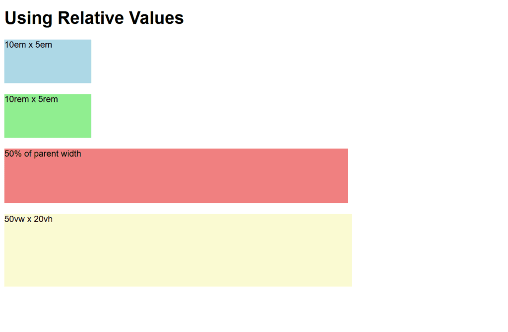
Figure 3 – Displaying the output of using relative values
Output
When viewed in a browser:
- A light blue box is displayed sized relative to the parent’s font size (10em x 5em).
- Below it is a light green box with the same dimensions but relative to the root font size (10rem x 5rem).
- Half of the width of the parent container is occupied by a light coral box.
- A light yellow box at the bottom dynamically changes to 20% of the viewport’s height and 50% of its width.
This illustrates how relative units are adaptable and responsive.
Using Percentage Values
Percentage values for size, spacing, and placement are frequently used in CSS. When building responsive layouts, these numbers are helpful because they are relative to another reference size. Depending on the CSS property being defined, the reference changes.
Key Features of Percentage Values
- Width and Height:
- Regarding width, the percentage is based on the parent element’s (the containing block’s) width.
- For height: If the height of the parent block is specified explicitly, the percentage is in relation to the height of the containing block.
- Margin and Padding:
- The percentage values are computed in relation to the containing block’s width.
- Positioning:
- The percentage values for the top, left, right, and bottom are based on the containing block’s dimensions.
Syntax
property: percentage%;- property: The CSS property being modified (e.g., width, height).
- percentage: A numeric value followed by %.
Example
<!DOCTYPE html>
<html lang="en">
<head>
    <meta charset="UTF-8">
    <meta name="viewport" content="width=device-width, initial-scale=1.0">
    <title>Percentage Values Example</title>
    <style>
        body {
            font-family: Arial, sans-serif;
            margin: 0;
            padding: 0;
        }
        .container {
            width: 80%;
            margin: 0 auto;
            border: 2px solid black;
            padding: 20px;
            text-align: center;
        }
        .box {
            width: 50%;
            height: 150px;
            margin: 10% auto;
            background-color: lightblue;
        }
        .nested-box {
            width: 50%;
            height: 50%;
            background-color: lightcoral;
            margin: auto;
        }
    </style>
</head>
<body>
    <h1>Using Percentage Values</h1>
    <div class="container">
        <p>Container is 80% of the viewport width</p>
        <div class="box">
            <p>Box is 50% of the container width and 150px tall</p>
            <div class="nested-box">
                <p>Nested box is 50% of the parent box</p>
            </div>
        </div>
    </div>
</body>
</html>
Explanation
- Container:
- .container, centered with margin: 0 auto, occupies 80% of the viewport’s width.
- Its padding guarantees that the content is spaced out within the container.
- Box:
- .box has a fixed height of 150 pixels and a width of 50% in relation to its parent container.
- margin: 10% auto centers horizontally and establishes a vertical margin of 10% in relation to the width of the container.
- Nested Box:
- 50% of the parent.box dimensions make up the .nested-box width and height.
- shows percentage values that are nested inside of another element.
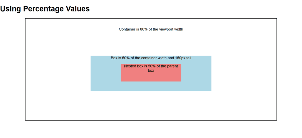
Figure 4 – Displaying the output of using percentage values
Output
When rendered in a browser:
- The container, which has some padding and a black border, takes up 80% of the viewport’s width.
- A light blue box inside the container occupies half of its width, has a fixed height of 150 pixels, and is spaced vertically 10% of the width of the container.
- Percentage-based nesting is demonstrated by the light coral nested box inside the blue box, which occupies 50% of its parent’s dimensions.
This shows how percentage values can create flexible, responsive layouts that adapt to different screen sizes and parent dimensions.
Working with the font-size-adjust Property
Adjusting the font size Using the CSS attribute, the font size is changed according to the font’s x-height, maintaining the text’s readability. Text readability is greatly influenced by the x-height, which is the height of lowercase characters like “x.”
Why Use font-size-adjust?
Variations in the x-heights of different typefaces with the same font-size might make them appear larger or smaller. You can improve text clarity when using a fallback font by using font-size-adjust to make sure the x-height is the same across fonts.
Syntax
font-size-adjust: <number> | none;- : A ratio of x-height to font size. Typically between 0 and 1.
- none: Default value. No adjustment is made.
How It Works
The browser uses the given ratio to determine the font size for the fallback font if the primary font is not available.
The ratio guarantees that the x-height of the backup font is equal to that of the original font.
Example
<!DOCTYPE html>
<html lang="en">
<head>
    <meta charset="UTF-8">
    <meta name="viewport" content="width=device-width, initial-scale=1.0">
    <title>Font Size Adjust Example</title>
    <style>
        body {
            font-family: Arial, sans-serif;
            font-size: 16px;
        }
        .no-adjust {
            font-family: "Times New Roman", serif;
            font-size-adjust: none;
        }
        .adjusted {
            font-family: "Times New Roman", serif;
            font-size-adjust: 0.5;
        }
    </style>
</head>
<body>
    <h1>Font Size Adjust Example</h1>
    <p>This text uses the default font (Arial).</p>
    <p class="no-adjust">
        This text uses "Times New Roman" without font-size-adjust. If "Times New Roman" is unavailable, the fallback font might appear smaller or less readable.
    </p>
    <p class="adjusted">
        This text uses "Times New Roman" with <code>font-size-adjust: 0.5</code>. The fallback font will be adjusted for better readability.
    </p>
</body>
</html>
Explanation
- Default Behavior:
- The fallback font’s smaller x-height can make the text without font-size-adjust (.no-adjust) look too small.
- Adjusted Font:
- To maintain readability, the text with font-size-adjust: 0.5 makes sure that the x-height of the fallback font is in line with the desired proportions.
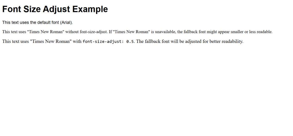
Figure 5 – Displaying the output of using the font-size-adjust Property
Output
When rendered in a browser:
- The first paragraph displays normally and is in Arial.
- The second paragraph uses “Times New Roman” without font-size-adjust. The x-height of the backup font may change if “Times New Roman” is not available, which could cause the text to appear too small or large.
- The third paragraph uses “Times New Roman” with font-size-adjust: 0.5. The size of the backup font is changed to preserve the same x-height ratio in the event that “Times New Roman” is not available, enhancing text consistency.
This demonstrates how font-size-adjust helps maintain consistent text readability across different fonts.
Working with the font-style property
The font-style CSS property determines if a font should be shown in an oblique, italic, or normal manner. In quotes, headings, and other stylistic contexts, it is frequently employed to highlight text.
Values of font-style
- normal:
- Default value.
- The text is displayed in its standard, upright font style.
- italic:
- The text is displayed in an italicized style.
- Uses a specific italic version of the font, if available.
- oblique:
- The text is displayed in a slanted style.
- The font is artificially slanted if an oblique variant is unavailable.
- initial:
- Resets the property to its default value (normal).
- inherit:
- Inherits the font style from the parent element.
Syntax:
font-style: value;Example
<!DOCTYPE html>
<html lang="en">
<head>
    <meta charset="UTF-8">
    <meta name="viewport" content="width=device-width, initial-scale=1.0">
    <title>Font Style Example</title>
    <style>
        body {
            font-family: Arial, sans-serif;
            font-size: 16px;
        }
        .normal {
            font-style: normal;
        }
        .italic {
            font-style: italic;
        }
        .oblique {
            font-style: oblique;
        }
    </style>
</head>
<body>
    <h1>Font Style Property Example</h1>
    <p class="normal">This is a paragraph with <strong>normal</strong> font style.</p>
    <p class="italic">This is a paragraph with <strong>italic</strong> font style.</p>
    <p class="oblique">This is a paragraph with <strong>oblique</strong> font style.</p>
</body>
</html>
Explanation
- Normal Style:
- The .normal class ensures the text is displayed in the standard, upright style.
- This is the default style for most fonts.
- Italic Style:
- The .italic class displays text in an italic style.
- Italics use a specifically designed font variant, which improves readability and aesthetics.
- Oblique Style:
- The .oblique class slants the text at an angle.
- If the font lacks an italic version, the browser may simulate the effect by slanting the normal font.
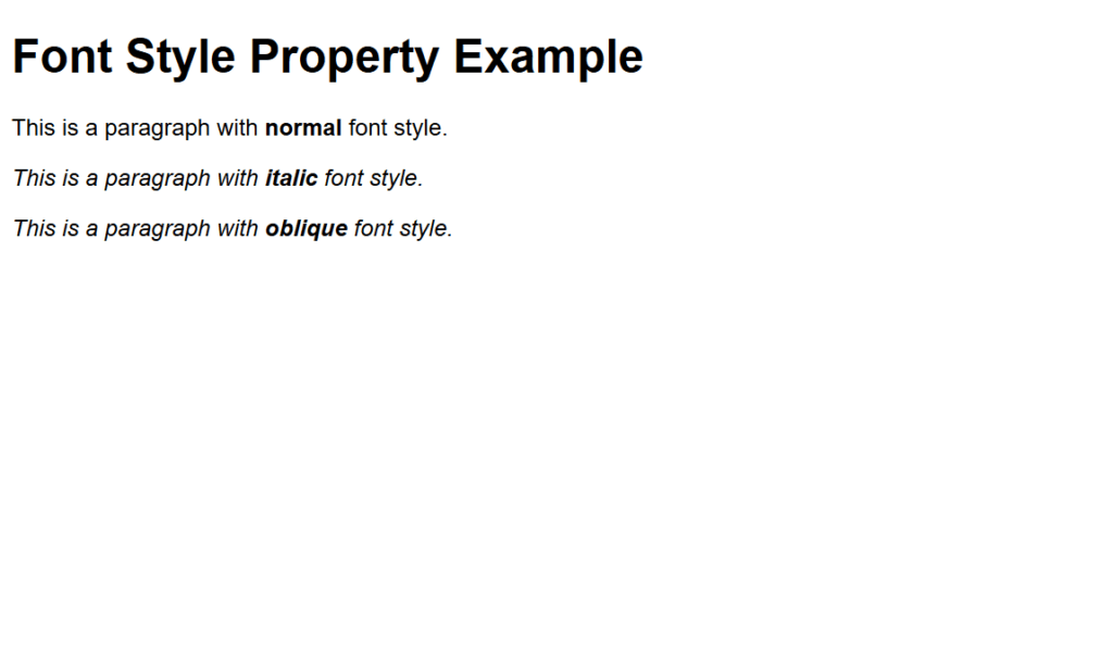
Figure 6 – Displaying the output of using the font-style Property
Output
When rendered in a browser:
- The first paragraph is presented straight and in the standard font style.
- Italicizing the second paragraph gives it a more formal or focused appearance.
- Similar to italics but with a somewhat distinct appearance, the third paragraph displays text at an oblique angle.
This illustration shows how to apply typographic emphasis and diversity in design using font-style.
Working with Web Fonts
Custom fonts can be used on your website by embedding them directly or by connecting to an online font file. In addition to conventional system typefaces, this allows you to build visually beautiful and distinctive typography.
Methods to Use Web Fonts
- Using @font-face Rule:
- Embed custom fonts by specifying their source files.
- Using Google Fonts or Other Font Services:
- Link to fonts hosted by providers like Google Fonts.
Example 1: Using @font-face
The @font-face rule lets you define custom fonts by linking to font files.
<!DOCTYPE html>
<html lang="en">
<head>
    <meta charset="UTF-8">
    <meta name="viewport" content="width=device-width, initial-scale=1.0">
    <title>Web Fonts Example</title>
    <style>
        @font-face {
            font-family: 'OpenSans';
            src: url('https://fonts.gstatic.com/s/opensans/v34/mem8YaGs126MiZpBA-UFUK0Udc1UAw.ttf') format('truetype');
        }

        body {
            font-family: Arial, sans-serif;
        }

        .custom-font {
            font-family: 'OpenSans', sans-serif;
            font-size: 24px;
            color: darkblue;
        }
    </style>
</head>
<body>
    <h1>Using Web Fonts</h1>
    <p>This is default text using the browser's default font.</p>
    <p class="custom-font">This text uses the custom "OpenSans" font.</p>
</body>
</html>
Example 2: Using Google Fonts
Google Fonts is an easy way to include web fonts by adding a <link> in your HTML.
<!DOCTYPE html>
<html lang="en">
<head>
    <meta charset="UTF-8">
    <meta name="viewport" content="width=device-width, initial-scale=1.0">
    <title>Google Fonts Example</title>
    <link href="https://fonts.googleapis.com/css2?family=Roboto:wght@400;700&display=swap" rel="stylesheet">
    <style>
        body {
            font-family: Arial, sans-serif;
        }

        .roboto {
            font-family: 'Roboto', sans-serif;
            font-size: 24px;
            color: darkgreen;
        }

        .roboto-bold {
            font-family: 'Roboto', sans-serif;
            font-weight: 700;
            font-size: 24px;
            color: darkred;
        }
    </style>
</head>
<body>
    <h1>Using Google Fonts</h1>
    <p>This is default text using the browser's default font.</p>
    <p class="roboto">This text uses the "Roboto" font with normal weight.</p>
    <p class="roboto-bold">This text uses the "Roboto" font with bold weight.</p>
</body>
</html>
Explanation
- Making use of @font-face:
- The font family (OpenSans) and its source (a URL to the.ttf font file) are specified by the @font-face rule.
- ‘OpenSans’ is the font family to which the custom font is applied.
- Making Use of Google Fonts:
- A URL to add fonts to your HTML can be found on Google Fonts.
- The selected Google Font (Roboto) is applied to components via the font-family property.
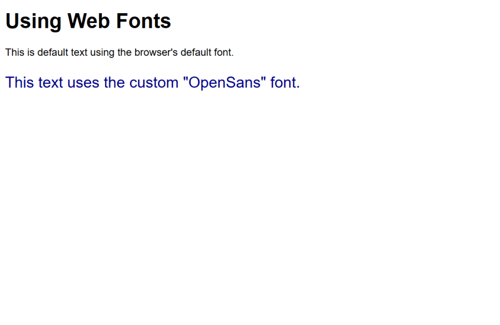
Figure 7 – Displaying the output of using Web fonts (@font-face)
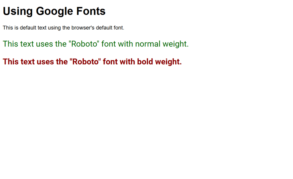
Figure 8 – Displaying the output of using Web fonts (Google fonts)
Output
When viewed in a browser:
Example 1:
The second paragraph uses the “OpenSans” font loaded via @font-face.
Example 2:
- The first paragraph uses the default browser font.
- The second paragraph uses the “Roboto” font in normal weight.
- The third paragraph uses the “Roboto” font in bold weight.
These examples demonstrate how web fonts enhance typography and allow for consistent, professional designs across devices.