Simple Methods of Using Effects, Frames, and Controls in CSS: To begin, first refer to how-to-use-effects-frames-and-controls-in-css
Changing Image Transparency with Mouse Events
Mouse events and CSS can be used to control image transparency. The most popular method for causing the transparency effect is to use CSS pseudo-classes like :hover. JavaScript, on the other hand, can offer more dynamic transparency control.
Example: Using CSS Hover
<!DOCTYPE html>
<html lang="en">
<head>
  <meta charset="UTF-8">
  <meta name="viewport" content="width=device-width, initial-scale=1.0">
  <title>Image Transparency on Hover</title>
  <style>
    .image-container img {
      width: auto; /* Set image width */
      height: auto; /* Maintain aspect ratio */
      transition: opacity 0.5s ease; /* Smooth transition effect */
      opacity: 1; /* Fully opaque by default */
    }

    .image-container img:hover {
      opacity: 0.5; /* 50% transparency on hover */
    }
  </style>
</head>
<body>
  <div class="image-container">
    <img src="https://media.istockphoto.com/id/1129797021/photo/a-pile-of-banknotes-dollars-as-part-of-the-world-trade-and-economic-system.jpg?b=1&s=612x612&w=0&k=20&c=xrZTTae1HYrNm5Pcj7jEZK5auoAdscjB6qfdysSN0QY=" alt="Example Image">
  </div>
</body>
</html>
Explanation
- Rules for CSS:
- The transparency level is defined by the opacity property.
- The transition attribute makes sure that when the mouse moves over the image, the opacity changes smoothly.
- The style is applied by the :hover pseudo-class when the user moves the mouse pointer over the image.
- Opacity Levels:
- The image is completely visible by default (opacity: 1).
- When hovering over the image (opacity: 0.5), it turns semi-transparent.
Output:
When the page loads, the image is fully visible.

Figure 1 – Displaying the output of Changing Image Transparency with Mouse Events in CSS
When the user hovers over the image, it fades to 50% transparency.
The fade effect is smooth because of the transition property.

Figure 2 – Displaying the output after changes
Writing Text in a Transparent Box
Using CSS features like opacity, rgba() colors, or background-color with transparency settings, you may build a transparent box with text inside. This method is frequently used to draw attention to text while preserving some of the the background.
Example: Text in a Transparent Box
<!DOCTYPE html>
<html lang="en">
<head>
  <meta charset="UTF-8">
  <meta name="viewport" content="width=device-width, initial-scale=1.0">
  <title>Text in Transparent Box</title>
  <style>
    body {
      font-family: Arial, sans-serif;
      background-image: url('https://images.pexels.com/photos/27913355/pexels-photo-27913355/free-photo-of-walking-into-the-water.jpeg?auto=compress&cs=tinysrgb&w=1260&h=750&dpr=2'); /* Background image */
      background-size: cover;
      background-position: center;
      margin: 0;
      padding: 0;
    }

    .transparent-box {
      width: 70%; /* Box width */
      margin: 50px auto; /* Center box horizontally */
      background-color: rgba(0, 0, 0, 0.5); /* Semi-transparent black */
      color: white; /* Text color */
      padding: 20px; /* Space inside the box */
      border-radius: 10px; /* Rounded corners */
      text-align: center; /* Center-align text */
      box-shadow: 0 4px 6px rgba(0, 0, 0, 0.3); /* Subtle shadow for depth */
    }

    h1 {
      margin: 0; /* Remove default margin */
      font-size: 2.5rem; /* Large heading */
    }

    p {
      margin: 10px 0 0; /* Add spacing below heading */
      font-size: 1.2rem; /* Paragraph text size */
    }
  </style>
</head>
<body>
  <div class="transparent-box">
    <h1>Welcome to My Website</h1>
    <p>This is an example of text displayed inside a transparent box.</p>
  </div>
</body>
</html>
Explanation
- Background Image:
- Using background-image, the body has a background picture.
- The background-size: cover option makes sure the image fills the window.
- Position of the background: center the picture.
- Transparent Box:
- rgba(0, 0, 0, 0.5) is the background color. RGBa is an acronym for red, green, blue, and alpha (transparency).
- The background is visible since the box is 50% transparent with an alpha value of 0.5.
- Smooth, rounded corners are produced by setting the border-radius to 10 pixels.
- Shadow: box-shadow gives the box more dimension.
- Text Styling:
- The text contrasts effectively with the dark transparent background when the color is set to white.
- Text alignment: text-align: center places the text in the middle of the page.
- Font Sizes: Adjusted for readability.
- Box Positioning:
- With a margin of 50px auto, which automatically determines equal left and right margins, the box is horizontally centered.

Figure 3 – Displaying the output of Writing Text in a Transparent Box in CSS
This method is both visually appealing and simple to implement, making it a versatile choice for web designs.
Applying Transformation Effects in CSS
You can apply many transformations to elements, including translation, rotation, scaling, and skewing, using CSS’s transform property. These effects can boost interactivity, produce dynamic animations, and improve visual presentation.
Transformation Types:
Translate: Moves an element from its original position.
Rotate: Rotates an element around a point.
Scale: Changes the size of an element.
Skew: Distorts an element along the X or Y axis.
Matrix: Combines multiple transformations in a single function.
Example: Applying Transformation Effects
<!DOCTYPE html>
<html lang="en">
<head>
  <meta charset="UTF-8">
  <meta name="viewport" content="width=device-width, initial-scale=1.0">
  <title>CSS Transformation Effects</title>
  <style>
    body {
      font-family: Arial, sans-serif;
      display: flex;
      justify-content: center;
      align-items: center;
      height: 100vh;
      margin: 0;
      background-color: #f4f4f4;
    }

    .box {
      width: 150px;
      height: 150px;
      background-color: #007bff;
      color: white;
      display: flex;
      justify-content: center;
      align-items: center;
      text-align: center;
      border-radius: 10px;
      transition: transform 0.5s ease, background-color 0.5s ease;
    }

    /* Transformation Effects */
    .box:hover {
      transform: rotate(45deg) scale(1.2) translateX(20px);
      background-color: #28a745;
    }
  </style>
</head>
<body>
  <div class="box">
    Hover Me
  </div>
</body>
</html>
Explanation
- HTML Structure:
- text inside a single div element that is styled as a box.
- CSS controls the box’s appearance and interaction effects.
- Default Styles:
- The box is styled with a constant size of 150 pixels by 150 pixels, a background color of blue, white text, and flexbox-centered content.
- Hover Effect:
- Transformations are applied when the user hovers over the box using the :hover pseudo-class.
- Transformations Applied:
- rotate(45deg): This is a 45-degree clockwise rotation of the box.
- The box is enlarged to 120% of its initial size using scale (1.2).
- The box is moved 20 pixels to the right along the X-axis by using the translateX(20px) function.
- Using a single transform property, these transformations are integrated.
- Transition for Smooth Effect:
- Over the course of 0.5 seconds, the transition property makes sure the changes happen smoothly.
- Change in Background Color:
- When hovered over, the box’s background turns green (#28a745) for a more dynamic appearance.
Output of applying transformation effects in CSS
By using transformation effects, you can add interactivity and modern visuals to your web designs effortlessly.
Applying the Transition Effects
When the values of specific properties in CSS change, you can use the transition property to make smooth animations. By animating the shift over a predetermined length, transitions provide a visually pleasant impact in place of abrupt changes.
Key Properties of Transition
- Transition-property: Indicates which CSS property (such as background-color or transform) should be animated.
- transition-duration: Indicates the appropriate duration of the transition (e.g., 0.5s, 1s).
- The transition timing function establishes the transition’s speed curve (e.g., ease, linear, ease-in-out).
- transition-delay: Establishes a pause before the changeover begins.
Example: Applying Transition Effects
<!DOCTYPE html>
<html lang="en">
<head>
  <meta charset="UTF-8">
  <meta name="viewport" content="width=device-width, initial-scale=1.0">
  <title>CSS Transition Effects</title>
  <style>
    body {
      font-family: Arial, sans-serif;
      display: flex;
      justify-content: center;
      align-items: center;
      height: 100vh;
      margin: 0;
      background-color: #f0f0f0;
    }

    .box {
      width: 150px;
      height: 150px;
      background-color: #007bff;
      border-radius: 10px;
      display: flex;
      justify-content: center;
      align-items: center;
      color: white;
      font-size: 1.2rem;
      font-weight: bold;
      cursor: pointer;
      transition: background-color 0.5s ease, transform 0.5s ease, box-shadow 0.3s ease;
    }

    .box:hover {
      background-color: #28a745; /* Change color on hover */
      transform: scale(1.2); /* Scale up the box */
      box-shadow: 0 8px 16px rgba(0, 0, 0, 0.2); /* Add shadow effect */
    }
  </style>
</head>
<body>
  <div class="box">
    Hover Me
  </div>
</body>
</html>
Explanation
- HTML Structure:
- A single div element styled as a box with text inside.
- When the user hovers over the box, it changes appearance.
- Default Styles:
- The box has a fixed size of 150 pixels by 150 pixels, a blue background, white text, and rounded corners with a border radius of 10 pixels.
- Three properties have a transition property applied to them:
- background-color for smooth color change.
- transform for scaling animation.
- box-shadow for adding/removing depth.
- Hover Styles:
- On hover, the :hover pseudo-class applies:
- Background Color: Changes from blue (#007bff) to green (#28a745).
- Transform: Scales the box by 20% (scale(1.2)).
- Box Shadow: Adds a shadow to create depth (0 8px 16px rgba(0, 0, 0, 0.2)).
- On hover, the :hover pseudo-class applies:
- Transition Behavior:
- transition: background-color 0.5s ease, transform 0.5s ease, box-shadow 0.3s ease;:
- The background-color and transform animations take 0.5 seconds.
- The box-shadow animation produces a subtle layering effect in 0.3 seconds.
- transition: background-color 0.5s ease, transform 0.5s ease, box-shadow 0.3s ease;:
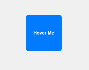
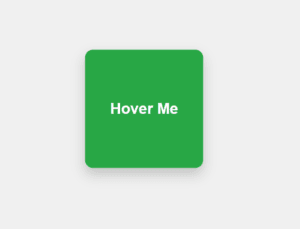
Figure 4 – Displaying the output of using Transition Effects in CSS
- Picture 1 – Before Hover Effects
- Picture 2 – After Hover Effects
By using the transition property, you can create elegant and responsive animations that improve the user experience on your website.
Applying the Animation Effects
With CSS animations, you can define keyframes for how items change over time to create intricate and captivating visual effects. To make your web pages more dynamic, you can animate characteristics like size, color, rotation, and position.
Key Components of CSS Animations
- @keyframes: Specifies the animation’s phases or phases.
- animation-name: Indicates the animation’s name that is connected to the @keyframes.
- The animation-duration parameter determines the duration of the animation (e.g., 2s).
- animation-timing-function: Indicates the speed curve of the animation (e.g., linear, easy).
- animation-delay: Postpones the animation’s beginning.
- animation-iteration-count: Indicates how many times the animation will repeat; if running continuously, this value is infinite.
- animation-direction: Controls whether the animation repeats in reverse or alternates.
Example: Applying Animation Effects
<!DOCTYPE html>
<html lang="en">
<head>
  <meta charset="UTF-8">
  <meta name="viewport" content="width=device-width, initial-scale=1.0">
  <title>CSS Animation Effects</title>
  <style>
    body {
      font-family: Arial, sans-serif;
      display: flex;
      justify-content: center;
      align-items: center;
      height: 100vh;
      margin: 0;
      background-color: #f0f0f0;
    }

    .animated-box {
      width: 100px;
      height: 100px;
      background-color: #007bff;
      border-radius: 10px;
      animation: bounce 2s ease-in-out infinite;
    }

    @keyframes bounce {
      0%, 100% {
        transform: translateY(0); /* Original position */
      }
      50% {
        transform: translateY(-50px); /* Move up */
      }
    }
  </style>
</head>
<body>
  <div class="animated-box"></div>
</body>
</html>
Explanation
- HTML Structure:
- CSS is used to animate a single div element that has been styled as a box.
- Default Styles:
- The 100px x 100px.animated-box file features a blue backdrop, rounded corners, and a border radius of 10px.
- Animation Keyframes:
- The animation is defined by @keyframes bounce:
- The element is in its initial position (translateY(0)) at 0% and 100%.
- The element rises 50 pixels at 50% (translateY(-50px)).
- Animation Property:
- animation: bounce Twos ease-in-out infinite:
- bounce: Alludes to the animation of @keyframes.
- 2s: One animation cycle’s duration.
- ease-in-out: Gives the animation a smooth speed curve.
- infinite: Never stops repeating the animation.
- animation: bounce Twos ease-in-out infinite:
Output of applying animations effects in CSS
CSS animations bring life to your designs, making websites more interactive and engaging. Let me know if you’d like to explore advanced animations!
Use Cases for Animation Effects
- Animations for loading: To show activity, make spinners, loaders, or progress bars.
- Hover Effects: When hovering over buttons or links, apply animations.
- Hero Sections: For dynamic headers, animate text, pictures, or backgrounds.
- Animations that start when the user scrolls down the page are known as scroll animations.
- Attention Grabbers: To draw attention to crucial information or calls to action, use animations.
Creating Frames
Frames are styled borders or outlines that surround elements in CSS to improve their visual appeal. These frames’ properties and methods can determine how simple or complex they are.
Key CSS Properties for Frames
- border: The primary property to create a visible frame.
- outline: Creates a frame outside the border.
- box-shadow: Adds depth or glow to the frame.
- border-radius: Makes frames rounded or circular.
- border-image: Uses an image as the border.
- clip-path: Creates custom-shaped frames.
Example: Creating a Frame
<!DOCTYPE html>
<html lang="en">
<head>
  <meta charset="UTF-8">
  <meta name="viewport" content="width=device-width, initial-scale=1.0">
  <title>CSS Frames</title>
  <style>
    body {
      font-family: Arial, sans-serif;
      display: flex;
      justify-content: center;
      align-items: center;
      height: 100vh;
      margin: 0;
      background-color: #f4f4f4;
    }

    .frame {
      width: 300px;
      height: 200px;
      background-color: #ffffff;
      border: 5px solid #007bff; /* Main frame (blue border) */
      border-radius: 15px; /* Rounded corners */
      box-shadow: 0 4px 10px rgba(0, 0, 0, 0.2); /* Shadow for depth */
      text-align: center;
      padding: 20px;
      color: #333;
    }

    .frame h2 {
      margin: 0 0 10px;
      font-size: 1.5rem;
    }

    .frame p {
      margin: 0;
      font-size: 1rem;
    }
  </style>
</head>
<body>
  <div class="frame">
    <h2>Welcome!</h2>
    <p>This is an example of a styled frame using CSS.</p>
  </div>
</body>
</html>
Explanation
- HTML Structure:
- a class-containing div element.frame has a paragraph (p) and a heading (h2).
- CSS Styles:
- border: Uses a solid blue border (5px solid #007bff) to define the main frame.
- The border-radius (15px) rounding the frame’s corners.
- Box-shadow: Uses a faint shadow (0 4px 10px rgba(0, 0, 0, 0.2)) to add depth to the frame.
- background-color: To improve contrast with the border and shadow, set the background color of the frame to white.
- Make sure the text within the frame is properly aligned and spaced out.

Figure 5 – Displaying the output of creating frames in css
Use Cases for Frames
- Cards: Use them to frame photos, blog entries, and product descriptions.
- Highlights: Highlight crucial areas, such as call-to-action boxes or notifications.
- Decorations: Give basic content spaces a visual component.
Because CSS frames are adaptable and simple to modify, you may produce stunning and useful designs.
Changing the Appearance of Buttons with CSS
In web design, buttons are vital interactive elements. Buttons can be styled with CSS to improve their look, feel, and functionality. They can be changed in terms of size, shape, color, hover effects, and more.
Key CSS Properties for Buttons
- background-color: Sets the button’s background.
- color: Defines the text color.
- border: Customizes the button’s border.
- padding and margin: Controls the spacing inside and around the button.
- border-radius: Makes buttons rounded or circular.
- box-shadow: Adds depth with shadows.
- transition: Smoothens animations like hover effects.
- font-size and font-weight: Adjust text appearance.
- Pseudo-classes (:hover, :focus, :active): Add interactivity.
Example: Changing the Appearance of a Button
<!DOCTYPE html>
<html lang="en">
<head>
  <meta charset="UTF-8">
  <meta name="viewport" content="width=device-width, initial-scale=1.0">
  <title>Stylish Button</title>
  <style>
    body {
      font-family: Arial, sans-serif;
      display: flex;
      justify-content: center;
      align-items: center;
      height: 100vh;
      margin: 0;
      background-color: #f4f4f4;
    }

    .button {
      background-color: #007bff; /* Initial background color */
      color: white; /* Text color */
      padding: 12px 24px; /* Button padding */
      font-size: 1rem; /* Font size */
      font-weight: bold; /* Bold text */
      border: none; /* Removes default border */
      border-radius: 8px; /* Rounded corners */
      box-shadow: 0 4px 6px rgba(0, 0, 0, 0.1); /* Shadow for depth */
      cursor: pointer; /* Pointer cursor on hover */
      transition: background-color 0.3s ease, transform 0.2s ease; /* Smooth transitions */
    }

    .button:hover {
      background-color: #0056b3; /* Darker blue on hover */
      transform: scale(1.05); /* Slightly enlarge button */
    }

    .button:active {
      background-color: #003d80; /* Even darker blue on click */
      transform: scale(0.95); /* Slightly shrink on click */
    }
  </style>
</head>
<body>
  <button class="button">Click Me</button>
</body>
</html>
Explanation
- Default Styles:
- background-color: #007bff;: Sets the original blue background.
- color: white;: Provides contrast by setting white text.
- padding: 12px 24px;: This makes the button noticeably larger by adding space inside it.
- border-radius: 8px;: Smoothes out the corners of the button.
- box-shadow: 0 4px 6px rgba(0, 0, 0, 0.1);: This method adds a light shadow to make the button appear higher.
- cursor: pointer;: Hovering over the button causes the cursor to change to a pointer.
- Hover Effect:
- background-color: #0056b3;: To create a hover effect, the background is changed to a deeper shade of blue.
- transform: scale(1.05);: Indicates interactivity by slightly enlarging the button.
- transition: Guarantees a smooth hover effect.
- Active (Click) Effect:
- background-color: #003d80;: While clicking, the color turns an increasingly deeper shade of blue.
- transform: scale(0.95);: Makes the button a little smaller to give the impression that it is “pressed”
- Responsive Design:
- Using proportionate padding and a font size of 1 rem, the button is stylized to look the same on all devices.


Figure 6 – Displaying the output of changing the appearance of buttons in css
Use Cases for Styled Buttons
- Use call-to-actions (CTAs) to draw attention to crucial actions, such as “Buy Now” or “Sign Up.”
- Navigation: Design menus or buttons for submitting forms.
- Interactive Forms: Well-designed submit/reset buttons improve user experience.
- Interactive Animations: Enhance buttons with visual appeal and feedback when they are clicked or hovered over.
Changing the Appearance of Vertical Menus with CSS
In web design, vertical menus are frequently utilized for sidebars or navigation. You may improve the user experience and add visual appeal to the design by customizing these menus. Their spacing, color, hover effects, and layout are all customizable.
Key CSS Properties for Vertical Menus
- list-style: Removes default bullet points from menu items.
- text-decoration: Removes underlines from links.
- background-color: Sets the menu’s background.
- padding and margin: Adjusts spacing around and inside menu items.
- border and border-radius: Defines the menu’s boundaries and adds rounded corners.
- Pseudo-classes (:hover, :focus, :active): Adds interactivity.
Example: Changing the Appearance of Vertical Menus
<!DOCTYPE html>
<html lang="en">
<head>
  <meta charset="UTF-8">
  <meta name="viewport" content="width=device-width, initial-scale=1.0">
  <title>Vertical Menu</title>
  <style>
    body {
      font-family: Arial, sans-serif;
      display: flex;
      justify-content: center;
      align-items: center;
      height: 100vh;
      margin: 0;
      background-color: #f0f0f0;
    }

    .vertical-menu {
      width: 250px; /* Width of the menu */
      background-color: #007bff; /* Menu background color */
      border-radius: 10px; /* Rounded corners */
      overflow: hidden; /* Hides overflow content */
      box-shadow: 0 4px 8px rgba(0, 0, 0, 0.2); /* Shadow for depth */
    }

    .vertical-menu a {
      display: block; /* Makes links take up full width */
      padding: 15px 20px; /* Spacing inside menu items */
      text-decoration: none; /* Removes underline */
      color: white; /* Text color */
      font-size: 1rem; /* Font size */
      transition: background-color 0.3s ease; /* Smooth hover effect */
    }

    .vertical-menu a:hover {
      background-color: #0056b3; /* Darker blue on hover */
    }

    .vertical-menu a.active {
      background-color: #28a745; /* Green background for active item */
      font-weight: bold; /* Makes active item text bold */
    }
  </style>
</head>
<body>
  <div class="vertical-menu">
    <a href="#" class="active">Home</a>
    <a href="#">About</a>
    <a href="#">Services</a>
    <a href="#">Contact</a>
  </div>
</body>
</html>
Explanation
- HTML Structure:
- Anchor tags (<a>) are arranged in an unordered list to structure the menu.
- The current menu item is highlighted with the class=”active” attribute.
- CSS Styling:
- Menu Container (.vertical-menu):
- width: 250px: Indicates the menu’s fixed width.
- setting the background color of the menu to blue with background-color: #007bff.
- border-radius: 10px: Gives the menu rounded corners.
- Box-shadow: Provides depth by adding a faint shadow.
- overflow: hidden: Ensures the menu’s content doesn’t overflow its boundaries.
- Menu Items (.vertical-menu a):
- display: block: Enables every menu item to fill the container’s width.
- padding: To improve readability, add spacing between each menu item.
- Text-decoration: None: eliminates links’ default underlining.
- color: white: To create contrast with the blue background, set the text color to white.
- transition: When hovered over, the backdrop color changes smoothly.
- Hover Effect (:hover):
- When the user hovers over a menu item, the background color changes to a darker shade of blue (#0056b3).
- Active State (.active):
- uses strong text and a green backdrop (#28a745) to draw attention to the active menu item.
- Menu Container (.vertical-menu):
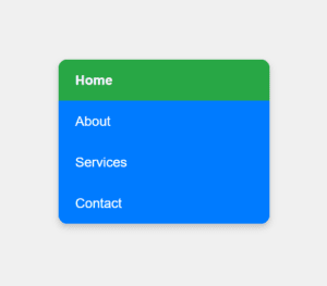
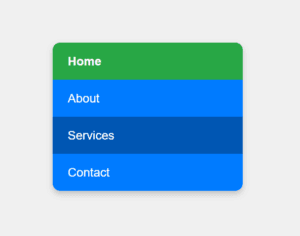
Figure 7 – Displaying the output of changing the appearance of vertical menus in css
Use Cases for Vertical Menus
- Navigation sidebars: Offer easy access to a website’s various parts.
- Dashboard links are managed via vertical menus in admin panels.
- For mobile devices, collapse horizontal menus into vertical ones.
The design of simple, interactive vertical menus is shown in this example.
Changing the Appearance of Horizontal Menus
For navigation bars, horizontal menus are frequently utilized. You can style them with CSS to improve their usability, visual appeal, and design coherence. To make menus look professional, you can adjust the layout, space, colors, and hover effects.
Key CSS Properties for Horizontal Menus
- display: Use inline-block or flex for horizontal alignment.
- list-style: Removes default bullet points for list items.
- text-decoration: Removes underlines from links.
- padding and margin: Adjust spacing for menu items.
- background-color: Defines the menu’s background.
- Pseudo-classes (:hover, :focus, :active): Add interactivity.
- transition: Smoothens hover animations.
Example: Changing the Appearance of Horizontal Menus
<!DOCTYPE html>
<html lang="en">
<head>
  <meta charset="UTF-8">
  <meta name="viewport" content="width=device-width, initial-scale=1.0">
  <title>Horizontal Menu</title>
  <style>
    body {
      font-family: Arial, sans-serif;
      margin: 0;
      padding: 0;
      background-color: #f4f4f4;
    }

    /* Menu Container */
    .horizontal-menu {
      display: flex; /* Align items horizontally */
      justify-content: center; /* Center the menu items */
      background-color: #007bff; /* Menu background color */
      padding: 10px 0; /* Add vertical padding */
      box-shadow: 0 4px 6px rgba(0, 0, 0, 0.1); /* Add shadow for depth */
    }

    /* Menu Items */
    .horizontal-menu a {
      text-decoration: none; /* Remove underline */
      color: white; /* Text color */
      padding: 10px 20px; /* Spacing around menu items */
      font-size: 1rem; /* Font size */
      transition: background-color 0.3s ease, transform 0.2s ease; /* Smooth hover effect */
    }

    /* Hover Effect */
    .horizontal-menu a:hover {
      background-color: #0056b3; /* Darker blue on hover */
      transform: translateY(-3px); /* Slight lift effect */
    }

    /* Active Menu Item */
    .horizontal-menu a.active {
      background-color: #28a745; /* Green for active item */
      font-weight: bold; /* Bold text for active item */
    }
  </style>
</head>
<body>
  <div class="horizontal-menu">
    <a href="#" class="active">Home</a>
    <a href="#">About</a>
    <a href="#">Services</a>
    <a href="#">Contact</a>
  </div>
</body>
</html>
Explanation
- HTML Structure:
- Inside a div container with the class.horizontal-menu, the menu items are shown as anchor (<a>) tags.
- Class=”active” indicates that the menu item is now active.
- CSS Styling:
- Menu Container (.horizontal-menu):
- display: Flex: Horizontally aligns the menu elements.
- justify-content: center: Places the menu bar’s items in the middle.
- setting the background color of the menu to blue with background-color: #007bff.
- padding: Provides spacing by adding vertical padding.
- Box-shadow: Uses a faint shadow to add depth.
- Menu Items (.horizontal-menu a):
- text-decoration: none: Takes away links’ default underlining.
- White: Provides text with a high contrast.
- Padding: Increases the distance between links to improve clickability.
- transition: Makes the hover effect more fluid.
- Hover Effect (:hover):
- For interactivity, the background is changed to a deeper shade of blue (#0056b3).
- uses transform: translateY(-3px) to add a lift effect.
- Active State (.active):
- uses a green background to draw attention to the current menu item (#28a745).
- makes the text of the active item bold.
- Menu Container (.horizontal-menu):

Figure 8 – Displaying the output of changing the appearance of Horizontal menus in css
Use Cases for Horizontal Menus
- Navigation of the Website: It serves as the main page navigation bar.
- Administrator Dashboards: Design top menus to navigate across sections.
- Pages for landing: Make one-page designs’ navigation aesthetically pleasing.
This example demonstrates how to create a clean and interactive horizontal menu.
Changing the Appearance of Scroll Bars
An essential component of websites with scrollable content are scrollbars. Customizing their look can enhance a webpage’s visual appeal and offer a seamless user experience. In order to style scrollbars for contemporary browsers, CSS offers properties.
Key CSS Properties for Scrollbars
Scrollbars are styled using regular CSS attributes and the ::-webkit-scrollbar pseudo-elements (for WebKit browsers like Chrome, Edge, and Safari).
- ::-webkit-scrollbar: Styles the entire scrollbar.
- ::-webkit-scrollbar-thumb: Styles the draggable part (thumb) of the scrollbar.
- ::-webkit-scrollbar-track: Styles the scrollbar track (the area the thumb moves along).
- scrollbar-width: Adjusts the width of the scrollbar in Firefox.
- scrollbar-color: Sets the colors for the scrollbar in Firefox.
Example: Custom Scrollbar with a Modern Design
<!DOCTYPE html>
<html lang="en">
<head>
  <meta charset="UTF-8">
  <meta name="viewport" content="width=device-width, initial-scale=1.0">
  <title>Modern Custom Scrollbar</title>
  <style>
    /* Base Styles */
    body {
      font-family: Arial, sans-serif;
      margin: 0;
      padding: 0;
      background-color: #f8f9fa; /* Light background */
    }

    .scroll-container {
      width: 70%;
      height: 300px;
      margin: 50px auto;
      overflow-y: scroll; /* Enable vertical scrolling */
      background-color: #ffffff; /* White background */
      border: 2px solid #007bff; /* Blue border for the box */
      padding: 15px;
      border-radius: 10px; /* Rounded corners for the container */
      box-shadow: 0 4px 8px rgba(0, 0, 0, 0.1); /* Subtle shadow */
    }

    /* Custom Scrollbar for WebKit Browsers */
    .scroll-container::-webkit-scrollbar {
      width: 8px; /* Narrow scrollbar */
    }

    .scroll-container::-webkit-scrollbar-track {
      background: linear-gradient(to bottom, #e9ecef, #f8f9fa); /* Gradient track */
      border-radius: 5px; /* Rounded track corners */
    }

    .scroll-container::-webkit-scrollbar-thumb {
      background: linear-gradient(to bottom, #007bff, #0056b3); /* Gradient thumb */
      border-radius: 5px; /* Rounded thumb corners */
      box-shadow: inset 0 0 4px rgba(0, 0, 0, 0.3); /* Inner shadow for thumb */
    }

    .scroll-container::-webkit-scrollbar-thumb:hover {
      background: linear-gradient(to bottom, #0056b3, #003d80); /* Darker gradient on hover */
    }

    /* Scrollbar Styles for Firefox */
    .scroll-container {
      scrollbar-width: thin; /* Narrow scrollbar */
      scrollbar-color: #007bff #e9ecef; /* Thumb and track colors */
    }

    /* Additional Content */
    h2 {
      color: #007bff; /* Blue heading */
      margin-bottom: 10px;
    }

    p {
      line-height: 1.6;
      color: #495057; /* Darker text color */
    }
  </style>
</head>
<body>
  <div class="scroll-container">
    <h2>Modern Scrollbar Example</h2>
    <p>Lorem ipsum dolor sit amet, consectetur adipiscing elit. Proin ut libero nec arcu feugiat placerat. Duis posuere urna nec erat faucibus, nec gravida ligula sollicitudin.</p>
    <p>Phasellus dapibus, ipsum vel aliquet tincidunt, sapien nisi pellentesque metus, sit amet dapibus purus ligula vel leo. Aenean nec fermentum ex, in feugiat erat.</p>
    <p>Integer vel ligula nec lorem facilisis fermentum. Nulla facilisi. Suspendisse eget lectus nec nunc eleifend eleifend vel at lectus.</p>
    <p>Mauris vitae fermentum velit, in sollicitudin lorem. Etiam vulputate dapibus nisi, sit amet cursus mauris hendrerit nec.</p>
    <p>Vivamus vulputate, mauris id hendrerit cursus, est nulla viverra libero, eu viverra velit nisi nec eros. Sed volutpat ex ut eros finibus pharetra.</p>
    <p>Donec vehicula, velit sed dignissim fermentum, enim ipsum sagittis elit, vel malesuada eros odio ac eros. In vel pharetra elit.</p>
    <p>Praesent non mauris et tortor sollicitudin hendrerit. Integer vel ligula nec lorem facilisis fermentum. Nulla facilisi.</p>
  </div>
</body>
</html>
Explanation
- HTML Structure:
- The .scroll-container contains sample text that overflows vertically, requiring a scrollbar.
- Base Styles:
- The container’s fixed height is 300 pixels, and its width is 70%.
- A vertical scrollbar is guaranteed by overflow-y: scroll.
- The container’s design is improved with a slight shadow, rounded corners, and a blue border.
- Custom Scrollbar for WebKit Browsers:
- Track (::-webkit-scrollbar-track):
- Styled with a light gradient from #e9ecef to #f8f9fa.
- Rounded corners (border-radius: 5px) give it a modern appearance.
- Thumb (::-webkit-scrollbar-thumb):
- Styled with a blue gradient from #007bff to #0056b3.
- Rounded corners and an inner shadow (box-shadow) make it look polished.
- Hover Effect (::-webkit-scrollbar-thumb:hover):
- The thumb changes to a darker gradient for interactivity.
- Track (::-webkit-scrollbar-track):
- Custom Scrollbar for Firefox:
- scrollbar-width: thin;:
- Makes the scrollbar narrower.
- scrollbar-color: #007bff #e9ecef;:
- Sets the thumb color (#007bff) and track color (#e9ecef).
- scrollbar-width: thin;:
- Content Styling:
- The container’s paragraphs and headings are formatted with contrasting text colors to improve readability.
Output of Changing the Appearance of Scroll Bars in CSS
Features in This Example:
- Modern Look:
- Rounded corners, gradients, and shadows give the scrollbar a contemporary design.
- Cross-Browser Support:
- Works in Chrome, Edge, Safari (via
::-webkit-scrollbar) and Firefox (viascrollbar-widthandscrollbar-color).
- Works in Chrome, Edge, Safari (via
- Interactive Feedback:
- Thumb changes color when hovered, indicating interactivity.