Simple Methods of Using Color Gradients in CSS: To begin, first visit – do-you-know-how-to-use-color-gradients-in-css-and-what-they-are
Using Color Properties Using CSS
There are multiple methods in CSS to specify colors for web element styling. Based on specifications like accuracy, transparency, or visual effects, each approach gives a different degree of versatility. These are the primary color attributes:
- RGB (Red, Green, Blue): Defines colors by mixing red, green, and blue values.
- RGBA (Red, Green, Blue, Alpha): Adds transparency (alpha) to RGB colors.
- HSL (Hue, Saturation, Lightness): Defines colors in terms of hue, saturation, and lightness.
- HSLA (Hue, Saturation, Lightness, Alpha): Adds transparency to HSL colors.
- Opacity: Adjusts the transparency of the entire element (including text and borders).
1. RGB (Red, Green, Blue)
Explanation:
- The RGB () method specifies colors by using the intensities of the red, green, and blue components.
- Each component has a range from 0 (none) to 255 (full intensity).
Example: (html and css code)
<div class="rgb-box">RGB Example</div>.rgb-box {
background-color: rgb(173, 216, 230); /* Light Blue */
width: 300px;
height: 100px;
text-align: center;
line-height: 100px;
border: 1px solid #000;
color: #000; /* Black text */
font-weight: bold;
}2. RGBA (Red, Green, Blue, Alpha)
Explanation:
- Like RGB, but with an alpha value for transparency.
- The range of the alpha value is 0 (completely transparent) to 1 (completely opaque).
Example: (html and css code)
<div class="rgba-box">RGBA Example</div>.rgba-box {
background-color: rgba(255, 0, 0, 0.5); /* Semi-transparent red */
width: 300px;
height: 100px;
text-align: center;
line-height: 100px;
border: 1px solid #000;
color: #000; /* Black text */
font-weight: bold;
}3. HSL (Hue, Saturation, Lightness)
Explanation:
- The hsl specifies colors () function using:
- Hue: The base color on a 360° color wheel, measured in degrees.
- Saturation: The degree of color intensity (100 percent = full color, 0% = gray).
- Lightness: The color’s brightness (100 percent white, 0% black).
Example: (html and css code)
<div class="hsl-box">HSL Example</div>.hsl-box {
background-color: hsl(240, 100%, 50%); /* Pure blue */
width: 300px;
height: 100px;
text-align: center;
line-height: 100px;
border: 1px solid #000;
color: #fff; /* White text */
font-weight: bold;
}4. HSLA (Hue, Saturation, Lightness, Alpha)
Explanation:
With an alpha value for transparency, it is similar to HSL.
Example: (html and css code)
<div class="hsla-box">HSLA Example</div>.hsla-box {
background-color: hsla(120, 50%, 50%, 0.7); /* Semi-transparent green */
width: 300px;
height: 100px;
text-align: center;
line-height: 100px;
border: 1px solid #000;
color: #000; /* Black text */
font-weight: bold;
}5. Opacity
Explanation:
- Adjusts the transparency of the element as a whole, including the borders and text.
- The range of values is 0 (completely transparent) to 1 (completely opaque).
Example: (html and css code)
<div class="opacity-box">Opacity Example</div>.opacity-box {
background-color: orange;
opacity: 0.6; /* 60% opaque */
width: 300px;
height: 100px;
text-align: center;
line-height: 100px;
border: 1px solid #000;
color: #fff; /* White text */
font-weight: bold;
}Final HTML and CSS
Here’s how all examples look together in one HTML and CSS file:
<!DOCTYPE html>
<html lang="en">
<head>
  <meta charset="UTF-8">
  <meta name="viewport" content="width=device-width, initial-scale=1.0">
  <title>Color Properties Examples</title>
  <style>
    body {
      font-family: Arial, sans-serif;
      display: flex;
      flex-direction: column;
      align-items: center;
      gap: 10px;
      padding: 20px;
      background-color: #f4f4f4;
    }

    .rgb-box, .rgba-box, .hsl-box, .hsla-box, .opacity-box {
      width: 300px;
      height: 100px;
      text-align: center;
      line-height: 100px;
      border: 1px solid #000;
      font-weight: bold;
    }

    .rgb-box {
      background-color: rgb(173, 216, 230); /* Light Blue */
      color: #000; /* Black text */
    }

    .rgba-box {
      background-color: rgba(255, 0, 0, 0.5); /* Semi-transparent red */
      color: #000; /* Black text */
    }

    .hsl-box {
      background-color: hsl(240, 100%, 50%); /* Pure blue */
      color: #fff; /* White text */
    }

    .hsla-box {
      background-color: hsla(120, 50%, 50%, 0.7); /* Semi-transparent green */
      color: #000; /* Black text */
    }

    .opacity-box {
      background-color: orange;
      opacity: 0.6; /* 60% opaque */
      color: #fff; /* White text */
    }
  </style>
</head>
<body>
  <div class="rgb-box">RGB Example</div>
  <div class="rgba-box">RGBA Example</div>
  <div class="hsl-box">HSL Example</div>
  <div class="hsla-box">HSLA Example</div>
  <div class="opacity-box">Opacity Example</div>
</body>
</html>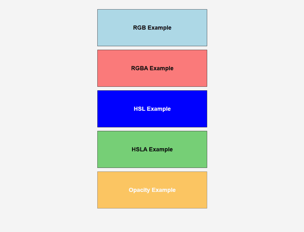
Figure 1 – Displaying the output of using Color Properties using CSS
Output Explanation:
- RGB Example: A rectangle with a light blue background and black text.
- RGBA Example: A semi-transparent red rectangle allowing the background to show through slightly.
- HSL Example: A pure blue rectangle with white text.
- HSLA Example: A semi-transparent green rectangle slightly showing the background.
- Opacity Example: An orange rectangle with 60% transparency, making everything inside (text, border) semi-transparent.
Using Color Gradients in CSS
Understanding Color Gradients in CSS
Smooth transitions between two or more colors are known as gradients in CSS. There are two main types of gradients that can be used as background images: radial gradients and linear gradients.
1. Linear Gradient
Explanation: A linear gradient, which is determined by its direction, produces a seamless color transition along a straight line.
- The gradient is set to run from top to bottom by default.
- The gradient’s direction can be specified (e.g., diagonal, left to right, etc.).
Syntax:
background: linear-gradient(direction, color1, color2, ...);- direction: Defines the gradient’s angle or direction (e.g., to right, 45deg).
- color1, color2, …: The colors in the gradient, separated by commas.
Example: Linear Gradient Effect
<!DOCTYPE html>
<html lang="en">
<head>
  <meta charset="UTF-8">
  <meta name="viewport" content="width=device-width, initial-scale=1.0">
  <title>Linear Gradient Example</title>
  <style>
    .linear-gradient-box {
      width: 400px;
      height: 150px;
      background: linear-gradient(to right, #ff7e5f, #feb47b); /* Gradient from peach to orange */
      text-align: center;
      line-height: 150px;
      font-family: Arial, sans-serif;
      font-size: 20px;
      color: white;
      font-weight: bold;
      border: 1px solid #000;
    }
  </style>
</head>
<body>
  <div class="linear-gradient-box">Linear Gradient</div>
</body>
</html>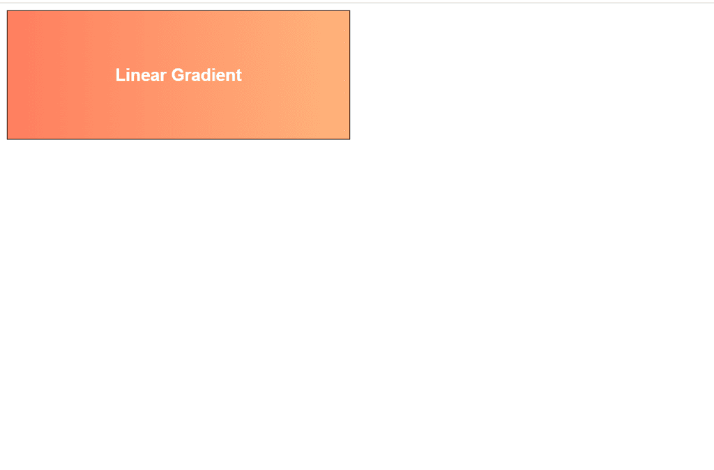
Figure 2 – Displaying the output of using Linear Gradient Effect
The result is a horizontal gradient with bold white text in the middle that moves from peach (#ff7e5f) on the left to orange (#feb47b) on the right.
2. Radial Gradient
Explanation: A radial gradient, like ripples in water, produces a smooth color transition that radiates outward from a center point.
- Either an ellipse or a circle (the default) can be used.
- You can control the gradient’s position and size.
Syntax:
background: radial-gradient(shape size at position, color1, color2, ...);- shape: circle (default) or ellipse.
- size: The size of the gradient (e.g., closest-side, farthest-corner).
- position: The center point of the gradient (e.g., center, top left).
- color1, color2, …: Colors for the gradient transition.
Example: Radial Gradient Effect
<!DOCTYPE html>
<html lang="en">
<head>
  <meta charset="UTF-8">
  <meta name="viewport" content="width=device-width, initial-scale=1.0">
  <title>Radial Gradient Example</title>
  <style>
    .radial-gradient-box {
      width: 400px;
      height: 150px;
      background: radial-gradient(circle at center, #42a5f5, #1e88e5, #0d47a1); /* Gradient from light blue to dark blue */
      text-align: center;
      line-height: 150px;
      font-family: Arial, sans-serif;
      font-size: 20px;
      color: white;
      font-weight: bold;
      border: 1px solid #000;
    }
  </style>
</head>
<body>
  <div class="radial-gradient-box">Radial Gradient</div>
</body>
</html>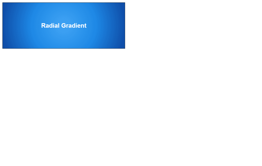
Figure 3 – Displaying the output of using Radial Gradient Effect
Output: Bold white text in the center of a radial gradient that changes from light blue (#42a5f5) at the center to dark blue (#0d47a1) at the edges.
Key Differences Between Linear and Radial Gradients:
| Feature | Linear Gradient | Radial Gradient |
| Transition Type | Along a straight line | Radiates outward from a center point |
| Direction Control | Specifies direction (e.g., to right) | Specifies position (e.g., at center) |
| Shape | Always linear | Can be circular or elliptical |