Simple Methods of Using Backgrounds in CSS: To begin, first refer –backgrounds-in-css-and-how-to-use-them
Setting the Background Color
CSS’s background-color attribute allows you to set an element’s background color. You can specify the color using various formats, including named colors, hexadecimal numbers, RGB, RGBA, HSL, or HSLA.
Syntax
background-color: color;Color Value Formats
- Named Colors: Colors have predetermined names, such as red, blue, and green.
- Hexadecimal: A code consisting of six digits, such as #ff0000 for red.
- RGB: Uses red, green, and blue (rgb) to define colors (e.g., rgb(255, 0, 0)).
- RGBA: Like RGB but with a transparency-enhancing alpha channel (e.g., rgba(255, 0, 0, 0.5)).
- HSL: Uses hue, saturation, and lightness (hsl(0, 100%, 50%)) to define colors.
- HSLA: Like HSL, but including an alpha channel for transparency, is HSLA.
Example:
<!DOCTYPE html>
<html lang="en">
<head>
    <meta charset="UTF-8">
    <meta name="viewport" content="width=device-width, initial-scale=1.0">
    <title>Background Color Example</title>
    <style>
        body {
            background-color: lightblue; /* Named color */
        }

        .box1 {
            background-color: #ff0000; /* Hexadecimal */
            color: white;
            padding: 20px;
            margin: 10px;
        }

        .box2 {
            background-color: rgb(0, 255, 0); /* RGB */
            color: black;
            padding: 20px;
            margin: 10px;
        }

        .box3 {
            background-color: rgba(0, 0, 255, 0.5); /* RGBA with transparency */
            color: white;
            padding: 20px;
            margin: 10px;
        }
    </style>
</head>
<body>
    <div class="box1">This is a red box.</div>
    <div class="box2">This is a green box.</div>
    <div class="box3">This is a semi-transparent blue box.</div>
</body>
</html>
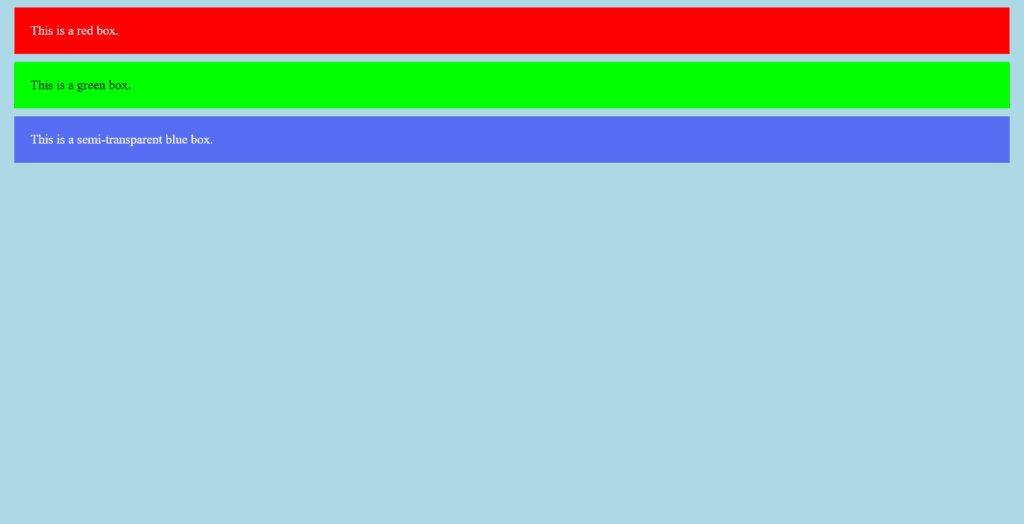
Figure 1 – Displaying the output of setting background colors using CSS
When rendered in a browser:
- The body background is light blue.
- Box 1 is red with white text.
- Box 2 is green with black text.
- Box 3 is a blue box with 50% transparency, allowing the light blue body background to show through.
Tips for Usage
Use transparent colors (such as RGBA or HSLA) for overlay effects.
Select hues that will keep the writing readable.
Use CSS variables to control color schemes for design coherence.
In web development, setting the background color is a crucial CSS technique to improve visual design and user experience.
Setting the Background Image
An image can be set as an element’s background using CSS’s background-image attribute. To access the image, you can either utilize built-in gradients or a URL.
Example:
<!DOCTYPE html>
<html lang="en">
<head>
    <meta charset="UTF-8">
    <meta name="viewport" content="width=device-width, initial-scale=1.0">
    <title>Scenic Background</title>
    <style>
        body {
            background-image: url('https://images.pexels.com/photos/147411/italy-mountains-dawn-daybreak-147411.jpeg?auto=compress&cs=tinysrgb&w=1260&h=750&dpr=2'); /* Replace with actual image path */
            background-size: cover; /* Ensures the image covers the entire viewport */
            background-position: center; /* Centers the image */
            background-repeat: no-repeat; /* Prevents repetition */
            margin: 0;
            font-family: Arial, sans-serif;
        }

        .content-box {
            background-color: rgba(255, 255, 255, 0.8); /* Translucent white */
            color: black;
            padding: 20px;
            border-radius: 10px;
            width: 50%;
            margin: 100px auto;
            text-align: center;
            box-shadow: 0 4px 8px rgba(0, 0, 0, 0.2);
        }
    </style>
</head>
<body>
    <div class="content-box">
        <h1>Nature's Beauty</h1>
        <p>Explore the wonders of the natural world.</p>
    </div>
</body>
</html>
CSS Explanation
- Body Background:
- background-image: Applies the mountain landscape image as the background.
- background-size: cover: Ensures the image scales to cover the entire viewport without distortion.
- background-position: center: Centers the image for a balanced layout.
- background-repeat: no-repeat: Prevents the image from repeating.
- Content Box:
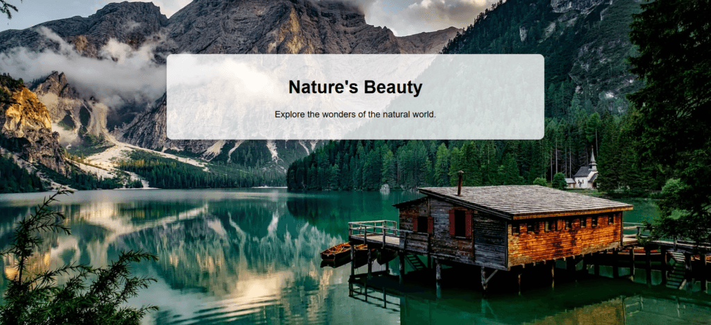
- Translucent White Box: The rgba(255, 255, 255, 0.8) creates a white box with 80% opacity.
- Padding and Margins: Adds spacing for a clean look.
- Box Shadow: Adds depth to the content box.

Figure 2 – Displaying the output of setting the background image using CSS
Tips for Usage
Responsive Design: To adapt the box’s width, padding, and placement for smaller displays, use @media queries.
Image Optimization: To speed up load times without compromising quality, reduce the size of the background image.
Accessibility: Make sure the background and text colors contrast enough to be readable.
For landing pages, portfolios, or any other web page that would benefit from a visually arresting background, this design is ideal. If you need assistance expanding or improving this example, please let me know!
Fixing and Scrolling a Background Image
The background image’s behavior while the user scrolls can be managed using CSS’s background-attachment property. The background will stay still while the content scrolls over it if you set it to fixed. This technique is often used to create a visually engaging effect for web pages.
Here’s an example of a nature-themed webpage with a fixed background image that scrolls content, using internal CSS. The design will focus on a natural setting with a beautiful landscape, creating a relaxing atmosphere for the user.
<!DOCTYPE html>
<html lang="en">
<head>
    <meta charset="UTF-8">
    <meta name="viewport" content="width=device-width, initial-scale=1.0">
    <title>Nature Scenery with Fixed Background</title>
    <style>
        /* Reset margins and padding for body and html */
        html, body {
            margin: 0;
            padding: 0;
            height: 100%;
            font-family: 'Georgia', serif;
            color: white;
        }

        /* Full-page background image of nature */
        body {
            background-image: url('https://images.pexels.com/photos/1033729/pexels-photo-1033729.jpeg?auto=compress&cs=tinysrgb&w=1260&h=750&dpr=2'); /* Example image URL for nature */
            background-attachment: fixed;
            background-position: center;
            background-size: cover;
            background-repeat: no-repeat;
        }

        /* Overlay effect to improve text readability */
        .overlay {
            position: absolute;
            top: 0;
            left: 0;
            width: 100%;
            height: 100%;
            background-color: rgba(0, 0, 0, 0.4); /* Slight dark overlay */
            z-index: -1; /* Ensures the overlay stays behind the content */
        }

        /* Centering the main content */
        .content {
            position: relative;
            text-align: center;
            padding: 100px 20px;
            z-index: 1; /* Ensure content stays above the overlay */
        }

        h1 {
            font-size: 4em;
            margin-bottom: 20px;
            text-shadow: 2px 2px 5px rgba(0, 0, 0, 0.7);
        }

        p {
            font-size: 1.8em;
            line-height: 1.6;
            max-width: 800px;
            margin: 0 auto;
            text-shadow: 1px 1px 4px rgba(0, 0, 0, 0.6);
        }

        .section {
            padding: 100px 20px;
            text-align: center;
            background-color: rgba(255, 255, 255, 0.8); /* Light background for text */
            margin-top: 50px;
            border-radius: 10px;
        }

        /* Long scrollable section */
        .long-section {
            height: 1500px;  /* Extended height to create scroll */
            background-color: #f1f1f1;
            margin-top: 50px;
            padding: 40px;
            text-align: center;
        }

        /* Responsive Styling for mobile devices */
        @media screen and (max-width: 768px) {
            h1 {
                font-size: 2.5em;
            }
            p {
                font-size: 1.4em;
            }
            .section {
                padding: 60px 10px;
            }
        }

    </style>
</head>
<body>

    <!-- Overlay for better readability -->
    <div class="overlay"></div>

    <!-- Content Section with Nature Theme -->
    <div class="content">
        <h1>Explore the Wonders of Nature</h1>
        <p>Immerse yourself in the beauty of the natural world. Enjoy the tranquility of forests, mountains, and rivers while scrolling through this peaceful experience.</p>
    </div>

    <!-- Scrollable Section 1 -->
    <div class="section">
        <h2>The Serenity of the Forest</h2>
        <p>Forests are the lungs of the planet, providing clean air and shelter for diverse ecosystems. The gentle rustling of leaves and the chirping of birds create a symphony of calmness, perfect for rejuvenating your mind and soul.</p>
    </div>

    <!-- Scrollable Section 2 -->
    <div class="section">
        <h2>Majestic Mountains</h2>
        <p>Mountains offer breathtaking views and the peace that comes from being high above the world. They remind us of the immense power and beauty of nature. Hike through their trails and experience the world from a different perspective.</p>
    </div>

    <!-- Long Scrollable Section -->
    <div class="long-section">
        <h2>Continue Your Journey</h2>
        <p>As you scroll, take a moment to appreciate the peaceful beauty of nature. The vast landscapes, the sky, the trees, and the animals all contribute to the delicate balance of life on Earth. Let your mind wander and be inspired by the infinite beauty of the world.</p>
    </div>

</body>
</html>
Video 1 – Displaying the output of Fixing and Scrolling Background Image using CSS
Explanation:
- Background with a nature theme:
- background-image: This is a stand-in picture for a background of nature. An excellent nature image (forest, mountains, river, etc.) might be used in place of this URL.
- fixed background-attachment: As a result, the backdrop image remains still while the information moves.
- background-position: center: Assures that the viewport’s background picture is centered.
- backdrop-size: cover: Makes sure the background image fills the viewport completely without extending.
- The Overlay Effect
- A dark transparent overlay (rgba(0, 0, 0, 0.4)) is used by the.overlay class to highlight the text against the natural backdrop.
- The overlay remains behind the text content when the z-index is set to -1.
- Style of the Main Content:
- With additional padding to provide some space around the content, the main heading and paragraph are centered in the.content class.
- To make the text stand up against the bright background, use Text Shadow (text-shadow: 2px 2px 5px rgba(0, 0, 0, 0.7)).
- Scrollable Sections:
- For the text parts, the.section class provides padding, rounded edges, and a somewhat transparent background (rgba(255, 255, 255, 0.8)).
- The.long-section class is a huge, 1500px-high scrollable section that can be used to produce a scroll effect.
- Design that is responsive:
- For smaller screens (such as tablets or smartphones), the @media query shrinks the font size, guaranteeing that the design is intelligible and aesthetically pleasing across a range of devices.
Output:
- Fixed Background: To create a calm, serene experience, the nature image remains in place while the content scrolls.
- Content Scrolls: The background stays still while the content moves as you scroll.
- Overlay: Even with a busy or bright background image, the overlay makes sure the text is readable.
- Responsive Design: The page adjusts to various devices and looks nice on both large and small displays.
This nature-themed webpage offers a tranquil atmosphere with a fixed background that enhances the user experience while scrolling through content. You can customize the images and text further to suit your specific nature-themed project!
Setting Multiple Background Images
In CSS, you can set multiple background images for an element, creating rich and layered visual effects. This is done using the background-image property, where you can specify more than one image, separated by commas. The background images are stacked in the order they are written, with the first one on the bottom and the last one on top.
We will place the small image as an actual HTML element (like an img tag) rather than using it as a background image. This ensures it is fully controllable, and it won’t run into issues with the background layer overlap or size.
Example:
<!DOCTYPE html>
<html lang="en">
<head>
    <meta charset="UTF-8">
    <meta name="viewport" content="width=device-width, initial-scale=1.0">
    <title>Multiple Background Images Example</title>
    <style>
        /* Ensure full height for body */
        html, body {
            margin: 0;
            padding: 0;
            height: 100%;
        }

        /* Apply large background image */
        body {
            height: 100vh; /* Full viewport height */
            background-image:
                url('https://cdn.pixabay.com/photo/2022/04/15/07/58/sunset-7133867_1280.jpg'); /* Large nature image */
            background-position: center; /* Large image centered */
            background-size: cover; /* Large image covers the entire screen */
            background-repeat: no-repeat; /* No repetition for the large image */
            background-attachment: fixed; /* Large image stays fixed */
        }

        /* Position the small image in the top-right corner */
        .small-image {
            position: fixed;
            top: 20px;
            right: 20px;
            width: 150px; /* Small image size */
            height: 150px;
            background-image: url('https://images.pexels.com/photos/21382599/pexels-photo-21382599/free-photo-of-a-bird-with-a-long-beak-standing-in-the-water.jpeg?auto=compress&cs=tinysrgb&w=600'); /* Small image */
            background-size: cover; /* Cover the small image area */
            background-repeat: no-repeat; /* No repetition */
        }

        /* Content styling */
        .content {
            text-align: center;
            padding: 50px;
            color: white;
            position: relative;
            z-index: 1; /* Ensures content is above the background */
        }

        h1 {
            font-size: 3em;
            margin-bottom: 20px;
            text-shadow: 2px 2px 10px rgba(0, 0, 0, 0.7);
        }

        p {
            font-size: 1.5em;
            line-height: 1.6;
            max-width: 800px;
            margin: 0 auto;
            text-shadow: 1px 1px 5px rgba(0, 0, 0, 0.6);
        }
    </style>
</head>
<body>

    <!-- Small image (as an element) -->
    <div class="small-image"></div>

    <!-- Content Section -->
    <div class="content">
        <h1>Multiple Background Images Example</h1>
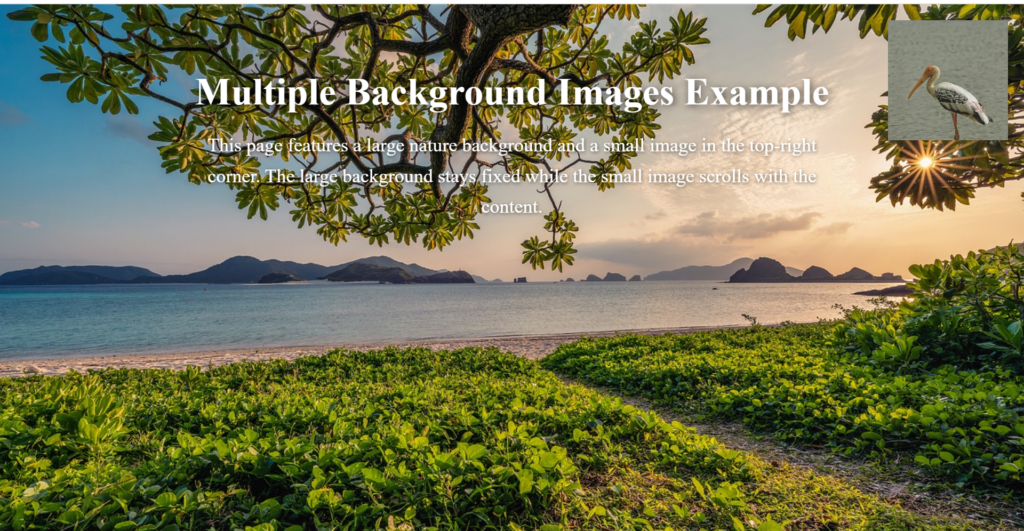
        <p>This page features a large nature background and a small image in the top-right corner. The large background stays fixed while the small image scrolls with the content.</p>
    </div>

</body>
</html>
Explanation:
- Large Background Image:
- The large nature image is set as a background image for the body. It will cover the entire viewport and stay fixed during scrolling (background-attachment: fixed).
- Small Image:
- The small image is now an HTML element (<div class=”small-image”>). This way, we can easily position it and control its size using CSS.
- Position: It is set to the top-right corner of the screen using position: fixed; top: 20px; right: 20px;. This will keep it in place while you scroll.
- Size: The width: 150px; height: 150px; makes the small image visible and fixed at 150×150 pixels.
- Content Styling:
- The content has a z-index of 1 to ensure it stays above the background image.

Figure 3 – Displaying the output of Using Multiple Background images using CSS
Expected Output:
The large background image will cover the entire screen and remain fixed as you scroll.
The small image will be visible in the top-right corner of the page, and it will scroll with the page content.
Using the background-clip and background-origin properties
Background images and colors can be controlled in relation to the elements they are applied to using CSS’s background-clip and background-origin attributes. With these characteristics, you have more control over how backgrounds appear in your site design.
- background-clip Property: Goal: This property specifies where the element’s background color or image should be drawn.
Values: border-box: By default, the background stretches to the border’s outer boundary.
padding-box: The background reaches the padding’s outside edge.
content-box: The area inside the content box—which does not include the padding or border—is painted with the backdrop. - background-origin Property: Goal: This property establishes the background image’s starting point.
Principles:
padding-box: The padding box determines the background position.
border-box: The border box determines the background position.
content-box: The content box determines the backdrop location.
In this example, we’ll apply both background-clip and background-origin to see how the background image behaves in different areas of the element.
<!DOCTYPE html>
<html lang="en">
<head>
    <meta charset="UTF-8">
    <meta name="viewport" content="width=device-width, initial-scale=1.0">
    <title>background-clip and background-origin Example</title>
    <style>
        /* Set up basic styling for the page */
        html, body {
            margin: 0;
            padding: 0;
            height: 100%;
            font-family: Arial, sans-serif;
        }

        .box {
            width: 300px;
            height: 300px;
            margin: 50px;
            padding: 20px;
            border: 10px solid black;
            background-image: url('https://i.pinimg.com/474x/0a/d1/65/0ad16554ca3593418b855694048ad932.jpg');
            background-size: cover;
            background-repeat: no-repeat;
        }

        /* Apply background-origin and background-clip properties */
        .border-box {
            background-origin: border-box;
            background-clip: border-box;
        }

        .padding-box {
            background-origin: padding-box;
            background-clip: padding-box;
        }

        .content-box {
            background-origin: content-box;
            background-clip: content-box;
        }

        /* Add some styling to the content */
        h1 {
            text-align: center;
            font-size: 2em;
        }

        .box-wrapper {
            display: flex;
            justify-content: space-around;
            align-items: flex-start;
            height: 100%;
            margin-top: 50px;
        }

    </style>
</head>
<body>

    <h1>Example of background-clip and background-origin</h1>

    <div class="box-wrapper">
        <div class="box border-box">
            <p>border-box</p>
        </div>

        <div class="box padding-box">
            <p>padding-box</p>
        </div>

        <div class="box content-box">
            <p>content-box</p>
        </div>
    </div>

</body>
</html>
Explanation:
- Basic Structure:
- We have three boxes (div elements with the class box), each with the same background image and size (background-size: cover).
- The background-image is a placeholder image that will be applied to each of the boxes.
- The padding, border, and margin are used to illustrate how the background-origin and background-clip properties affect the background.
- Background Properties:
- background-origin specifies where the background image will start:
- border-box: The image will position relative to the entire element, including the border.
- padding-box: The image will position relative to the padding area (excluding the border).
- content-box: The image will position relative to the content area (excluding padding and border).
- background-clip defines the area where the background will be visible:
- border-box: The background is painted behind the entire element, including the border.
- padding-box: The background is clipped to the padding area, so it won’t extend into the border.
- content-box: The background is clipped to the content area, excluding the padding and border.

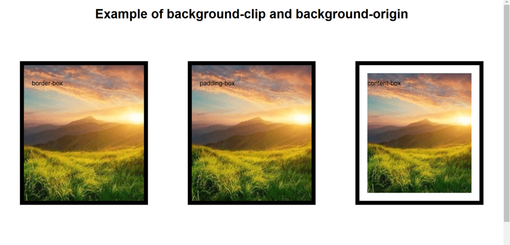
Figure 4 – Displaying the output of Background-clip and Background-origin properties
Expected Output:
- border-box:
- The background image covers the entire element, including the padding and border area.
- The background extends beyond the content area, into the padding and border areas.
- padding-box:
- The background image is clipped to the padding area, so it won’t be painted in the border area. The background is visible only in the padding and content areas.
- content-box:
- The background image is clipped to the content area, excluding the padding and border. The background will only appear inside the content area.
You have more control over the placement and style of background colors and images inside an element when you use background-clip and background-origin together. When working with items that contain borders or padding, these characteristics enable more exact design control.