Simple Methods of Displaying, Positioning, and Floating an Element: To begin, first refer – how-to-display-position-and-float-an-element
Working with the display Property
The way an element appears on the page and interacts with other components is determined by the display property in CSS. For more complex layouts, different display values determine whether an element acts as a block, inline, or container.
Common Values of the display Property
1. block:
- The element fills its container’s width and begins on a new line.
- For example: <div>, <p>, and <h> (default behavior).
2. inline:
- The element only takes up as much width as its content and does not begin on a new line.
- Examples: <span>, <a>.
3. inline-block:
- behaves similarly to inline but respects width/height, padding, and margins like a block element.
4. none:
- eliminates the element from the document flow by completely hiding it.
5. flex:
- creates a versatile container for dynamic and responsive layouts.
6. grid:
- enables the element to function as a grid container, which is perfect for organized layouts.
Example with Explanation
<!DOCTYPE html>
<html lang="en">
<head>
    <meta charset="UTF-8">
    <meta name="viewport" content="width=device-width, initial-scale=1.0">
    <title>Display Property Example</title>
    <style>
        .block {
            display: block;
            background-color: lightblue;
            margin-bottom: 10px;
            padding: 10px;
        }

        .inline {
            display: inline;
            background-color: lightgreen;
            margin-right: 10px;
            padding: 10px;
        }

        .inline-block {
            display: inline-block;
            background-color: lightcoral;
            margin: 10px;
            padding: 10px;
            width: 100px;
            height: 50px;
            text-align: center;
        }

        .hidden {
            display: none;
        }
    </style>
</head>
<body>
    <h1>Display Property Examples</h1>

    <!-- Block Example -->
    <div class="block">I am a block element</div>

    <!-- Inline Example -->
    <span class="inline">I am an inline element</span>
    <span class="inline">So am I</span>

    <!-- Inline-Block Example -->
    <div class="inline-block">I</div>
    <div class="inline-block">Am</div>
    <div class="inline-block">Inline-Block</div>

    <!-- None Example -->
    <p class="hidden">This paragraph is hidden using `display: none`.</p>
    <p>This text is visible, but the hidden paragraph above doesn't affect layout.</p>
</body>
</html>
Explanation
- Block (display: block):
- The block element fills the container’s width.
- shows up on a fresh line.
- Inline (display: inline):
- Only the width of its content is occupied by inline components.
- On a single line, several inline components are displayed.
- Inline-Block (display: inline-block):
- Inline-block elements run inline like text while adhering to padding, margins, and widths.
- None (display: none):
- The layout flow is entirely free of the hidden paragraph.
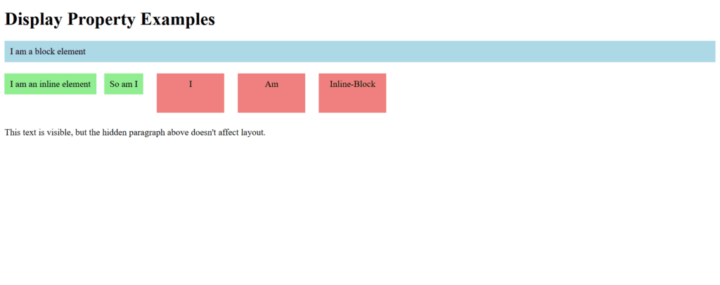
Figure 1 – Displaying the output of using the display property in CSS
This demonstrates how display influences layout and element behavior.
Working with the visibility property
Without changing the page flow, the CSS visibility attribute determines whether an element is visible or hidden. In contrast to display: none, visibility-based hidden items maintain their original layout placement.
Common Values of the visibility Property
- visible:
- The element’s default value makes it fully visible.
- hidden:
- Despite being invisible, the element takes up space in the document flow.
- collapse:
- used in table components to eliminate the space between rows or columns and hide them. (It acts as though it is hidden for non-table components.)
- inherit:
- inherits the parent element’s visibility value.
Example with Explanation
<!DOCTYPE html>
<html lang="en">
<head>
    <meta charset="UTF-8">
    <meta name="viewport" content="width=device-width, initial-scale=1.0">
    <title>Visibility Property Example</title>
    <style>
        .visible {
            visibility: visible;
            background-color: lightgreen;
            padding: 10px;
            margin-bottom: 10px;
        }

        .hidden {
            visibility: hidden;
            background-color: lightblue;
            padding: 10px;
            margin-bottom: 10px;
        }

        .example-container {
            border: 1px solid black;
            padding: 10px;
            width: 300px;
        }
    </style>
</head>
<body>
    <h1>Visibility Property Examples</h1>

    <div class="example-container">
        <p class="visible">I am visible.</p>
        <p class="hidden">I am hidden but still take up space.</p>
        <p>This text follows the hidden paragraph and is not affected by its visibility.</p>
    </div>
</body>
</html>
Explanation
- visibility: visible:
- The background and content of the first paragraph are visible.
- visibility: hidden:
- Despite not being displayed, the second paragraph takes up space in the arrangement.
- The surrounding components stay in place to provide the impression that the hidden piece is visible.
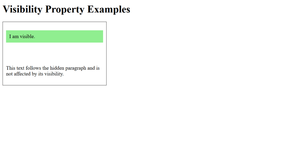
Figure 2 – Displaying the output of using the visibility property
This example demonstrates how visibility can control the visibility of elements without altering the layout.
Hiding an Element
In CSS, there are multiple methods for hiding elements, and each has a unique impact on the layout and flow of the document. Using the display, visibility, and opacity properties are common techniques.
Methods to Hide an Element
- sing display: none
- eliminates the component from the flow of the document.
- The element doesn’t take up any space and is invisible.
- Using visibility: hidden
- keeps the element’s place in the layout while hiding it.
- Using opacity: 0
- completely transparentizes the element without changing its interactivity or space.
- Using z-index (optional, advanced):
- If the element is covered, it is effectively hidden by moving it behind other elements.
- Positioning Off-Screen:
- uses positioning to move the element out of the viewport.
Example with Explanation
<!DOCTYPE html>
<html lang="en">
<head>
    <meta charset="UTF-8">
    <meta name="viewport" content="width=device-width, initial-scale=1.0">
    <title>Hiding Elements Example</title>
    <style>
        .display-none {
            display: none;
        }

        .visibility-hidden {
            visibility: hidden;
        }

        .opacity-zero {
            opacity: 0;
        }

        .position-offscreen {
            position: absolute;
            left: -9999px;
        }

        .container {
            border: 1px solid black;
            padding: 10px;
            margin-bottom: 20px;
        }
    </style>
</head>
<body>
    <h1>Hiding Elements Example</h1>

    <div class="container">
        <p>This is a visible paragraph.</p>
        <p class="display-none">This paragraph is hidden using `display: none`.</p>
        <p>This text follows the `display: none` paragraph.</p>
    </div>

    <div class="container">
        <p>This is a visible paragraph.</p>
        <p class="visibility-hidden">This paragraph is hidden using `visibility: hidden`.</p>
        <p>This text follows the `visibility: hidden` paragraph.</p>
    </div>

    <div class="container">
        <p>This is a visible paragraph.</p>
        <p class="opacity-zero">This paragraph is hidden using `opacity: 0`.</p>
        <p>This text follows the `opacity: 0` paragraph.</p>
    </div>

    <div class="container">
        <p>This is a visible paragraph.</p>
        <p class="position-offscreen">This paragraph is hidden by positioning off-screen.</p>
        <p>This text follows the off-screen paragraph.</p>
    </div>
</body>
</html>
Explanation
- display: none:
- The next information rises as though the hidden paragraph had never been there, and the hidden paragraph is entirely eliminated from the arrangement.
- visibility: hidden:
- Despite being invisible, the paragraph takes up space and keeps the arrangement as though it were visible.
- opacity: 0:
- Despite being completely transparent, the paragraph is interactive (clickable, for example). It maintains its place.
- Positioning Off-Screen:
- Position: absolute is used to move the paragraph well outside the screen, hiding it without changing the layout.
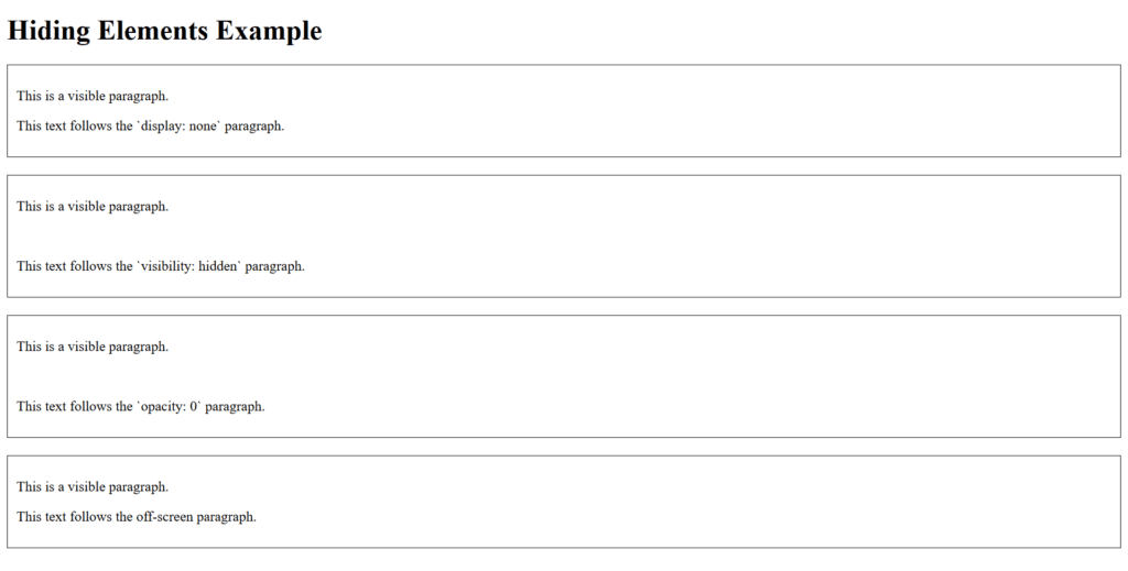
Figure 3 – Displaying the output of hiding an element in CSS
Best Practices
- If you want to conceal an element and take it completely out of the layout, use display: none.
- When an element needs to be hidden while maintaining its layout, use visibility: hidden.
- For temporary element hiding that preserves interactivity, use opacity: 0.
- Make use of off-screen placement for accessibility (e.g., making content available to screen readers while visually obscuring it).
Knowing these approaches will help you select the one that best suits your design and functionality needs.
Setting Fixed Position of an Element
An element can be positioned relative to the browser viewport using CSS’s position: fixed attribute, which keeps it there even when the page is scrolled. This is frequently utilized for sidebars, sticky headers, and floating action buttons.
Key Features of position: fixed
- The viewport, not the parent or container, determines the element’s location.
- When the user scrolls through the page, it stays in place.
- The fixed position can be specified using the top, right, bottom, and left properties.
Example with Explanation
<!DOCTYPE html>
<html lang="en">
<head>
    <meta charset="UTF-8">
    <meta name="viewport" content="width=device-width, initial-scale=1.0">
    <title>Fixed Position Example</title>
    <style>
        body {
            font-family: Arial, sans-serif;
            line-height: 1.6;
        }

        .fixed-header {
            position: fixed;
            top: 0;
            left: 0;
            width: 100%;
            background-color: #333;
            color: white;
            text-align: center;
            padding: 10px 0;
            z-index: 1000;
        }

        .fixed-footer {
            position: fixed;
            bottom: 0;
            left: 0;
            width: 100%;
            background-color: #444;
            color: white;
            text-align: center;
            padding: 10px 0;
            z-index: 1000;
        }

        .content {
            margin-top: 60px; /* Push content below the fixed header */
            margin-bottom: 40px; /* Push content above the fixed footer */
            padding: 20px;
        }
    </style>
</head>
<body>
    <div class="fixed-header">
        This is a Fixed Header
    </div>

    <div class="content">
        <p>Lorem ipsum dolor sit amet, consectetur adipiscing elit. Sed sit amet felis eget nisl laoreet gravida. Suspendisse potenti. Vivamus quis urna a elit pharetra malesuada.</p>
        <p>Scroll down to see the fixed footer at the bottom of the page. Both the header and footer remain fixed as you scroll.</p>
        <p>Additional content here...</p>
        <p>Additional content here...</p>
        <p>Additional content here...</p>
        <p>Additional content here...</p>
        <p>Additional content here...</p>
        <p>Additional content here...</p>
        <p>Additional content here...</p>
    </div>

    <div class="fixed-footer">
        This is a Fixed Footer
    </div>
</body>
</html>
Explanation
- Fixed Header:
- Position: fixed; top: 0; left: 0; is used to anchor the header to the top of the viewport.
- With width: 100%, it fills the entire width of the page.
- It remains on top of other stuff thanks to the z-index of 1000.
- Fixed Footer:
- Likewise, position: fixed; bottom: 0; left: 0; is used to anchor the footer to the bottom.
- Additionally, it uses width: 100% to fill the entire page.
- Content Adjustment:
- To prevent it from overlapping the fixed header, the content area utilizes margin-top: 60px.
- To avoid overlap with the fixed footer, use a margin-bottom of 40 pixels.
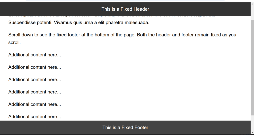
Figure 4 – Displaying the output of setting a fixed position of an element in CSS
You may make dynamic layouts that improve usability and interactivity by combining position: fixed with other CSS attributes like z-index and width.
Setting Relative Position of an Element
You can move an element in relation to its typical location in the document flow using CSS’s position: relative attribute. It offers a means of nudging an element without having an immediate impact on its siblings. In contrast to absolute or fixed, it allows for top, right, bottom, or left alterations while preserving the element’s flow inside the text.
Key Features of position: relative
- The element stays in the flow of the document.
- It is positioned in relation to where it was before.
- The elements are moved in relation to their beginning place via the top, right, bottom, and left properties.
Example with Explanation
<!DOCTYPE html>
<html lang="en">
<head>
    <meta charset="UTF-8">
    <meta name="viewport" content="width=device-width, initial-scale=1.0">
    <title>Relative Position Example</title>
    <style>
        .container {
            border: 2px solid #ccc;
            padding: 20px;
            position: relative; /* Allows child elements with position: absolute to position themselves */
        }

        .relative-box {
            position: relative;
            background-color: lightblue;
            width: 150px;
            height: 100px;
            margin: 10px;
        }

        .moved-box {
            position: relative;
            background-color: lightcoral;
            width: 150px;
            height: 100px;
            margin: 10px;
            top: 20px; /* Moves down by 20px */
            left: 30px; /* Moves right by 30px */
        }

        p {
            margin-top: 10px;
        }
    </style>
</head>
<body>
    <h1>Relative Position Example</h1>

    <div class="container">
        <div class="relative-box">
            Original Position Box
        </div>
        <div class="moved-box">
            Moved Using Top and Left
        </div>
        <p>Notice how the moved box overlaps but still reserves its original space in the document flow.</p>
    </div>
</body>
</html>
Explanation
- Container:
- The content has a visible border thanks to the.container.
- Although it is not necessary for this example, the position: relative on the container guarantees that child elements can position themselves in relation to it if necessary.
- The Relative Box
- The first box (.relative-box) stays in its default position because it uses position: relative but without top, right, bottom, or left values.
- Moved Box:
- Position: relative is used by the second box (.moved-box), with top: 20px and left: 30px.
- Without changing the arrangement of its siblings, this moves the box 20 pixels to the bottom and 30 pixels to the right with relation to its initial location.
- Document Flow:
- Other elements cannot collapse into those gaps because both boxes remain in their original locations inside the document flow.
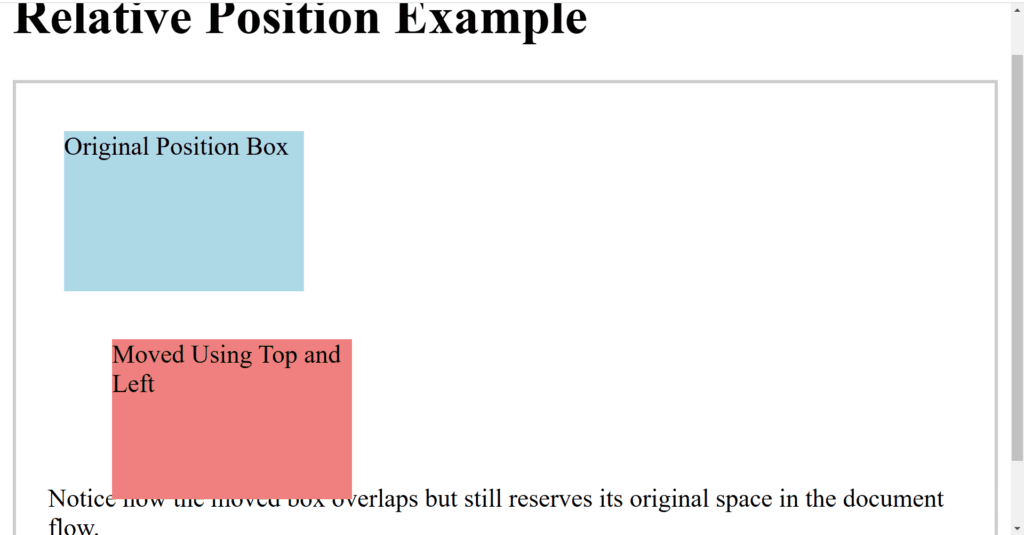
Figure 5 – Displaying the output of setting a relative position of an element in CSS
This demonstrates how position: relative maintains the text flow while providing tight control over element placement.
Setting the Absolute Position of an Element
An element can be positioned in relation to its nearest positioned ancestor (an ancestor with a position value other than static) using CSS’s position: absolute property. The element is positioned in relation to the viewport if there isn’t a positioned ancestor. The element is totally eliminated from the document flow using this way.
Key Features of position: absolute
- The element’s position is in relation to its closest ancestor.
- It is positioned in relation to the viewport if there isn’t a positioned ancestor.
- Since the element is eliminated from the document flow, its placement has no bearing on that of its siblings.
- Its precise location is defined by the top, right, bottom, and left properties.
Example with Explanation
<!DOCTYPE html>
<html lang="en">
<head>
    <meta charset="UTF-8">
    <meta name="viewport" content="width=device-width, initial-scale=1.0">
    <title>Absolute Position Example</title>
    <style>
        .container {
            position: relative; /* Creates a positioned ancestor for absolute children */
            border: 2px solid #333;
            width: 300px;
            height: 200px;
            margin: 20px auto;
            background-color: #f9f9f9;
        }

        .absolute-box {
            position: absolute;
            top: 20px; /* 20px from the top of the container */
            left: 30px; /* 30px from the left of the container */
            width: 120px;
            height: 80px;
            background-color: lightcoral;
            color: white;
            display: flex;
            justify-content: center;
            align-items: center;
            font-size: 14px;
        }

        .another-absolute-box {
            position: absolute;
            bottom: 10px; /* 10px from the bottom of the container */
            right: 20px; /* 20px from the right of the container */
            width: 120px;
            height: 80px;
            background-color: lightblue;
            color: white;
            display: flex;
            justify-content: center;
            align-items: center;
            font-size: 14px;
        }
    </style>
</head>
<body>
    <h1>Absolute Position Example</h1>

    <div class="container">
        <div class="absolute-box">Top-Left Box</div>
        <div class="another-absolute-box">Bottom-Right Box</div>
    </div>
</body>
</html>
Explanation
- Container:
- To serve as a reference point for its offspring with position: absolute, the.container element is assigned position: relative. In the absence of this, the absolute elements would be oriented in relation to the viewport as a whole.
- First Box (absolute-box):
- positioned using top: 20px; left: 30px; to be 20px from the top and 30px from the left of the container.
- It appears in the container’s upper-left corner.
- Second Box (another-absolute-box):
- positioned using bottom: 10px; right: 20px; so that it is 10px from the bottom and 20px from the right of the container.
- It can be found in the container’s lower-right section.
- Document Flow:
- Since both boxes are not part of the regular document flow, the arrangement of other items within the container is not impacted or changed.
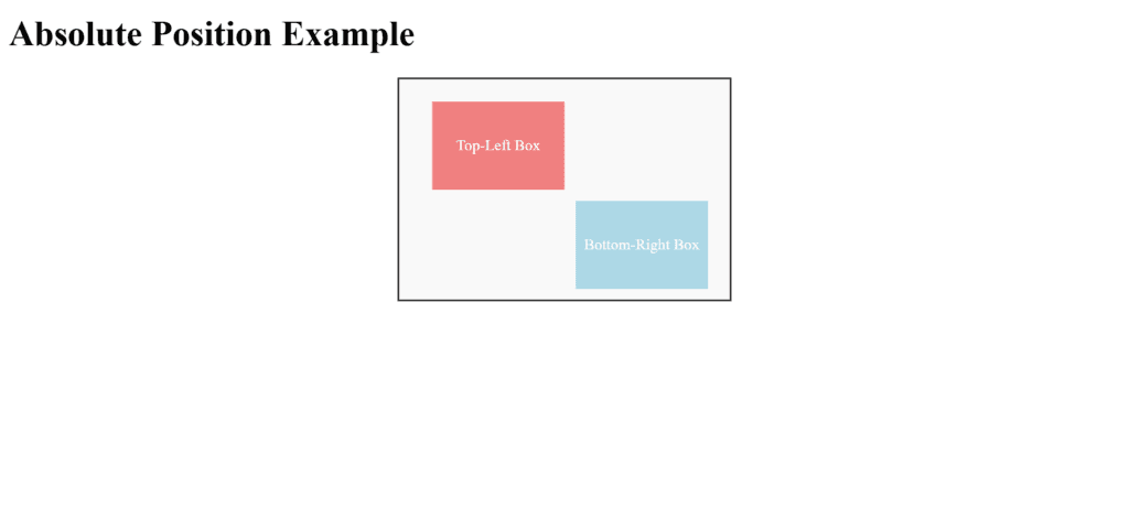
Figure 6 – Displaying the output of setting an absolute position of an element in CSS
You can get exact control over where elements appear in your layout by combining position: absolute with a well-defined positioned ancestor.
Floating an Element in CSS: Left and Right
Text or other inline elements can flow around an element by positioning it to the left or right within its container using CSS’s float property. Text wrapping around images or layouts are common uses for this attribute.
Key Features of the float Property
- The element is positioned to the left of its container when using float: left.
- float: right: Puts the element in the rightmost position relative to its container.
- The floated element nevertheless interacts with sibling content even if it is not part of the regular document flow.
- To stop elements from wrapping around a floated element, use the clear attribute.
Example: Floating Elements Left and Right
<!DOCTYPE html>
<html lang="en">
<head>
    <meta charset="UTF-8">
    <meta name="viewport" content="width=device-width, initial-scale=1.0">
    <title>Float Example</title>
    <style>
        body {
            font-family: Arial, sans-serif;
            line-height: 1.6;
        }

        .container {
            width: 80%;
            margin: 20px auto;
            border: 1px solid #ddd;
            padding: 20px;
            overflow: hidden; /* Clearfix to contain floated children */
        }

        .float-left {
            float: left;
            width: 40%;
            background-color: lightblue;
            padding: 10px;
            margin-right: 10px;
            text-align: center;
        }

        .float-right {
            float: right;
            width: 40%;
            background-color: lightcoral;
            padding: 10px;
            margin-left: 10px;
            text-align: center;
        }

        .content {
            background-color: #f9f9f9;
            padding: 10px;
        }

        .clearfix::after {
            content: "";
            display: table;
            clear: both;
        }
    </style>
</head>
<body>
    <h1>Floating Elements Example</h1>

    <div class="container clearfix">
        <div class="float-left">
            This element is floated to the left.
        </div>
        <div class="float-right">
            This element is floated to the right.
        </div>
        <div class="content">
            <p>
                Lorem ipsum dolor sit amet, consectetur adipiscing elit. Sed vel metus nec purus cursus blandit.
                Curabitur vehicula facilisis elit a feugiat. Nam eget eros vel felis pharetra faucibus at id purus.
            </p>
            <p>
                Float is a powerful CSS property for creating layouts or aligning elements, but it needs to be managed
                carefully to avoid layout issues.
            </p>
        </div>
    </div>
</body>
</html>
Explanation
- Container:
- The floating components are contained in the.container div, which also has overflow: hidden to remove the floated children (a popular clearfix technique).
- Float to the Left:
- Float: left is used to floate the.float-left div to the left.
- It lets text or other elements flow to its right and takes up 40% of the container width.
- Float to the Right:
- Float: right is used to floate the.float-right div to the right.
- It lets text or other elements flow to its left and takes up 40% of the container width.
- Content:
- The remaining text, which wraps around the floated elements according to their placements, is contained in the.content div.
- Clearfix:
- In order to avoid layout problems, the.clearfix class makes sure that the container encloses the floated items.
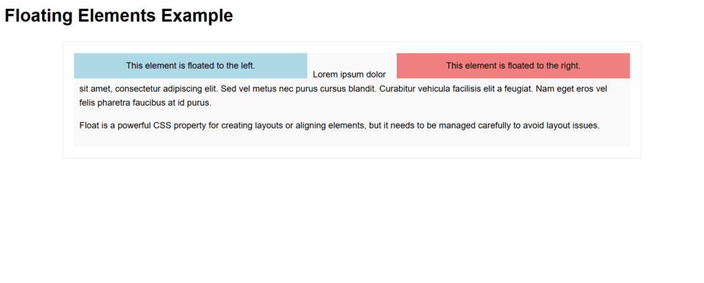
Figure 7 – Displaying the output of floating an element to right and left in CSS
Best Practices
- To make sure the container can handle floated items, use clearfix approaches (overflow: hidden or clearfix class).
- Avoid using float excessively in layouts; instead, use more contemporary layout methods like Grid or Flexbox.
- Better maintainability and responsive design compatibility are thus guaranteed.
Turning-off Float
One element may wrap around another in the same container if it is floating (float: left or float: right). This behavior can be avoided by using the clear property to “turn off” the float. In order to prevent an element from overlapping or wrapping around a floated element and so breaking the float, the clear attribute is used.
Key Features of the clear Property
- Wrapping around a left-floating element is prevented by using clear: left.
- Avoid wrapping around an element that is floating to the right by using clear: right.
- clear: both: Prevents wrapping around components that float to the left or right.
Example with Explanation
<!DOCTYPE html>
<html lang="en">
<head>
    <meta charset="UTF-8">
    <meta name="viewport" content="width=device-width, initial-scale=1.0">
    <title>Turning Off Float Example</title>
    <style>
        body {
            font-family: Arial, sans-serif;
            line-height: 1.6;
        }

        .container {
            width: 80%;
            margin: 20px auto;
            border: 1px solid #ddd;
            padding: 20px;
        }

        .float-left {
            float: left;
            width: 40%;
            background-color: lightblue;
            padding: 10px;
            margin-right: 10px;
            text-align: center;
        }

        .float-right {
            float: right;
            width: 40%;
            background-color: lightcoral;
            padding: 10px;
            margin-left: 10px;
            text-align: center;
        }

        .clear-both {
            clear: both;
            background-color: lightgreen;
            padding: 10px;
            text-align: center;
            margin-top: 10px;
        }
    </style>
</head>
<body>
    <h1>Turning Off Float Example</h1>

    <div class="container">
        <div class="float-left">
            This element is floated to the left.
        </div>
        <div class="float-right">
            This element is floated to the right.
        </div>
        <div class="clear-both">
            This element is cleared and starts below floated elements.
        </div>
        <p>
            Without the `clear` property, this paragraph would wrap around the floated elements instead of starting below them.
        </p>
    </div>
</body>
</html>
Explanation
- Container:
- The.container guarantees correct layout and gives each element a boundary.
- Float Elements:
- Float: left and float: right are used to floate the.float-left and.float-right divs to the left and right, respectively.
- Clear Element:
- In order to prevent wrapping over the floated elements, the.clear-both div utilizes clear: both.
- It compels itself to appear beneath both floating elements.
- The paragraph
- The paragraph does not wrap around the floated components; instead, it displays beneath the.clear-both div.
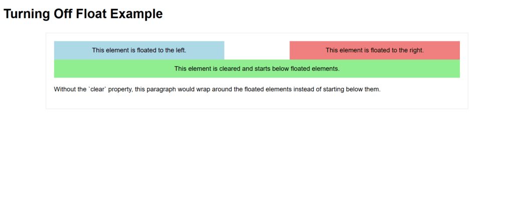
Figure 8 – Displaying the output of turning-off float in css
Best Practices
- For items that must begin beneath all floated elements, use clear: both.
- To properly handle floats, apply a clearfix method or overflow: hidden to parent containers.
- For further layout customization, think about utilizing contemporary layout methods like Grid or Flexbox.