Simple Methods of Creating Columns in CSS: To Begin, first refer to – know-how-to-create-boxes-and-columns-using-css
Working with Columns in CSS
The Multi-Column Layout Module in CSS provides capabilities for creating and managing columns in layouts. It makes dividing text into several columns easier and gives the appearance of a magazine or newspaper layout. The number, width, spacing, and rule styles of columns can all be changed using the key properties.
Key CSS Properties for Columns
column-count:
- indicates the number of columns that should be used to separate the content.
- Example
column-count: 3;column-width:
- specifies each column’s minimum width. The number of columns is determined by the browser using the available space.
- Example
column-width: 200px;columns (Shorthand):
- creates a single declaration by combining column-count and column-width.
- Example
columns: 3 200px; /* 3 columns, each 200px wide */column-gap:
- specifies the distance between columns.
- Example
column-gap: 20px;column-rule:
- Sets a line (rule) between columns.
- shorthand for:
- Rule thickness is indicated by column-rule-width.
- column-rule-style: The rule’s style, such as solid, dotted, or dashed.
- color of the rule (column-rule-color).
- Example
column-rule: 2px solid black;column-span:
- Indicates whether an element should extend into every column.
- Possible values:
- none (by default), which keeps the element in a single column.
- all: The element is present in every column.
- Example
column-span: all;break-inside:
- keeps columns from breaking inside of an element.
- Example
break-inside: avoid;Example with Explanation
<!DOCTYPE html>
<html lang="en">
<head>
  <meta charset="UTF-8">
  <meta name="viewport" content="width=device-width, initial-scale=1.0">
  <title>CSS Columns Example</title>
  <style>
    /* General styling */
    body {
      font-family: Arial, sans-serif;
      line-height: 1.6;
    }

    /* Multi-column layout */
    .multi-column {
      columns: 3 200px; /* 3 columns, each at least 200px wide */
      column-gap: 20px; /* Space between columns */
      column-rule: 2px solid lightgray; /* Rule between columns */
    }

    /* Spanning across all columns */
    .header {
      column-span: all;
      font-size: 1.5em;
      text-align: center;
      color: darkblue;
      margin-bottom: 10px;
    }

    /* Avoid breaking content inside */
    .no-break {
      break-inside: avoid;
      background-color: lightyellow;
      padding: 10px;
      margin-bottom: 10px;
    }
  </style>
</head>
<body>
  <div class="multi-column">
    <div class="header">CSS Multi-Column Layout</div>
    <p>
      The CSS Multi-Column Layout Module makes it easy to create columns in a web layout. This module allows splitting content into columns, just like a newspaper or magazine. By using properties like column-count, column-width, and column-gap, you can control the number, width, and spacing of columns. It simplifies complex layouts and improves readability.
    </p>
    <p class="no-break">
      This is an example of content that spans multiple columns. It uses the column-span and break-inside properties to ensure the content appears correctly.
    </p>
    <p>
      Additional features like column-rule let you add visual separators between columns, enhancing the design. These properties are supported by modern browsers, making multi-column layouts accessible for most web projects.
    </p>
  </div>
</body>
</html>
Explanation
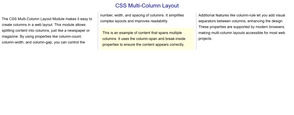
- Multi-Column Layout (.multi-column):
- columns: 3 200px; produces three columns with a minimum width of 200px.
- column-gap: 20px; increases the distance between columns by 20px.
- The column-rule, which adds a light gray line between columns, is 2px solid lightgray.
- Spanning Across Columns (.header):
- column-span: all; makes sure the header is visible by spanning all columns.
- Preventing Breaks (.no-break):
- Break-inside: avoid; keeps the element intact by preventing it from being divided across columns.

Figure 1 – Displaying the output of using columns in CSS
Key Points
- For handling dense material in a well-structured, understandable manner, the Multi-Column Layout is great.
- Use break-inside and column-span to manage certain content placement.
- Verify cross-browser compatibility because certain attributes can need prefixes like -webkit-.
This method works well for articles, blogs, and any other layout where text needs to be displayed in several columns. It easily enhances visual appeal and readability.
Creating Floating Elements
Content in a CSS container can “float” to the left or right thanks to floating elements. When designing layouts with elements arranged side by side, like multi-column layouts or images with text wrapping, the float attribute is frequently utilized.
Key Properties of Floating Elements:
float:
- indicates if an element should float to the right, left, or neither.
- Values:
- The element is floated to the left.
- right: The element floats to the right.
- None: The element doesn’t float; this is its default value.
- inherit: The float value is inherited from its parent.
clear:
- used to stop material from circling elements that are floating.
- Values:
- left: Stops content from showing up next to elements that are floating on the left.
- right: Stops content from showing up next to items that are floating on the right.
- both: Prevents content from showing up next to items that are floating on either side.
Example with Explanation
This example shows a straightforward arrangement that mimics a grid or card structure with three boxes floating side by side. It shows how to properly arrange material using float, spacing, and clearfix.
<!DOCTYPE html>
<html lang="en">
<head>
  <meta charset="UTF-8">
  <meta name="viewport" content="width=device-width, initial-scale=1.0">
  <title>Floating Boxes Example</title>
  <style>
    /* General styling */
    body {
      font-family: Arial, sans-serif;
      margin: 20px;
    }

    h1 {
      text-align: center;
      color: darkslateblue;
    }

    /* Container for floating boxes */
    .container {
      width: 100%;
      margin: 0 auto;
    }

    /* Floating boxes */
    .box {
      float: left; /* Floats each box to the left */
      width: 30%; /* Each box takes 30% of the container's width */
      margin: 1.5%; /* Adds space between boxes */
      background-color: lightcoral;
      color: white;
      text-align: center;
      padding: 20px;
      border-radius: 8px; /* Rounded corners */
      box-shadow: 2px 2px 10px rgba(0, 0, 0, 0.2); /* Subtle shadow */
    }

    /* Clearfix to clear floats */
    .clearfix::after {
      content: "";
      display: table;
      clear: both;
    }
  </style>
</head>
<body>
  <h1>Floating Boxes Example</h1>
  <div class="container clearfix">
    <div class="box">Box 1</div>
    <div class="box">Box 2</div>
    <div class="box">Box 3</div>
  </div>
</body>
</html>
Explanation
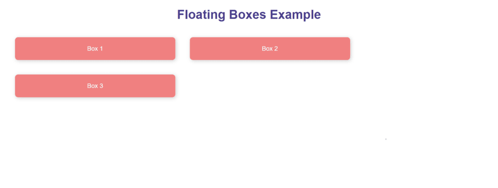
Floating Boxes (.box):
- float: left; places each box so that they line up side by side on the left.
- width: 30%, which guarantees that every box occupies 30% of the container’s width.
- 1.5% margin, which adds uniform box space.
- Styling:
- background-color: lightcoral; gives each box a distinct color.
- text-align: center; centers the text inside the box.
- padding and border-radius enhance the appearance.
- box-shadow adds a subtle depth effect.
- Container (.container):
- To guarantee that the floating boxes line up correctly within a specified area, a container encloses them.
- Clearfix (.clearfix):
- used to avoid layout problems by clearing the floats inside the container.
- After the floated elements, an invisible block is added to restore normal flow.

Figure 2 – Displaying the output of using Floating Elements in CSS
Key Points
- Float Usage:
- Float: left or float: right can be used to align components side by side.
- Items that float are eliminated from the document’s organic flow.
- Spacing:
- Use margin to leave space between floated components.
- Ensure that the total width of the floating items and margins does not exceed 100%.
- Clearfix:
- required to take floats out of a container.
- If the container collapses without a clearfix, layout issues may occur.
- Styling Enhancements:
- Shadows (box-shadow) and rounded corners (border-radius) give the design a polished, modern look.
- Limitations of Float:
- Floats are not ideal for designs that are responsive or complex. For more complex layouts, consider CSS Grid or Flexbox.
Although CSS float offers basic layout capabilities, current layout approaches are more appropriate for simple designs or legacy compatibility.
Setting Box Dimensions
In CSS, attributes like width, height, min-width, max-width, min-height, and max-height are the main tools used to regulate box dimensions. These attributes enable you to specify an element’s size and modify it in accordance with particular specifications or limitations. For accurate layout management, it is crucial to comprehend how these parameters interact with the CSS box model.
Key Properties for Box Dimensions
- width and height:
- Indicate an element’s height and width.
- can be expressed in relative (%, em, vw, vh) or absolute (px, cm) units.
- min-width and min-height:
- Make sure an element doesn’t shrink below a specific size by setting the minimum width and height it can have.
- max-width and max-height:
- To keep an element from getting too big, set the maximum width and height it can have.
- Relative Units:
- %: In relation to the element that contains it.
- vw, vh: In relation to the height and breadth of the viewport.
Example with Explanation
<!DOCTYPE html>
<html lang="en">
<head>
  <meta charset="UTF-8">
  <meta name="viewport" content="width=device-width, initial-scale=1.0">
  <title>Box Dimensions Example</title>
  <style>
    /* General styles */
    body {
      font-family: Arial, sans-serif;
      margin: 20px;
    }

    h1 {
      text-align: center;
      color: darkslateblue;
    }

    /* Box styles */
    .box {
      background-color: lightblue;
      color: darkblue;
      padding: 20px;
      margin: 10px auto;
      text-align: center;
      border: 2px solid darkblue;
    }

    /* Fixed width and height */
    .fixed {
      width: 200px;
      height: 100px;
    }

    /* Minimum dimensions */
    .min {
      min-width: 150px;
      min-height: 80px;
    }

    /* Maximum dimensions */
    .max {
      max-width: 300px;
      max-height: 120px;
      overflow: auto; /* Adds a scrollbar if content exceeds max dimensions */
    }

    /* Responsive width */
    .responsive {
      width: 50%; /* 50% of the container's width */
    }
  </style>
</head>
<body>
  <h1>Box Dimensions in CSS</h1>
  <div class="box fixed">Fixed Dimensions (200px x 100px)</div>
  <div class="box min">Minimum Dimensions (Min: 150px x 80px)</div>
  <div class="box max">
    Maximum Dimensions (Max: 300px x 120px). This box has constrained size and will scroll if content exceeds the limit.
  </div>
  <div class="box responsive">Responsive Width (50% of container)</div>
</body>
</html>
Explanation
- Fixed Dimensions (.fixed):
- width: 200 pixels; height: 100 pixels; establishes a fixed box size.
- Regardless of the size of its parent container or its contents, the box will not enlarge.
- Minimum Dimensions (.min):
- The box won’t shrink below these measurements if the minimum width and height are 150 and 80 pixels, respectively.
- helpful for preserving legibility of small-scale content.
- Maximum Dimensions (.max):
- limits the box’s size to 300 pixels for width and 120 pixels for height.
- Overflow: auto; permits scrolling in the event that the content surpasses the maximum dimensions.
- Responsive Dimensions (.responsive):
- width: 50%; causes the box to occupy half of the width of the element it contains.
- Perfect for designing adaptable layouts.

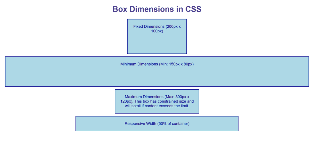
Figure 3 – Displaying the output of Using Box Dimensions in CSS
Output
- Fixed Dimensions: A compact box measuring 200 pixels by 100 pixels.
- Minimum Dimensions: A box that is at least 150 pixels wide and 80 pixels high, with the ability to expand if necessary.
- Maximum Dimensions: A box with scrolling enabled if content spills over and limited to a maximum size.
- A box that dynamically resizes with the viewport or parent container to reach 50% of the container’s width is known as responsive dimensions.
Key Points
- Use width and height for static layouts where elements need fixed dimensions.
- Use min-width and min-height to ensure elements remain usable and legible.
- Use max-width and max-height to constrain elements and control overflow.
- Responsive designs benefit from percentage-based widths or viewport units (vw, vh).
- Combine overflow properties (e.g., overflow: auto) with max-width or max-height for better usability.
This example shows how box dimensions can be efficiently managed to provide layouts that are responsive, flexible, and static.