Know How to Create Boxes and Columns Using CSS? When utilizing CSS to create boxes and columns, attributes like display, flexbox, and grid are used to efficiently organize material. You can utilize characteristics like width, height, border, padding, and margin to create boxes. It’s usual practice to use display: flex or display: grid for columns. Flexbox makes constructing columns easier by using the flex-direction property and setting display: flex on a container. Align-items and justify-content can be used to align items and distribute space. By using grid-template-columns to specify column sizes and spacing, CSS Grid provides more sophisticated control over columns and layouts. These methods can be combined to create designs that are both aesthetically pleasing and responsive.
Exploring the Box Model
Designing and placing items on a webpage requires a basic understanding of the CSS Box Model. It depicts the organization of an element as a rectangular box with four main sections:
- Content: Text, pictures, or other content are found in the innermost section.
- Padding: The distance between the element’s border and its content is known as padding. Besides being transparent, it produces inner spacing.
- Border: The line enclosing the padding and content is called the border. It can be different in thickness, color, and style.
- Margin: The outermost area on the page that divides one element from other elements is called the margin.
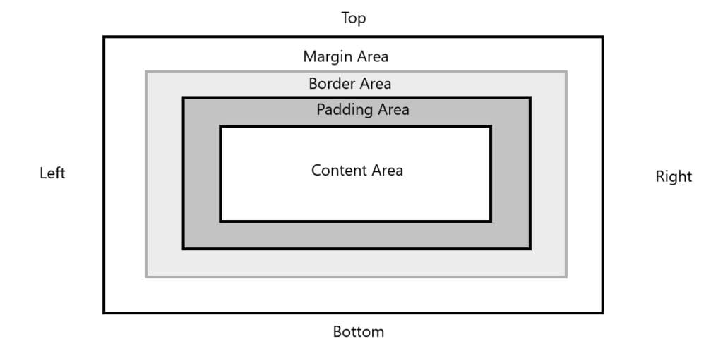
Figure 1 – Areas of Box Model
Understanding the box model makes it easier to control element spacing and arrangement exactly. In order to fine-tune the appearance and interaction of elements in a design, developers can modify characteristics such as width, height, padding, border, and margin. The content area’s width and height are applied by default, but with box-sizing: layout management is made easier with border-box, which includes padding and a border in the desired proportions.
Let’s explore various other aspects of the box model in the following sections:
1. Exploring Box Dimensions
Exploring box dimensions in CSS involves understanding how the width, height, padding, border, and margin of an element affect its size. The box dimensions specify how an element interacts with other items and how much space it takes up on a webpage. Here’s an explanation:
- Width and Height: Determine the content area’s width and height. These values can be configured using certain units (such as px, %, em, vw, and vh) or they can be left to change automatically to match the content.
- Padding: Creates space between the content and the border inside the box. It expands the box’s apparent size without changing nearby components.
- Border: Encloses the content and padding. Its unique breadth, style, and color characteristics all affect the box’s overall dimensions.
- Margin: Makes room outside the box and keeps it apart from other components. To lessen distance, margins might collapse between neighboring components.
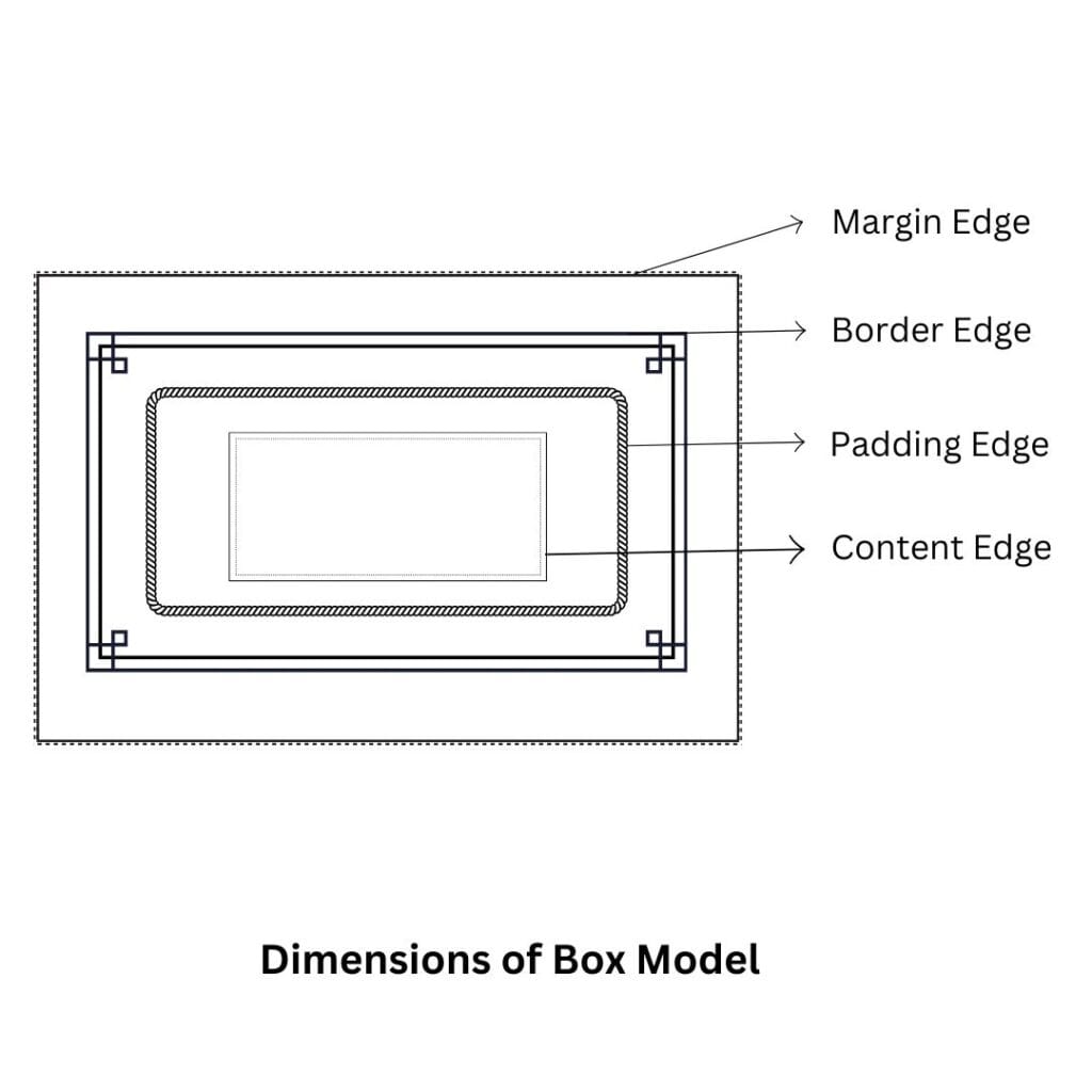
Figure 2 – Dimensions of Box Model
The total width and height of a box are calculated as:
Total Width=Content Width+Padding (Left + Right)+Border (Left + Right)+Margin (Left + Right)
Total Height=Content Height+Padding (Top + Bottom)+Border (Top + Bottom)+Margin (Top + Bottom)
The box-sizing attribute allows you to modify the way that dimensions are determined. To make layout tweaks easier, box-sizing: border-box incorporates padding and a border in the width and height. It is essential to comprehend these ideas in order to produce accurate and responsive designs.
2. Exploring Padding Properties
The CSS padding property adds an inner cushion to improve spacing and design by regulating the distance between an element’s content and border. An element’s visual size can be altered by padding without changing how it appears to relate to other components.
Key Padding Properties:
- Shorthand Property (padding):
- Allows you to set padding for all four sides at once.
- Example:
padding: 10px; /* Applies 10px to all sides */
padding: 10px 20px; /* 10px top & bottom, 20px left & right */
padding: 10px 20px 15px 5px; /* Top, right, bottom, left */- Individual Side Properties:
- Define padding for specific sides:
- padding-top: Space above the content.
- padding-right: Space to the right of the content.
- padding-bottom: Space below the content.
- padding-left: Space to the left of the content.
- Define padding for specific sides:
padding-top: 15px;
padding-right: 10px;
Behavior and Usage:
- If box-sizing is set to content-box (default), padding makes the box larger.
- Padding is included within the element’s specified width and height when box-sizing: border-box is used, which simplifies layout computations.
- Any CSS size unit, including px, em, %, or rem, can be used for padding.
Practical Applications:
- Spacing Elements: To improve readability or aesthetics, leave space between the content and the borders.
- Responsive Design: Adapt dynamically to the container size by using padding depending on a percentage.
- Visual Balance: To match the design, make sure the spacing is consistent or asymmetrical.
Making layouts that are both aesthetically pleasing and well-structured requires an understanding of and proficiency with padding properties.
3. Exploring Border Properties
The CSS border property, which can be altered in width, style, and color, defines the outline that surrounds an element and sits between the padding and margin. While distinct properties like border-top, border-right, border-bottom, and border-left allow you to design each side separately, the shorthand border property lets you configure all three aspects in one declaration, such as border: 2px solid blue. Detailed control is provided by sub-properties like border-width, border-style, and border-color. For instance, border-style can produce a variety of patterns, including solid, dashed, and dotted.
Furthermore, borders with image-based patterns can be created using border-image and border-radius, which permit rounded corners. An indispensable tool for designing clearly defined and eye-catching layouts, borders improve visual structure, provide focus, and divide pieces.
| Property | Description |
| border-bottom-left-radius | Indicates the shape of the border of the bottom-left corner. |
| border-bottom-right-radius | Indicates the shape of the border of the bottom-right corner. |
| border-image | Indicates a shorthand property for setting all the border-image properties |
| border-image-outset | Indicates the amount by which the border image area extends beyond the border box. |
| border-image-repeat | Indicates whether the image-border should be repeated, rounded, or strectched. |
| border-image-slice | Indicates the inward offsets of the image-border |
| border-image-source | Indicates whether the image-border should be repeated, rounded, or stretched. |
| border-image-width | Indicates the widths of the image-border. |
| border-radius | Indicates a shorthand property for setting all the border radius related properties |
| border-top-left-radius | Indicates the shape of the border of the top-left corner. |
| border-top-right-radius | Indicates the shape of the border of the top-right corner. |
| box-shadow | Attaches one or more drop-shadows to the box. |
Table 1 – Properties of Border
A. The border-width property
In CSS, the border-width property is a crucial sub-parameter for adjusting how borders look. It specifies the thickness of an element’s border. It can be used individually for more exact control or as a component of the abbreviated border property.
Key Features:
- Values:
- The following keywords have pre-defined border widths: thin, medium (default), and thick.
- Specific Measurements: You can set custom values using units such as px, em, rem, %, and others. Example:
border-width: 5px;- Individual Sides:
- The border-width property can be tailored for specific sides of an element or applied to all sides simultaneously:
- border-top-width
- border-right-width
- border-bottom-width
- border-left-width
- The border-width property can be tailored for specific sides of an element or applied to all sides simultaneously:
border-width: 2px 4px; /* Top & bottom: 2px, left & right: 4px */- Shorthand Use:
- You can specify one to four values in border-width:
- One value: Applies the same width to all sides.
- Two values: the first for top and bottom, the second for left and right.
- Three values: the first for top, the second for left and right, and the third for the bottom.
- Four values: top, right, bottom, and left, respectively.
- You can specify one to four values in border-width:
Practical Applications:
The border-width attribute, which modifies the prominence of borders, is essential for attaining visual balance in designs. It can be used to highlight particular components, make neat divisions, or establish limits in a scheme. Web designs look better when combined with other border attributes like border-style and border-color.
B. The border-color property
The CSS border-color property is used to improve the visual appearance of borders by specifying the color of an element’s border. It can be modified for each side of a border separately or defined for all sides.
Key Features:
- Values:
- Color Names: Use predefined color names like red, blue, or green.
- Hexadecimal Codes: Specify colors with hex codes, e.g., #ff5733.
- RGB/RGBA: Define colors using rgb(255, 87, 51) or include transparency with rgba(255, 87, 51, 0.5).
- HSL/HSLA: Use hue, saturation, and lightness, for example, hsl(12, 100%, 50%), or use hsla(12, 100%, 50%, 0.5) to include transparency.
- Transparent: Makes the border invisible without removing it.
- Individual Sides:
- Customize border colors for specific sides using:
- border-top-color
- border-right-color
- border-bottom-color
- border-left-color
- Example
- Customize border colors for specific sides using:
border-top-color: red;
border-right-color: blue;- Shorthand Use:
- border-color can set all sides at once:
- One value: Applies the same color to all sides.
- Two values: First for top/bottom, second for left/right.
- Three values: First for top, second for left/right, third for bottom.
- Four values: Applies colors in the order of top, right, bottom, and left.
- border-color can set all sides at once:
Practical Applications:
Through contrast or border matching with the design theme, the border-color attribute enhances aesthetic value. It can be used to generate visually unique elements in conjunction with border-width and border-style. To improve a webpage’s layout and user experience, for example, use bolder colors for emphasis or softer colors for subtle effects.
C. The border-style property
In CSS, an element’s border pattern or design is specified via the border-style attribute. It chooses the border’s visual appearance, enabling a range of styles to accommodate various design requirements.
Key Features:
- Supported Styles:
- none: No border is displayed.
- solid: A single, continuous line (default for most use cases).
- dashed: A series of short dashes.
- dotted: A series of dots.
- double: Two parallel lines with a space between them.
- groove: A 3D border appearing as if carved into the page.
- ridge: A 3D border appearing as if it stands out from the page.
- inset: A border that appears embedded in the page.
- outset: A border that appears to protrude from the page.
- hidden: No border is visible, but it still occupies space.
- Individual Sides:
- Customize the style for each border side using:
- border-top-style
- border-right-style
- border-bottom-style
- border-left-style
- Customize the style for each border side using:
border-top-style: solid;
border-bottom-style: dashed;- Shorthand Use:
- Set styles for all four sides with the border-style shorthand:
- One value: Applies the same style to all sides.
- Two values: First for top/bottom, second for left/right.
- Three values: First for top, second for left/right, third for bottom.
- Four values: Applies styles in the order of top, right, bottom, and left.
- Set styles for all four sides with the border-style shorthand:
border-style: solid dashed dotted double;Practical Applications:
The border-style parameter is crucial for specifying how borders should look. It is frequently coupled with border-color and border-width to produce designs that are both aesthetically pleasing and useful. In forms and ornamental features, for instance, dashed and dotted styles are commonly employed, although 3D styles like ridge and groove can give layouts depth. By choosing suitable designs, designers can produce borders that complement a webpage’s overall functioning and concept.
D. The border-shorthand property
The border shorthand property in CSS is a convenient way to set all aspects of an element’s border—width, style, and color—in a single declaration. It simplifies the code, ensuring consistency and reducing redundancy in border styling.
Syntax
border: [border-width] [border-style] [border-color];Components:
- border-width (optional): Indicates how thick the border is. Thin, medium, thick, or a particular dimension (e.g., 2px, 0.5em) are acceptable values.
- border-style (required): Specifies the border’s design. Solid, dashed, dotted, double, and other styles are common.
- border-color (optional): Determines the border’s color using RGB, HSL, named colors, hex codes, or transparent.
Examples:
- All Properties Set:
- Border width: 2px
- Border style: solid
- Border color: blue
border: 2px solid blue;- Default Style and Color:
- Sets a 5px border using the default solid style and currentColor for the color.
border: 5px;- No Border:
- Removes the border entirely.
border: none;Behavior:
If a component has been omitted, the browser’s default value is used:
- border-width: medium
- border-style: necessary; if set to none, no border will be displayed.
- border-color: Uses the text color of the element (currentColor) by default.
Practical Applications:
The shorthand property is frequently used to write concise and clean code, particularly when an element’s borders are applied consistently on all sides. Individual shorthand attributes such as border-top or border-bottom are used for customizations on particular sides (for example, top or bottom only). Managing styles is made easier and a consistent design is guaranteed when the shorthand is used with additional border settings.
E. The border-radius property
To give the border of an element a softer, more contemporary look, the border-radius property in CSS is used to create rounded corners. It is flexible and may be applied evenly or to particular areas of an object.
Syntax:
border-radius: [value];Key Features:
- Uniform Rounding:
- A single value applies the same rounding to all four corners.
- Example
border-radius: 10px; /* All corners are rounded by 10px */- Individual Corner Control:
- You can specify values for each corner in the following order: top-left, top-right, bottom-right, bottom-left.
- Example
border-radius: 10px 20px 15px 5px; /* Top-left: 10px, top-right: 20px, bottom-right: 15px, bottom-left: 5px */- Elliptical Rounding:
- Elliptical shapes can be created by defining distinct horizontal and vertical radii for each corner using a slash (/).
- Example
border-radius: 50px / 20px; /* Horizontal: 50px, Vertical: 20px */- Percentage Values:
- For square items, setting the border-radius to 50% produces a complete circle; for rectangle elements, it produces rounded ovals.
- Example:
border-radius: 50%;Shorthand Variations:
- Individual corner properties:
- border-top-left-radius
- border-top-right-radius
- border-bottom-right-radius
- border-bottom-left-radius
- Example:
border-top-left-radius: 15px;
border-bottom-right-radius: 25px;
Practical Applications:
Creating rounded buttons, round profile images, pill-shaped input fields, and soft card designs are all common uses for the border-radius parameter. It adds a sleek and eye-catching touch to the user interface, improving it. It can be combined with other characteristics, such as background and box-shadow, to create complex designs with ease.
F. The border-image property
Using an image as the border of an element rather than a solid color or preset style is possible with CSS’s border-image feature. It offers a flexible approach to border design, allowing for imaginative and eye-catching patterns.
Syntax:
border-image: source slice width outset repeat;Key Components:
- source:
- The image used for the border.
- Specified using the url() function.
- Example
border-image-source: url('border.png');- slice:
- Defines how the source image is divided into nine regions (four corners, four edges, and the center).
- Values can be specified in pixels, percentages, or as fill to include the center.
- Example
border-image-slice: 30;- width:
- Sets the width of the border area in which the image will be applied.
- Example
border-image-width: 10px;- outset:
- Specifies the amount of space the border extends beyond the element’s box.
- Example
border-image-outset: 5px;- repeat:
- Determines how the border image is applied along the edges.
- Values: stretch (default, stretches the image), repeat (tiles the image), round (tiles and scales to fit), or space (adds space between tiles).
- Example
border-image-repeat: round;Shorthand Example:
The border-image shorthand combines all components:
border-image: url('border.png') 30 10 0 repeat;- Source: url(‘border.png’)
- Slice: 30
- Width: 10
- Outset: 0
- Repeat: repeat
Practical Applications:
For creative designs like textured borders, decorative frames, or distinctive styling that complements a theme, the border-image property is perfect. It can be used in conjunction with border-radius to create artistic effects and offers a more dynamic substitute for static border styles. A variety of creative and adaptable designs can be produced by varying the slicing and repetition parameters.
G. The border-shadow property
In CSS, shadow effects are applied around the frame of an element using the box-shadow property. By mimicking a shadow behind the piece, it adds depth and visual appeal. It may be altered to provide various effects.
Syntax:
box-shadow: [h-offset] [v-offset] [blur-radius] [spread-radius] [color] [inset];Key Components:
- h-offset (horizontal offset):
- specifies the shadow’s horizontal position.
- The shadow is moved to the right by a positive value and to the left by a negative number.
- Example
box-shadow: 10px 0px;- v-offset (vertical offset):
- specifies the shadow’s vertical position.
- The shadow is moved upward by a negative number and downward by a positive one.
- Example
box-shadow: 0px 10px;- blur-radius:
- determines the shadow’s sharpness. The blurriness of the shadow increases with a higher value.
- Example
box-shadow: 0px 0px 10px;- spread-radius:
- regulates the shadow’s size. The shadow expands with a positive value and contracts with a negative value.
- Example
box-shadow: 0px 0px 10px 5px;- color:
- indicates the shadow’s color. RGB, RGBA, hex codes, color names, and more can be used.
- Example
box-shadow: 0px 0px 10px rgba(0, 0, 0, 0.5);- inset (optional):
- produces an inside shadow rather than a shadow surrounding the element’s outside.
- Example
box-shadow: inset 0px 0px 10px rgba(0, 0, 0, 0.5);Shorthand Example:
box-shadow: 10px 10px 15px 5px rgba(0, 0, 0, 0.3);- Horizontal offset: 10px
- Vertical offset: 10px
- Blur radius: 15px
- Spread radius: 5px
- Color: rgba(0, 0, 0, 0.3)
Practical Applications:
In UI designs, the box-shadow feature is frequently utilized to add depth and dimension. It is frequently used for buttons, cards, modals, and other components that must be noticeable or seem high-end. The blur, spread, and color can all be changed to provide designers the ability to produce subtle or striking effects. The inset option is also helpful for adding shadows to more complex designs inside objects, like as input fields or containers.
4. Exploring Margin Properties
The CSS margin property sets the distance between an element and other components on the page by controlling the area surrounding it. Although margins are transparent—that is, they have no effect on the element’s background or content—they are essential to layout design because they efficiently space out elements.
Key Features:
Shorthand Margin Property: This property lets you set the margins for an element’s four sides simultaneously. One, two, three, or four values can be entered into it:
- One value: Gives each side the same margin.
margin: 20px; /* 20px on all four sides */- Two values: First for the top and bottom, second for left and right.
margin: 20px 10px; /* 20px top/bottom, 10px left/right */- Three values: First for top, second for left/right, third for bottom.
margin: 20px 10px 15px; /* Top: 20px, left/right: 10px, bottom: 15px */- Four values: Top, right, bottom, and left, respectively.
margin: 20px 10px 15px 5px; /* Top: 20px, right: 10px, bottom: 15px, left: 5px */Individual Margin Properties: You can use the following to set margins for each side separately:
- margin-top: Sets the margin for the top.
- margin-right: Sets the margin for the right.
- margin-bottom: Sets the margin for the bottom.
- margin-left: Sets the margin for the left.
- Example:
margin-top: 20px;
margin-right: 15px;
margin-bottom: 10px;
margin-left: 5px;
Auto Margin:
- Block-level elements are frequently centered horizontally within their container using the margin:auto value. For centering items like divs or photos, this is quite helpful.
- Example:
margin: auto; /* Horizontally centers the element */Margin Collapsing:
- The greater of the two margins is used and the smaller one is deflated when the top and bottom vertical borders of adjacent items meet. This is called margin collapse, and it usually happens with items that are at the block level.
Percentage-Based Margin:
- Percentage values can be used to set margins. This relates to the contained element’s width.
- Example:
margin: 5%;Practical Applications:
In order to provide alignment and spacing in web layouts, the margin property is essential. In order to prevent elements from touching one another, it helps separate content. The following are common uses for margins:
- Layout spacing: Manage the distance between sections, content blocks, and containers with layout spacing.
- Centering elements: If you want to center items like divs, pictures, or form elements horizontally, use margin: auto.
- Responsive design: For items that need to scale and adapt to various screen sizes, use margins based on percentages.
In conclusion, making site designs that are neat, well-structured, and responsive requires a comprehension of and effective use of the margin components.
5. Exploring width and height Properties
Its horizontal and vertical dimensions inside the layout are determined by the width and height parameters in CSS. They are essential in managing the responsiveness and general organization of web designs.
Key Features:
Specifying Values:
- Absolute Units: Use fixed units like px, cm, or mm to set a specific size.
width: 200px;
height: 300px;- Relative Units: To make dimensions relative to the size of the parent element, use percentages (%).
width: 50%; /* 50% of the parent element's width */
height: 100%; /* Full height of the parent element */- Flexible Units: Use em, rem, vw, or vh for dynamic and scalable layouts:
- em/rem: Relative to font size.
- vw/vh: A percentage of the viewport’s width or height.
width: 80vw; /* 80% of the viewport's width */
height: 50vh; /* 50% of the viewport's height */
Automatic Sizing:
- By default, block-level elements’ width and height are dictated by the dimensions of the container and their content.
- The default behavior is overridden when these properties are set.
auto Value:
- By setting both parameters to their default values, auto enables the browser to determine the size based on the content or additional variables like margin and padding.
- Example:
width: auto; /* Automatically adjust to fit content or container */Minimum and Maximum Dimensions:
- Use min-width, max-width, min-height, and max-height to enforce constraints on an element’s size.
- Example:
min-width: 100px; /* Prevents the width from shrinking below 100px */
max-height: 400px; /* Prevents the height from exceeding 400px */
Content-Box vs. Border-Box:
- By default, only the content area (content-box model) is affected by the width and height settings. The overall size is increased by adding borders or padding.
- To add padding and a border with the desired size, use box-sizing: border-box;.
box-sizing: border-box;
width: 200px; /* Total width includes padding and border */
Practical Applications:
- Fixed Layouts: To keep some elements, such as logos or icons, at constant sizes, use absolute units.
- Responsive Design: Use viewport-relative or percentage units in responsive design to create flexible layouts.
- Dynamic Scaling: To manage scaling gracefully, combine relative units with min and max limits.
- Consistency: Make sure that the dimensions of various elements are predictable and consistent by using box-sizing.
Understanding the width and height parameters can help you create layouts that are both aesthetically pleasing and responsive to user input.
6. Floating Boxes
In CSS, the term “Floating Boxes” describes the method of positioning components horizontally inside a container by utilizing the float property. With the help of this strong layout tool, you can create dynamic designs by allowing text and other elements to wrap around a floating element. Though newer layout methods like Flexbox and Grid are now more common, understanding floating boxes remains essential for working with legacy code and specific design scenarios.
Key Features of the float Property:
Values:
- left: Other content wraps to the right of the element, which is floating to the left of its container.
float: left;- right: Other content wraps to the left of the element, which is floating to the right of its container.
float: right;- none: Default value; the element does not float.
float: none;- inherit: Inherits the float value from its parent element.
float: inherit;Clearing Floats:
- To clear property from wrapping around floating elements, use the clear attribute. It guarantees appropriate alignment and arrangement:
- clear: left; stops wrapping around components that are floating on the left.
- clear: right; stops wrapping around elements that are floating on the right.
- clear: both; prevents wrapping the left and right floats.
clear: both;Overflow for Parent Containers:
- Since the parent container cannot “see” the floated children, it may collapse when all of the kid parts are floating. To correct this:
- Apply overflow: hidden; or overflow: auto; to the parent container.
.parent {
  overflow: hidden;
}- Alternatively, use the “clearfix” hack:
.clearfix::after {
  content: "";
  display: table;
  clear: both;
}
Practical Applications:
Image and Text Wrapping:
- Allow text to flow around an image that is floating to the left or right.
<img src="image.jpg" style="float: left; margin-right: 10px;">
<p>This text wraps around the floated image.</p>
Sidebars:
- The primary content should flow alongside a sidebar that is floating to the left or right.
.sidebar {
  float: right;
  width: 30%;
}
.main-content {
  float: left;
  width: 70%;
}
Inline Layouts:
- By floating components to the left or right, you can create rows of boxes or horizontal navigation bars.
.nav-item {
  float: left;
  margin-right: 15px;
}
Limitations of Floats:
Although floats are helpful, they are not the best option for intricate layouts because of issues like:
- Resolving problems.
- Vertical alignment of pieces is difficult.
- issues with the collapse of the parent container.
Flexbox and CSS Grid provide greater control and flexibility for contemporary layouts. For certain situations, such as text wrapping or while working on older projects, floats are still a useful tool.
7. Overflowing of Box Content
When the content inside an element is larger than what its width and height parameters allow, this is known as overflowing of box content. A webpage’s design and layout may be affected by this circumstance. To control this behaviour and regulate the display of the additional content, CSS offers the overflow property.
| Property | Description |
| overflow-x | Indicates clipping at the left and right edges |
| overflow-y | Indicates clipping at the top and bottom edges |
| overflow-style | Indicates a scrolling method for elements that overflow |
Table 2 – Overflow Properties of CSS
Practical Applications:
Scroll Container:
.scroll-box {
  width: 300px;
  height: 200px;
  overflow: auto;
}- enables content that doesn’t fit within the given width and height to be scrolled.
Prevent Overflow:
.fixed-box {
  width: 100px;
  height: 100px;
  overflow: hidden;
}- ensures that no content overflows the specified boundaries.
Dynamic Content:
.responsive-box {
  max-width: 100%;
  overflow-x: auto;
}- Handles wide content like tables or code blocks in responsive designs.
Common Issues and Solutions:
- Overflowing the Box with Content:
- Make sure to specify box-sizing: border-box; to incorporate padding and borders within dimensions, and make appropriate use of overflow.
- Layout Affected by Scrollbars:
- To ensure visual consistency and conditionally manage scrollbars, use overflow: auto or overflow-x: hidden.
Maintaining layouts that are both aesthetically beautiful and easy to use requires careful handling of overflowing content. You may make adaptable and user-friendly web designs by fusing responsive design principles with overflow characteristics.
8. Exploring Marquee Properties
A scrolling animation called the marquee effect frequently moves text or other items around the screen. Despite its historical use, the <marquee> HTML element is no longer recommended for use in contemporary web design. Instead, more adaptable and user-friendly ways to accomplish comparable scrolling effects are offered by CSS.
Modern CSS Approach for Marquee Effects
Basic Marquee Animation Using @keyframes:
- Use CSS animations to create a marquee effect.
- Example: (css)
.marquee {
  overflow: hidden;
  white-space: nowrap;
  box-sizing: border-box;
}

.marquee-content {
  display: inline-block;
  padding-left: 100%;
  animation: scroll-left 10s linear infinite;
}

@keyframes scroll-left {
  from {
    transform: translateX(100%);
  }
  to {
    transform: translateX(-100%);
  }
}- HTML Structure:
<div class="marquee">
  <div class="marquee-content">This is a scrolling marquee effect created with CSS!</div>
</div>
Key Properties for Marquee Styling:
- overflow: hidden;: Makes sure that the material that is not inside the container is clipped.
- white-space: nowrap;: Prevents text from wrapping to the next line.
- transform: Transfers the information throughout the screen.
- animation: Defines the speed, direction, and repetition of the animation.
Customizing the Marquee Effect
- Change Scroll Direction:
- Modify the @keyframes to control direction:
- Left to right
- Modify the @keyframes to control direction:
@keyframes scroll-right {
  from {
    transform: translateX(-100%);
  }
  to {
    transform: translateX(100%);
  }
}- Adjust Scroll Speed:
- Change the duration in the animation property
animation: scroll-left 5s linear infinite; /* Faster */
animation: scroll-left 15s linear infinite; /* Slower */- Pause on Hover:
- Use :hover to pause the animation:
.marquee-content:hover {
  animation-play-state: paused;
}- Bidirectional Scrolling:
- Alternate scrolling directions using animation-direction
animation-direction: alternate;Practical Applications:
- Announcements or News Tickers: To show significant headlines or updates, use marquee effects.
- Interactive User Interface Elements: Use scrolling effects in ads, banners, and product displays.
- Creative Animations: To improve a web design’s visual appeal, incorporate dynamic movement.
Considerations for Accessibility and Performance:
- Avoid Overuse: Scrolling text continuously might cause user distraction and impair readability.
- Provide alternatives: For ease of access, provide a static version of the content.
- Optimize Performance: Utilize transform and other GPU-accelerated features to cut down on lag.
Using contemporary CSS techniques instead of the antiquated <marquee> tag allows you to build scrolling effects that are adaptable, versatile, and aesthetically pleasing while adhering to current web standards.
9. Rotating Boxes in CSS
In CSS, the term “rotating boxes” describes the usage of the rotate() function in conjunction with the transform property to produce rotation effects. This method works well for giving site design elements like buttons, cards, and images more visual appeal, animation, and interactivity.
Basic Rotation Using rotate()
You can rotate an element around its origin point using the rotate() function in the transform attribute.
Syntax:
transform: rotate(angle);- angle: Specifies the degree of rotation.
- Positive values (e.g., rotate(45deg)) rotate clockwise.
- Negative values (e.g., rotate(-45deg)) rotate counterclockwise.
Example:
.box {
  width: 100px;
  height: 100px;
  background-color: lightblue;
  transform: rotate(45deg); /* Rotates the box 45 degrees clockwise */
}
Rotating Around Different Origins
The element’s origin point, which is by default the center, is where the rotation takes place. The transform-origin attribute allows you to modify the origin.
Syntax:
transform-origin: x-axis y-axis;- Values can be keywords (top, left, center, etc.) or percentages.
- Example
.box {
  transform: rotate(45deg);
  transform-origin: top left; /* Rotates around the top-left corner */
}
Adding Animation to Rotation
- Use the @keyframes rule and the animation property to create rotating animations.
- Example
.rotating-box {
  width: 100px;
  height: 100px;
  background-color: coral;
  animation: spin 2s linear infinite;
}

@keyframes spin {
  from {
    transform: rotate(0deg);
  }
  to {
    transform: rotate(360deg);
  }
}
Rotating in 3D Space
- Combine rotateX(), rotateY(), or rotateZ() to create 3D rotation effects.
- Example
.box-3d {
  width: 100px;
  height: 100px;
  background-color: lightgreen;
  transform: rotateX(45deg) rotateY(30deg);
}
Interactive Rotation with Hover
- Use the :hover pseudo-class to rotate elements when the user hovers over them.
- Example:
.box:hover {
  transform: rotate(180deg);
  transition: transform 0.5s ease;
}
Practical Applications
Rotating Cards: Create flipping effects for cards using rotations:
.card {
  transform: rotateY(180deg);
}
Loading Spinners: Use continuous rotation for loader icons.
animation: spin 1s linear infinite;Creative Layouts: Add slight rotations for decorative elements or creative designs.
Tips for Rotating Boxes
- Use this transition to see how user interaction is affected by smooth rotation.
- For more dynamic effects, combine rotations with other transformations such as scale() or translate().
- To make sure your designs are responsive and usable, test them across a range of devices.
Rotating boxes using CSS is a flexible and effective method of adding dynamic and captivating features to websites without sacrificing user experience or performance.
Exploring the LINE Box Model
The CSS Line Box Model specifies the alignment and arrangement of inline-level items inside a line of text. In a block container, every line of text creates a line box that includes all of the line’s text fragments and inline elements. Including padding, borders, and margins, the tallest text or element in the line determines the line box’s height. The vertical-align property is used to align inline components within the line box; it accepts baseline, top, middle, and bottom values.
Inline elements’ margins and padding only affect the box horizontally; they don’t affect the box vertically unless the element is a replacement element, like an image. To properly manage text alignment, spacing, and inline element layouts, one must comprehend the line box concept.
| Property | Description |
| alignment-adjust | Let you specify where elements should align |
| alignment-baseline | Indicates the alignment of an inline-level element with respect to its parent |
| baseline-shift | Let you reposition the dominant-baseline for other dominant-baseline |
| dominant-baseline | Indicates a scaled-baseline-table |
| drop-initial-after-adjust | Indicates an alignment point for the initial letter box for the primary connection point |
| drop-initial-after-align | Indicates an alignment line within the initial line box that is used at the primary connection point with the initial letter box |
| drop-initial-before-adjust | Indicates an alignment point of the drop initial for the secondary connection point |
| drop-initial-before-align | Indicates an alignment line within the initial line box that is used at the secondary connection point with the initial letter box |
| drop-initial-size | Indicates a value to show the size of the initial letter |
| drop-initial-value | Indicates a value to activate a drop-initial effect |
| inline-box-align | Indicates the alignment of a line of a multi-line inline block with the previous and next inline elements within a line |
| line-stacking | Indicates a shorthand property for setting the line-stacking-strategy, line-stacking-ruby, and line-stacking-shift properties |
| line-stacking-ruby | Indicates the line stacking method for elements, which are ruby annotation elements |
| line-stacking-shift | Indicates the line stacking method for elements, which are baseline-shifted elements |
| line-stacking-strategy | Indicates that the line boxes can be stacked together in a block element |
| text-height | Indicates the height of the text content area in an inline box |
Table 3 – Properties of the line box model
Exploring the TEMPLATE LAYOUT Model
Using templates to visually define a webpage’s structure, the Template Layout Model in CSS is a technique for creating complex layouts. It provides a methodical and legible approach to layout design by streamlining the process of organizing text into rows and columns. This idea is modernized by the CSS Grid Layout Module, which offers strong capabilities for designing with templates.
Key Features of the Template Layout Model:
Grid Definition:
- A container can be divided into rows and columns by using the display:grid; property to define the grid.
- Example:
.container {
  display: grid;
  grid-template-rows: 100px 200px;
  grid-template-columns: 1fr 2fr;
}
Template Areas:
- Named template areas allow designers to map out the layout visually.
- Example:
.container {
  display: grid;
  grid-template-areas:
    "header header"
    "sidebar content"
    "footer footer";
}

.header {
  grid-area: header;
}
.sidebar {
  grid-area: sidebar;
}
.content {
  grid-area: content;
}
.footer {
  grid-area: footer;
}
Flexible Sizing:
- For flexible layouts, grid objects can use fixed sizes, percentages, or fractional units (fr).
- Example:
grid-template-columns: 1fr 2fr; /* Two columns, second is twice as wide */Implicit and Explicit Grids:
- The designer directly defines explicit grids.
- When content overflows, the browser automatically creates implicit grids.
Alignment and Spacing:
- Use properties like justify-items, align-items, and gap to manage alignment.
- Example:
.container {
  justify-items: center; /* Horizontal alignment */
  align-items: stretch; /* Vertical alignment */
  gap: 20px; /* Space between rows and columns */
}
Benefits of the Template Layout Model:
- Readability: The layout’s named template sections make it simple to comprehend and update.
- Its ability to adjust to various screen sizes makes it perfect for responsive design.
- Exact control over the alignment and placement of elements is provided by precision.
Practical Applications:
- Webpage layouts: Create complex pages with content sections, sidebars, and headers.
- Dashboards: Design organized layouts for navigation and data viewing.
- Adapt grid layouts dynamically to different screen sizes with responsive design.
Example Layout:
.container {
  display: grid;
  grid-template-areas:
    "header header"
    "sidebar main"
    "footer footer";
  grid-template-rows: 70px 1fr 50px;
  grid-template-columns: 200px 1fr;
}

.header {
  grid-area: header;
}

.sidebar {
  grid-area: sidebar;
}

.main {
  grid-area: main;
}

.footer {
  grid-area: footer;
}
The strength of the Template Layout Model in CSS is demonstrated by this CSS, which generates an organized layout with a header, sidebar, main content area, and footer.
The display Property
The way an element is rendered in the document flow, affecting its layout and interactions with other components, is determined by the display property in CSS. It is among the fundamental elements of web layout design.
Common Values of display:
block:
- turns it into a block-level element.
- occupies its parent’s entire width and begins on a new line.
- Examples: <div>, <p>
- Example CSS:
div {
  display: block;
}
inline:
- turns the element into an inline one.
- only takes up as much width as its text and doesn’t begin on a new line.
- Examples: <span>, <a>
- Example CSS:
span {
  display: inline;
}
inline-block:
- functions similarly to an inline element but lets you adjust its height and width.
- Example:
button {
  display: inline-block;
  width: 100px;
  height: 40px;
}
none:
- hides the element entirely, eliminating it from the flow of the document.
- Example:
.hidden {
  display: none;
}
flex:
- Enables a Flexbox layout for its container.
- Example:
.container {
  display: flex;
}
grid:
- Enables a Grid layout for its container.
- Example:
.container {
  display: grid;
}
inline-flex / inline-grid:
- It behaves like flex or grid but remains inline.
The position Property
The CSS position property specifies an element’s placement inside the document as well as how it communicates with the components around it. It determines whether the element is positioned in relation to the viewport, a particular parent, or its normal flow.
Values of position:
static (default):
- The element is arranged in accordance with the standard document flow.
- cannot be shifted to the left, right, bottom, or top.
- Example:
div {
  position: static;
}
relative:
- The element is positioned in relation to where it normally is.
- The top, right, bottom, or left might be used to offset it.
- Example:
div {
  position: relative;
  top: 10px;
  left: 20px;
}
absolute:
- The element’s location is in relation to its closest non-static ancestor.
- Example:
div {
  position: absolute;
  top: 0;
  right: 0;
}
fixed:
- When scrolling, the element’s position stays fixed in relation to the viewport.
- Example:
div {
  position: fixed;
  bottom: 10px;
  right: 10px;
}
sticky:
- Depending on the scroll position, the element alternates between fixed and relative.
- Example:
div {
  position: sticky;
  top: 0;
}
Practical Applications:
- For contemporary layouts, use display: flex or display: grid.
- To slightly offset elements without interfering with the document’s flow, use position: relative.
- For exact element placement inside a container, use position: absolute.
- For floating buttons or sticky navigation bars, use position: fixed.
- For headers that remain at the top when scrolling, use position: sticky.
You may make dynamic and adaptable layouts for any web design by combining the display and position parameters.
Exploring the Multi-Column Model in CSS
The CSS Multi-Column Model makes it simple to arrange content in numerous columns, much like in magazines or newspapers. It makes it easier to create responsive designs that improve readability and aesthetic appeal by allowing text and other information to flow naturally across columns.
Key Properties of the Multi-Column Model
column-count:
- indicates how many columns the content should be organized into.
- Example:
.content {
  column-count: 3;
}
column-width:
- determines each column’s optimal width. To suit the available space, the browser modifies the number of columns.
- Example:
.content {
  column-width: 200px;
}
columns (Shorthand):
- Combines column-width and column-count.
- Example
.content {
  columns: 200px 3;
}
column-gap:
- Specifies the space between columns.
- Example
.content {
  column-gap: 20px;
}
column-rule:
- Defines a line (rule) between columns, including its width, style, and color.
- Example
.content {
  column-rule: 2px solid #ccc;
}
column-span:
- Determines if an element spans across all columns.
- Values: none (default), all.
- Example
.heading {
  column-span: all;
}
break-inside:
- Controls how the content breaks between columns.
- Example
.content {
  break-inside: avoid;
}
Practical Examples:
Basic Multi-Column Layout:
.article {
  column-count: 3;
  column-gap: 20px;
}
Fixed Column Width:
.article {
  column-width: 250px;
  column-gap: 15px;
}
Adding Column Rules:
.article {
  column-count: 2;
  column-gap: 20px;
  column-rule: 1px dotted #333;
}
Spanning an Element Across Columns:
.title {
  column-span: all;
}
Benefits of the Multi-Column Model
- Enhancement of Readability: Divides information into more manageable chunks.
- Based on the size of the screen, responsive design modifies the number of columns.
- User-friendly: Creates intricate layouts with little CSS.
- For a polished appearance, the aesthetic appeal mimics conventional print arrangements.
Considerations
- Large text blocks shouldn’t use multi-column layouts excessively as this can detract from readability.
- To avoid uncomfortable breaks within paragraphs or images, use break-inside sparingly.
- For improved responsiveness, combine media queries with multi-column attributes.
Example Code:
.container {
  column-count: 3;
  column-gap: 20px;
  column-rule: 2px solid #ddd;
}

.header {
  column-span: all;
  font-weight: bold;
  font-size: 1.5em;
}
This code inserts a rule between columns, separates text into three columns with a 20px margin, and permits the header to extend over all columns. A useful tool for producing dynamic, eye-catching layouts is the Multi-Column Model. For more examples click here