Simple Methods of Using Interactive Elements in HTML: To begin, first refer – interactive-elements
Using the DETAILS and SUMMARY Elements
Content can be hidden or shown using a disclosure widget created using HTML and components. Your desired content is housed in the element, while the <summary> element acts as a visible header or label. This is a basic example of how to make an expanding section on a webpage using the <details> and <summary> elements:
<!DOCTYPE html>
<html lang="en">
<head>
<meta charset="UTF-8">
<meta name="viewport" content="width=device-width, initial-scale=1.0">
<title>Details and Summary Example</title>
<style>
  summary {
    font-weight: bold;
    cursor: pointer;
  }
</style>
</head>
<body>

<details>
  <summary>Click to expand</summary>
  <p>This is the hidden content that will be shown when you click the summary.</p>
</details>

</body>
</html>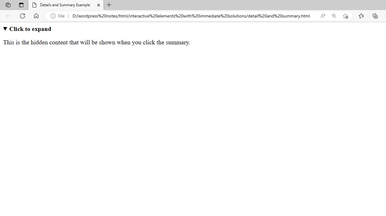
Figure 1 – Showing the use of the DETAILS and SUMMARY Elements
In this case, the summary that is initially displayed is the text that says “Click to expand”. It will disclose the secret paragraph when you click on it. The information is labeled or headed by the <summary> element, while the <details> element serves as a container for the content that can be shown or hidden.
Using the COMMAND Element
Before HTML5, the <command> element was used in former versions of HTML to define commands that users could access via a toolbar or menu. However, it should not be utilized in contemporary web development, as it is now obsolete. You may accomplish similar functionality by handling user interactions with JavaScript and event handlers instead of the <command> element. Both the <menu> and <command> elements are deprecated in HTML5 and are not supported by contemporary browsers. It was included in an earlier iteration of the HTML specification, but more recent methods of generating interactive elements—like buttons, links, and JavaScript frameworks and libraries—have taken its place.
You may accomplish equivalent functionality with <button> elements with event listeners or <a> elements with suitable styling and JavaScript capability instead of the <command> element. This is an illustration utilizing <button> elements:
<!DOCTYPE html>
<html>
<head>
    <title>Command Element Example</title>
</head>
<body>
    <button id="saveButton">Save</button>
    <button id="deleteButton">Delete</button>

    <script>
        document.getElementById("saveButton").addEventListener("click", function() {
            alert("Save function called!");
            // Add your save logic here
        });

        document.getElementById("deleteButton").addEventListener("click", function() {
            alert("Delete function called!");
            // Add your delete logic here
        });
    </script>
</body>
</html>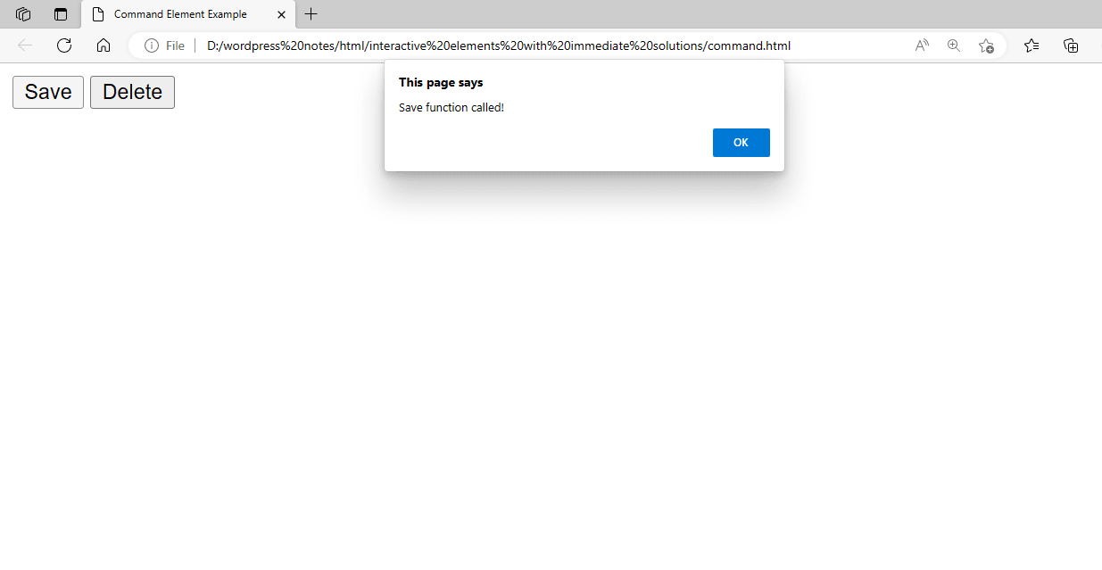
Figure 2 – Showing the use of the COMMAND Element
In this instance, pressing the “Save” or “Delete” buttons will cause the corresponding actions to be performed. More adaptability and compatibility with contemporary web standards are offered by this method.
Using the MENU Element
In earlier iterations of HTML, menus were created using the <menu> and <menuitem> elements. Nevertheless, HTML5 deprecated both elements, so it is advised to create menus using more contemporary techniques, including lists (<ul> and <li> elements) styled with CSS or more complex interactions utilizing JavaScript tools. This is an illustration of how you could have utilized the <menu> elements:
<!DOCTYPE html>
<html>
<head>
    <title>Dropdown Menu Example</title>
    <style>
        /* Hide the nested ul by default */
        ul ul {
            display: none;
        }
        /* Display the nested ul when its parent li is hovered over */
        ul li:hover > ul {
            display: block;
        }
        /* Basic styles for the menu */
        ul {
            list-style-type: none;
            padding: 0;
            margin: 0;
            background-color: #f1f1f1;
        }
        ul li {
            display: inline-block;
            position: relative;
        }
        ul li a {
            display: block;
            padding: 10px 20px;
            text-decoration: none;
            color: #333;
        }
        ul ul {
            position: absolute;
            top: 100%;
            left: 0;
            background-color: #fff;
            border: 1px solid #ccc;
        }
    </style>
</head>
<body>
    <ul>
        <li><a href="#">Home</a></li>
        <li>
            <a href="#">Products</a>
            <ul>
                <li><a href="#">Product 1</a></li>
                <li><a href="#">Product 2</a></li>
                <li><a href="#">Product 3</a></li>
            </ul>
        </li>
        <li><a href="#">About</a></li>
        <li><a href="#">Contact</a></li>
    </ul>
</body>
</html>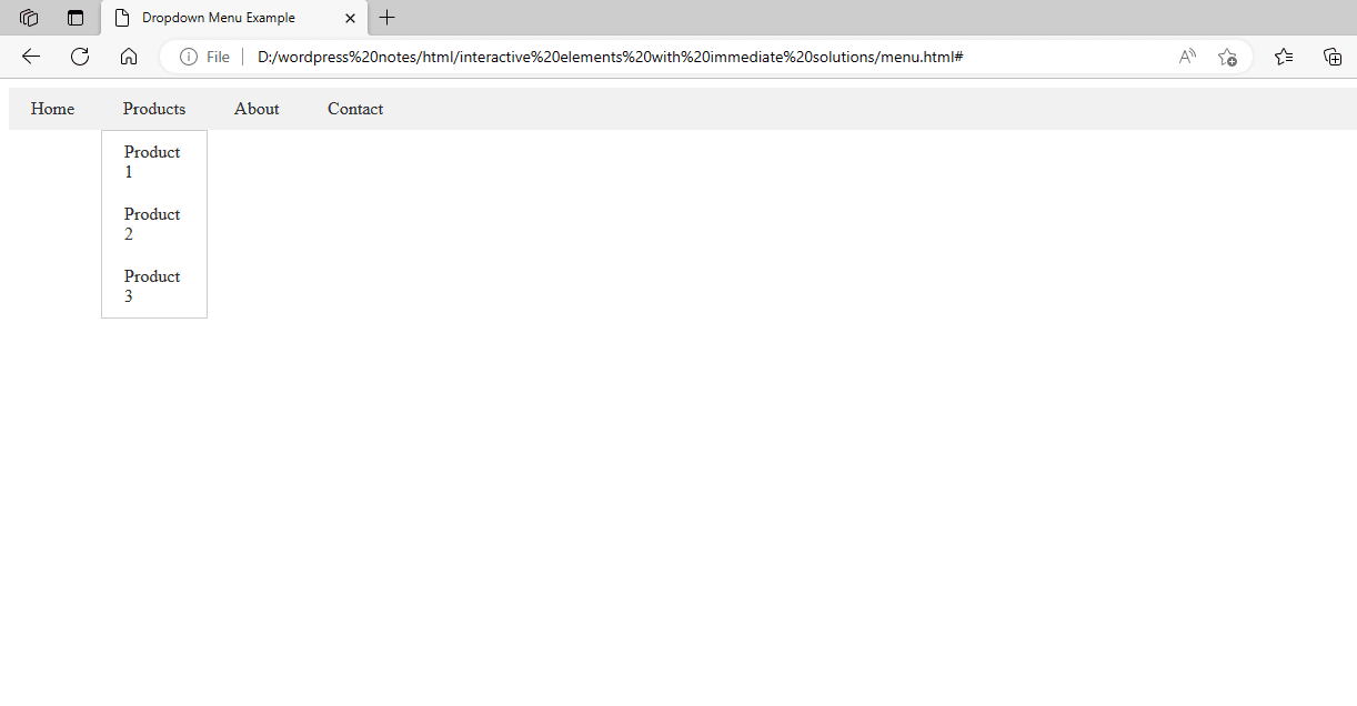
Figure 3 – Showing the use of the MENU Element
Using the KBD Element
HTML’s <kbd> element indicates keyboard input, such as keystrokes or keyboard shortcuts. Here’s an example of how you can use the <kbd> element to show a keyboard shortcut:
<!DOCTYPE html>
<html>
<head>
    <title>Keyboard Shortcut Example</title>
</head>
<body>
    <p>To save your work, press <kbd>Ctrl</kbd> + <kbd>S</kbd>.</p>
</body>
</html>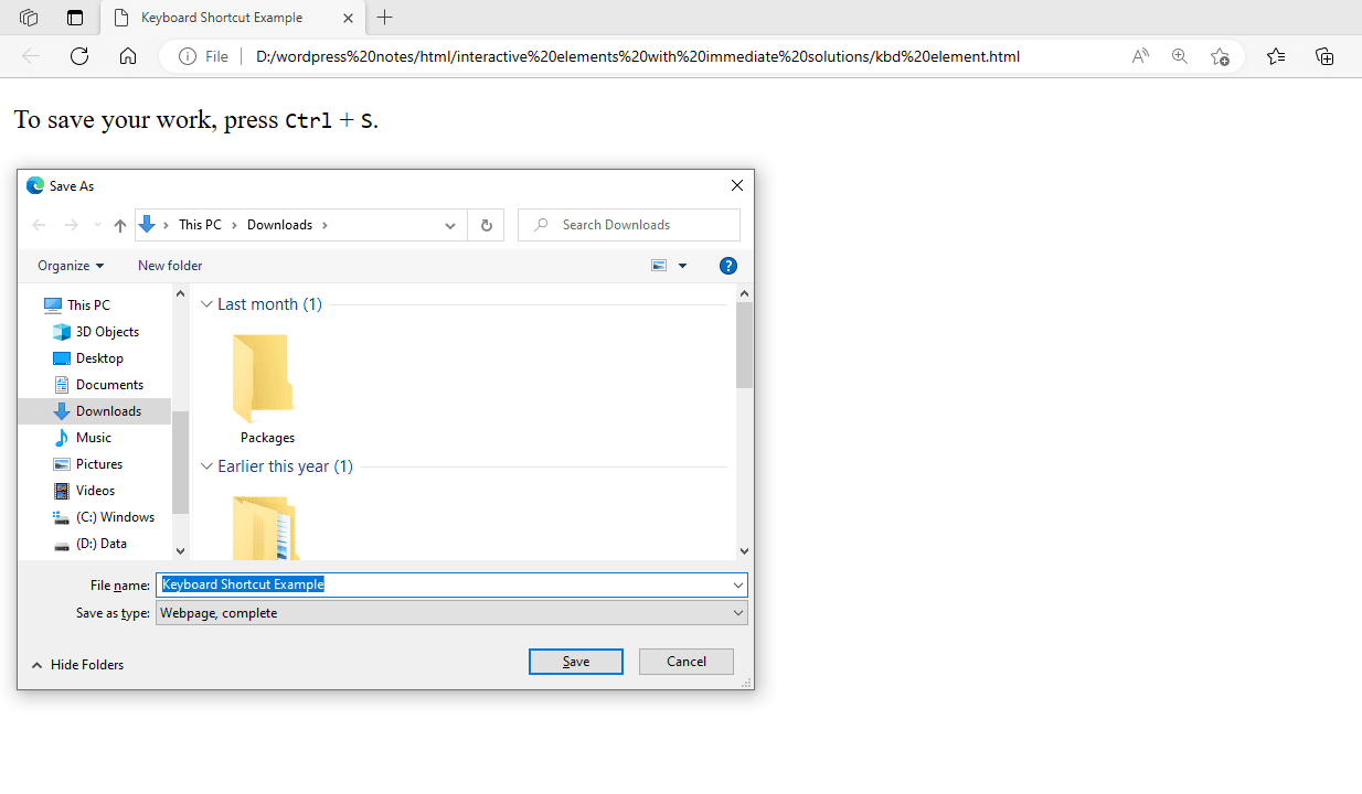
Figure 4 – Showing the use of the KBD Element
In this example, the text “Ctrl” and “S” inside the <kbd> elements indicate that the user should hit the Control and S keys simultaneously to save their work. The <kbd> element is generally designed to look like it’s displaying keyboard keys with a monospaced font.
Using the TIME Element
The <time> element in HTML represents dates and times in machine-readable format. It can also be used to represent the duration or timing of an event. Here’s an example of using the <time> element to display a date:
<!DOCTYPE html>
<html>
<head>
    <title>Time Element Example</title>
</head>
<body>
    <p>The concert starts at <time datetime="2024-05-15T19:30">7:30 PM</time> on May 15th, 2024.</p>
</body>
</html>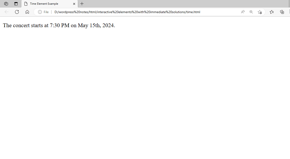
Figure 5 – Showing the use of the TIME Element
The <time> element is used in this example to display a concert’s start time. The datetime attribute represents the date and time in machine-readable format (ISO 8601), while the <time> element has a human-readable representation of the time. The <time> element can express durations or specific periods based on the context.