Here are some Simple Methods for Creating Forms in HTML: To begin, first refer to – working-with-forms
Creating a Form:
HTML forms use the <form> element and numerous input components to collect user data. Here’s an elementary example of how to make a simple form:
<!DOCTYPE html>
<html>
<head>
  <title>Simple Form Example</title>
</head>
<body>
  <h2>Simple Form</h2>
  <form action="/submit_form" method="post">
    <label for="name">Name:</label><br>
    <input type="text" id="name" name="name"><br>
    <label for="email">Email:</label><br>
    <input type="email" id="email" name="email"><br>
    <label for="message">Message:</label><br>
    <textarea id="message" name="message" rows="4" cols="50"></textarea><br>
    <input type="submit" value="Submit">
  </form>
</body>
</html>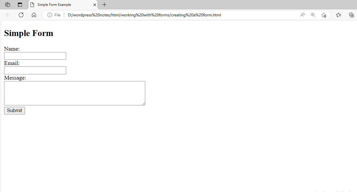
Figure 1 – Displaying the Output of a Form on a Web Page
This example shows a simple form with three input fields: name, email, and message. The action parameter defines the URL where the form data should be submitted, while the method attribute specifies the HTTP method (post in this case). When the user completes the form and hits the “Submit” button, the form data is transmitted to the server specified in the action property using the POST method. The server can then process the form information and respond appropriately.
This is a simple example, but forms can be far more complicated, with several input types, validation, and styling.
Working with the INPUT Element:
HTML’s <input> element creates interactive controls for web forms. It allows you to construct a variety of input fields, including text fields, checkboxes, radio buttons, buttons, and more. The element’s type attribute determines the sort of control created. Here’s an example of using the <input> element to build a simple form with several types of input fields:
<!DOCTYPE html>
<html>
<head>
  <title>Input Element Example</title>
</head>
<body>
  <h2>Input Element Example</h2>
  <form action="/submit_form" method="post">
    <label for="name">Name:</label><br>
    <input type="text" id="name" name="name"><br>

    <label for="email">Email:</label><br>
    <input type="email" id="email" name="email"><br>

    <label for="password">Password:</label><br>
    <input type="password" id="password" name="password"><br>

    <label for="birthdate">Birthdate:</label><br>
    <input type="date" id="birthdate" name="birthdate"><br>

    <label for="color">Favorite Color:</label><br>
    <input type="color" id="color" name="color"><br>

    <label for="number">Quantity:</label><br>
    <input type="number" id="number" name="number" min="1" max="10"><br>

    <label for="file">Upload File:</label><br>
    <input type="file" id="file" name="file"><br>

    <label for="checkbox">Agree to Terms:</label>
    <input type="checkbox" id="checkbox" name="checkbox" required><br>

    <input type="submit" value="Submit">
  </form>
</body>
</html>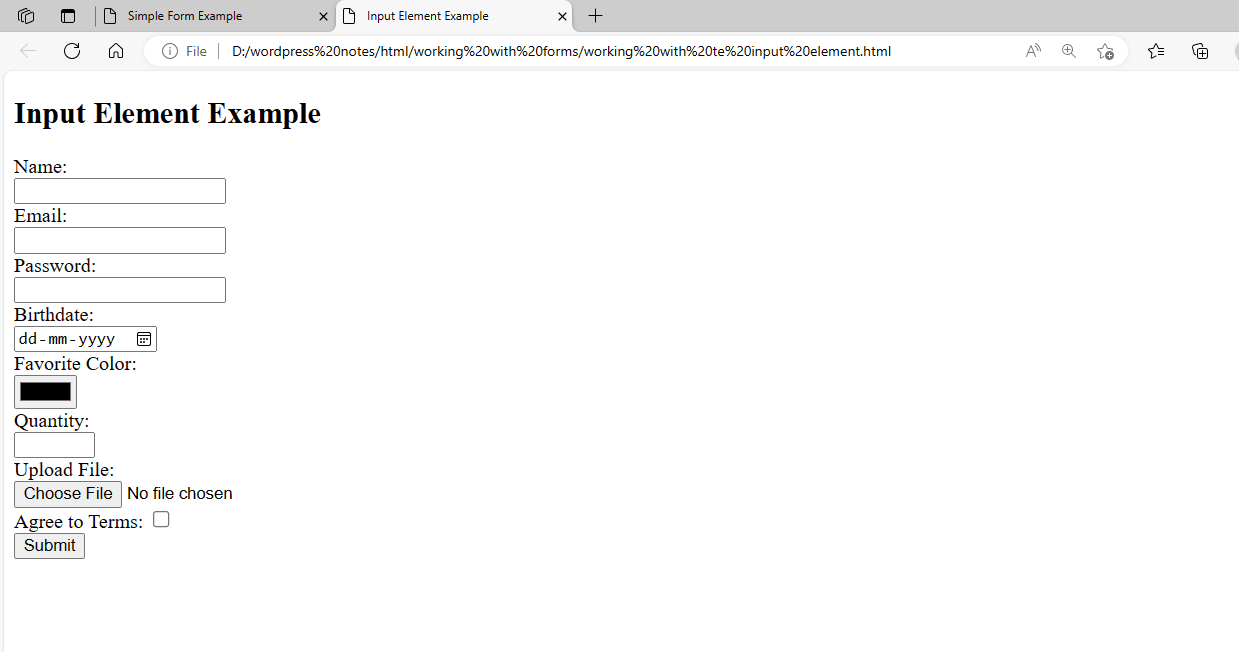
Figure 2 – Displaying the Output of the INPUT Element
In this example, we have a form with the following types of input fields:
- Enter your name and email address as text.
- Password input.
- Enter a date for the birthdate.
- Use the color input to select a color.
- Number input for choosing a quantity from a range.
- File input for uploading a file.
- Checkbox for agreeing to the terms.
- Click the Submit button to submit the form.
Each input field is labeled for accessibility, and certain input fields include additional properties like min, and max, that are needed to establish limitations and requirements for user input.
Working with a Text Field
To work with a text field in HTML, use the <input> element with the type=”text” attribute. information fields are typically used for one-line input, such as providing a name, email address, or other brief information. This is a detailed example of how to construct and use a text field in an HTML form:
<!DOCTYPE html>
<html>
<head>
  <title>Text Field Example</title>
</head>
<body>
  <h2>Text Field Example</h2>
  <form action="/submit_form" method="post">
    <label for="name">Name:</label><br>
    <input type="text" id="name" name="name" placeholder="Enter your name" required><br>

    <label for="email">Email:</label><br>
    <input type="email" id="email" name="email" placeholder="Enter your email" required><br>

    <label for="message">Message:</label><br>
    <textarea id="message" name="message" rows="4" cols="50" placeholder="Enter your message"></textarea><br>

    <input type="submit" value="Submit">
  </form>
</body>
</html>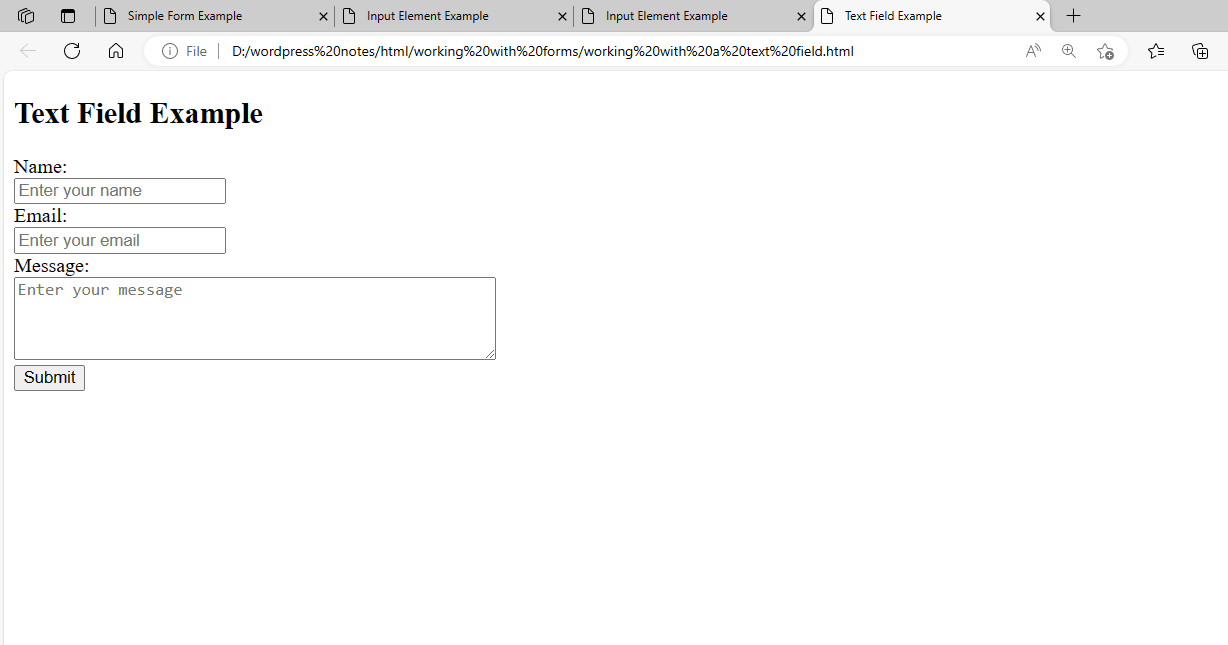
Figure 3 – Displaying the Output of the Text Field
In this example:
- We have two text areas for inputting your name and email address.
- The <input> element’s type=”text” attribute provides a single-line text input field.
- The id attribute associates the element with the element for accessibility.
- The name attribute identifies the input field when the form is submitted.
- We’ve introduced the placeholder attribute to provide the user with a tip about what to type into the form.
- The necessary property is used to make the fields mandatory.
When the form is submitted, the information entered in the text fields is transmitted to the server for processing. The server-side code can then access the data by calling the names supplied in the input fields’ name attributes.
Working with a Password Field
To work with a password field in HTML, use the <input> element with type=”password” attribute. Password fields are used to insert passwords or other sensitive information that should be obscured. This is a detailed example of how to construct and use a password field in an HTML form:
<!DOCTYPE html>
<html>
<head>
  <title>Password Field Example</title>
</head>
<body>
  <h2>Password Field Example</h2>
  <form action="/submit_form" method="post">
    <label for="username">Username:</label><br>
    <input type="text" id="username" name="username" placeholder="Enter your username" required><br>

    <label for="password">Password:</label><br>
    <input type="password" id="password" name="password" placeholder="Enter your password" required><br>

    <input type="submit" value="Login">
  </form>
</body>
</html>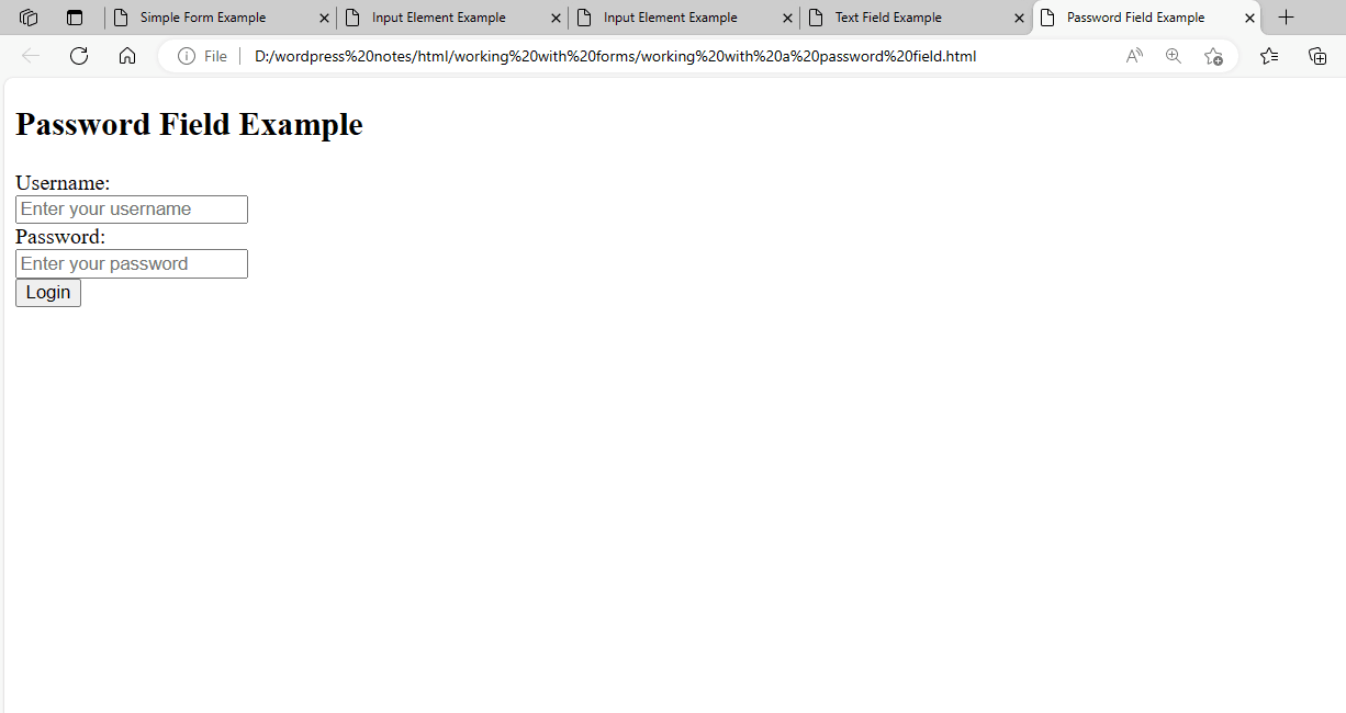
Figure 4 – Displaying the Output of the Password Field
In this example:
- We have a password field where users can enter their password.
- The type=”password” attribute on the <input> element provides a password input field that masks the typed content.
- The id attribute associates the element with the <input> element for accessibility.
- The name attribute identifies the input field when the form is submitted.
- We’ve introduced the placeholder attribute to provide the user with a tip about what to type into the form.
- The necessary property is used to make the field mandatory.
When the form is submitted, the information supplied in the password box is transmitted to the server for processing. It is vital to note that the password data is delivered in plain text and should be encrypted on the server for security reasons.
Creating a Hidden Field
To create a hidden field in HTML, use the <input> element with the type=”hidden” attribute. Hidden fields are used to hold data that the user does not see but is sent to the server when the form is submitted. This is handy for transmitting information such as user IDs, session tokens, and other data that the user should not be allowed to see or alter. Here’s a detailed example of how to create and use a hidden field in an HTML form:
<!DOCTYPE html>
<html>
<head>
  <title>Hidden Field Example</title>
</head>
<body>
  <h2>Hidden Field Example</h2>
  <form>
User Name: <input id="name" type="text"/><br/>
<input type="hidden" id="country" value="India"/><br/>
<input type="submit" onclick="alert('Hello' + document.getElementById('name').value + 'from' + document.getElementById('country').value)" value="Submit">
</form>
</body>
</html>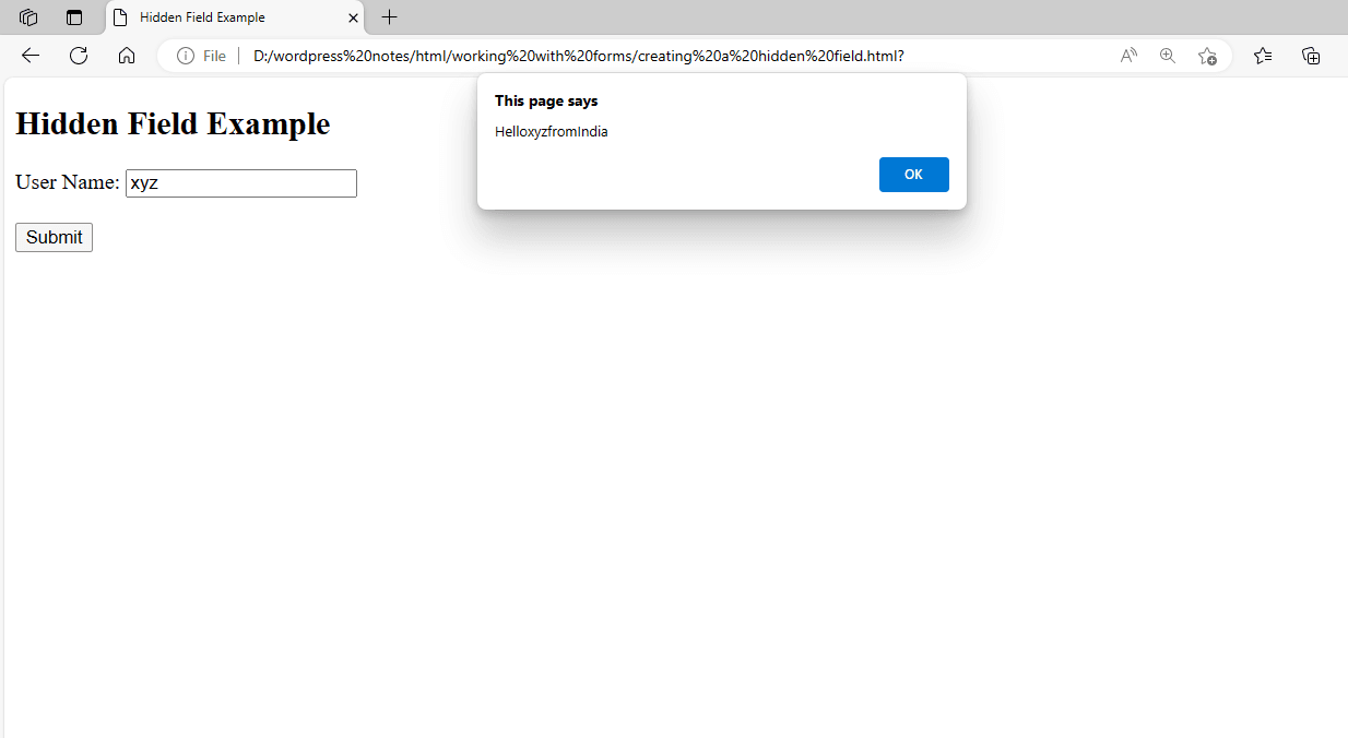
Figure 5 – Displaying the output of the hidden field
In this example, we’ve defined two fields: user name and country. We modified the nation field’s type to hidden and set the default value to India. Figure 5 shows the output of constructing a hidden field.html file. As you can see, the web page just displays one field with a button control. Now, enter your name into the user name form and click the submit button. In this situation, we entered XYZ. As seen in Figure 5, this shows an alert box with the user name and the country name. The alert box retrieves the user’s name from the user name field and the country name from the hidden field.
Creating a Checkbox Field
To create a checkbox field in HTML, use the <input> element with the type=”checkbox” attribute. Checkboxes enable users to select one or more items from a list of alternatives. Here’s an example of how to add a checkbox field to an HTML form:
<!DOCTYPE html>
<html>
<head>
  <title>Checkbox Field Example</title>
</head>
<body>
  <h2>Checkbox Field Example</h2>
  <form action="/submit_form" method="post">
    <input type="checkbox" id="option1" name="option1" value="Option 1">
    <label for="option1">Option 1</label><br>

    <input type="checkbox" id="option2" name="option2" value="Option 2">
    <label for="option2">Option 2</label><br>

    <input type="checkbox" id="option3" name="option3" value="Option 3">
    <label for="option3">Option 3</label><br>

    <input type="submit" value="Submit">
  </form>
</body>
</html>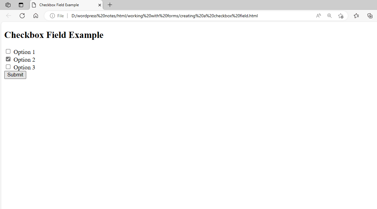
Figure 6 – Displaying the Output of the Checkbox Field
In this example:
- We have three checkbox fields, each with a unique ID, name, and value.
- The id attribute links the element with the checkbox for accessibility.
- The name property identifies the checkbox field when the form is submitted.
- The value attribute defines what value will be transmitted to the server if the checkbox is selected.
When you submit the form, the server will receive the values of the checked checkboxes. If a checkbox is unchecked, the value is not included in the form data transmitted to the server.
Creating a Radio Button Field
To create a radio button field in HTML, use the <input> element with the type=”radio” attribute. Radio buttons allow users to choose one of several mutually exclusive options. Here’s an example of how to add a radio button field in an HTML form:
<!DOCTYPE html>
<html>
<head>
  <title>Radio Button Field Example</title>
</head>
<body>
  <h2>Radio Button Field Example</h2>
  <form action="/submit_form" method="post">
    <input type="radio" id="male" name="gender" value="male">
    <label for="male">Male</label><br>

    <input type="radio" id="female" name="gender" value="female">
    <label for="female">Female</label><br>

    <input type="radio" id="other" name="gender" value="other">
    <label for="other">Other</label><br>

    <input type="submit" value="Submit">
  </form>
</body>
</html>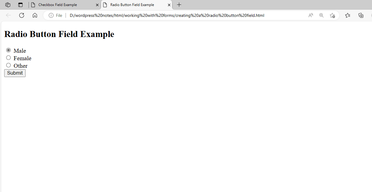
Figure 7 – Displaying the Output of the Radio Button Field
In this example:
- We have three radio button fields, each with a unique ID, name, and value.
- The id attribute links the <label> element to the radio button for accessibility.
- The name attribute is used to group radio buttons together. Only one radio button from a group can be chosen at a time.
- The value attribute specifies the value that will be delivered to the server when the radio button is selected.
When the form is submitted, the server receives the value of the selected radio button in the gender field. If no radio button is selected, no value will be provided to the gender column.
Creating a Submit Button Field
To create a submit button in HTML, use the <input> element with the type=”submit” property. Submit buttons are used to send forms to the server for processing. Here’s an example of how to add a submit button to an HTML form:
<!DOCTYPE html>
<html>
<head>
  <title>Submit Button Example</title>
</head>
<body>
  <h2>Submit Button Example</h2>
  <form action="/submit_form" method="post">
    <label for="name">Name:</label><br>
    <input type="text" id="name" name="name"><br>

    <label for="email">Email:</label><br>
    <input type="text" id="email" name="email"><br>

    <input type="submit" value="Submit">
  </form>
</body>
</html>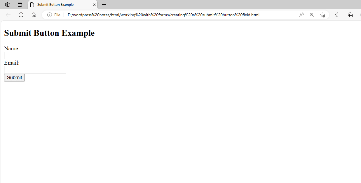
Figure 8 – Displaying the Output of the Submit Button Field
In this example:
- We generated a submit button using the <input> element with type=”submit”.
- The value attribute of the submit button determines what text will be displayed on the button.
- When you click the submit button, the form data (in this case, the values of the name and email fields) is transferred to the server specified in the form’s action property for processing.
Submitting the form usually results in a page reload or a redirect to another page, depending on the server’s response.
Creating a Reset Button Field
To create a reset button in HTML, use the <input> element with the type=”reset” property. Reset buttons are used to reset form fields to their original values. Here’s an example of creating a reset button in an HTML form:
<!DOCTYPE html>
<html>
<head>
  <title>Reset Button Example</title>
</head>
<body>
  <h2>Reset Button Example</h2>
  <form action="/submit_form" method="post">
    <label for="name">Name:</label><br>
    <input type="text" id="name" name="name"><br>

    <label for="email">Email:</label><br>
    <input type="text" id="email" name="email"><br>

    <input type="submit" value="Submit">
    <input type="reset" value="Reset">
  </form>
</body>
</html>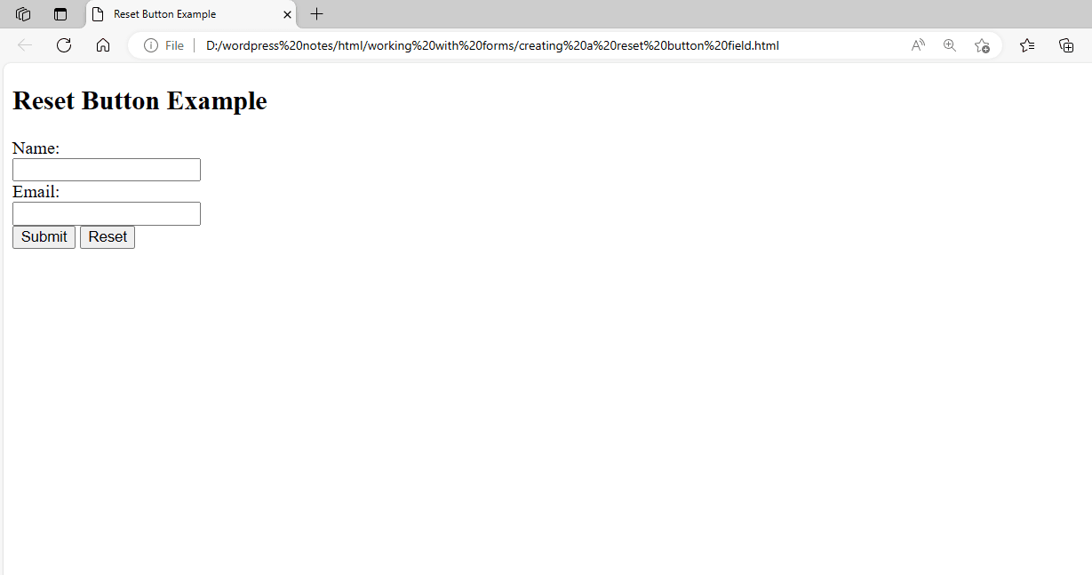
Figure 9 – Displaying the Output of the Reset Button Field
In this example:
- We generated a reset button using the element with type=”reset”.
- The value attribute of the reset button specifies what text will be displayed on the button.
- When you click the reset button, all of the form fields (in this case, the name and email fields) are reset to their default settings, as if the form were just loaded.
Reset buttons are important for allowing users to clear the form and start over without having to manually clear each field.
Using the SELECT and OPTION Elements
The <select> element in HTML creates a drop-down list of options for the user to select from. Each element can have one or more <option> elements that specify the dropdown list’s options. Here’s an example of using the <select> and <option> elements to build a dropdown list:
<!DOCTYPE html>
<html>
<head>
  <title>Select Element Example</title>
</head>
<body>
  <h2>Select Element Example</h2>
  <form action="/submit_form" method="post">
    <label for="cars">Choose a car:</label><br>
    <select id="cars" name="cars">
      <option value="volvo">Volvo</option>
      <option value="saab">Saab</option>
      <option value="fiat">Fiat</option>
      <option value="audi">Audi</option>
    </select><br>

    <input type="submit" value="Submit">
  </form>
</body>
</html>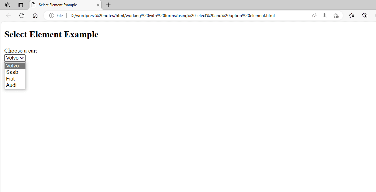
Figure 10 – Displaying the Output of the SELECT and OPTION Elements
In this example:
The <select> element with the id cars and the name vehicles creates a drop-down list for picking an automobile. The <select> element has four elements, each with a value property that defines the value to be transmitted to the server if the option is picked, as well as the text presented to the user.
When you submit the form, the selected value from the drop-down list (Volvo, Saab, Fiat, or Audi) is transmitted to the server in the vehicles field.
Using the OPTGROUP Element
The <optgroup> element in HTML groups similar <option> components within a <select> element. It enables you to establish a hierarchical structure in a drop-down list, making it easier for users to discover and select the appropriate option. Here’s an example of using the <optgroup> element to group options in a dropdown list:
<!DOCTYPE html>
<html>
<head>
  <title>Optgroup Element Example</title>
</head>
<body>
  <h2>Optgroup Element Example</h2>
  <form action="/submit_form" method="post">
    <label for="cars">Choose a car:</label><br>
    <select id="cars" name="cars">
      <optgroup label="Swedish Cars">
        <option value="volvo">Volvo</option>
        <option value="saab">Saab</option>
      </optgroup>
      <optgroup label="German Cars">
        <option value="mercedes">Mercedes</option>
        <option value="audi">Audi</option>
      </optgroup>
    </select><br>

    <input type="submit" value="Submit">
  </form>
</body>
</html>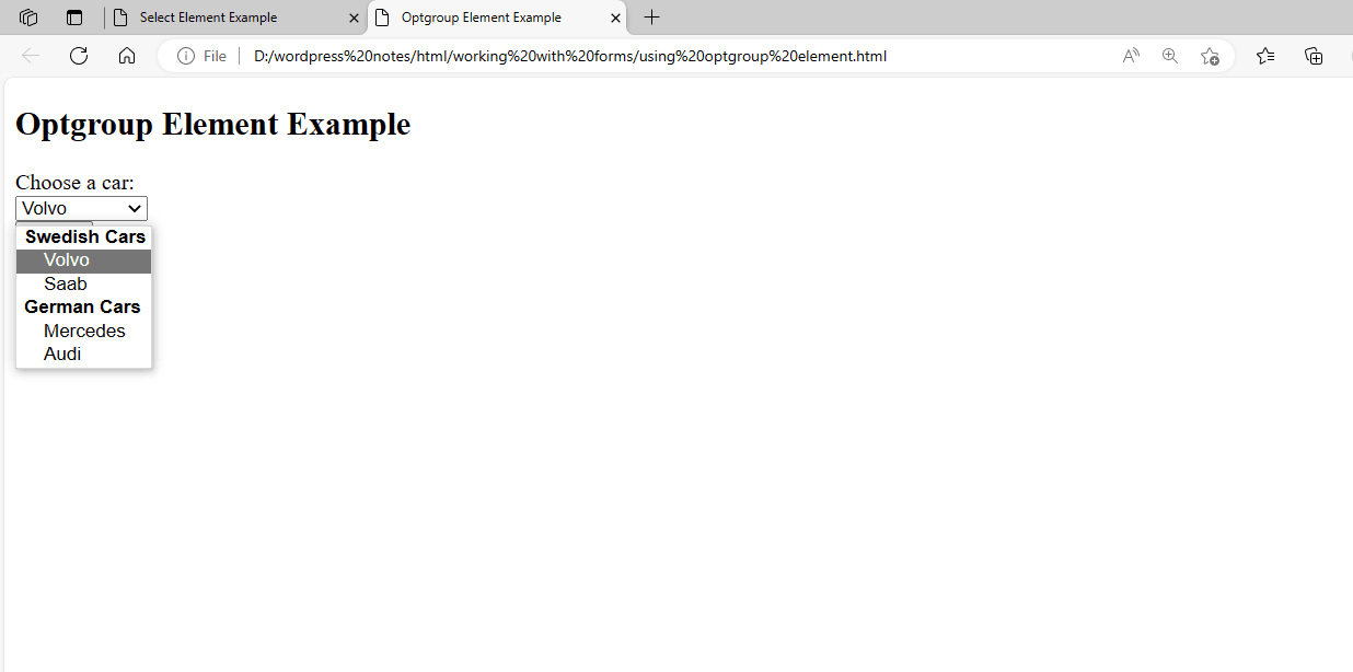
Figure 11 – Displaying the Output of the optgroup Element
In this example:
The <select> element with the id cars and the name vehicles creates a drop-down list for picking an automobile. The <select> element has two <optgroup> elements, each with a label property to specify the group’s label.
- Each <optgroup> element contains <option> elements, which define the group’s options.
- When you submit the form, the selected value from the drop-down list (Volvo, Saab, Mercedes, or Audi) is transmitted to the server in the vehicles field.
Working with the TEXTAREA Element
The <textarea> HTML element creates a multi-line text input field. It’s handy for allowing users to enter lengthy content, such as comments or messages. Here’s an example of using the <textarea> element:
<!DOCTYPE html>
<html>
<head>
    <title>Textarea Example</title>
</head>
<body>
    <h2>Textarea Example</h2>
    <form action="/submit_form" method="post">
        <label for="message">Message:</label><br>
        <textarea id="message" name="message" rows="4" cols="50"></textarea><br>
        <input type="submit" value="Submit">
    </form>
</body>
</html>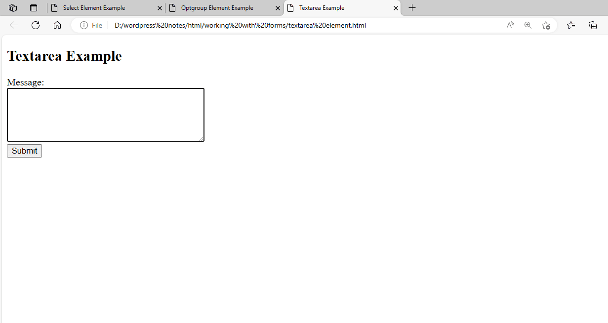
Figure 12 – Displaying the Output of the TEXTAREA Element
In this example:
- We have a <textarea> element with the id and name set to message. The <textarea> element’s rows=”4″ and cols=”50″ parameters determine its initial size. Users can add multiple lines of text in the text area, and the text will be sent to the server as the message field’s value when the form is submitted.
- You can customize the <textarea> element by changing its initial value, deactivating it, or inserting placeholder text, among other choices.
Using the FIELDSET and LEGEND Elements
In HTML, the <fieldset> element groups similar components within a form and adds a border to visually differentiate them from other elements. The <legend> element specifies a caption or title for the <fieldset> element:
Here’s an example of how to use the <fieldset> and <legend> elements:
<!DOCTYPE html>
<html>
<head>
  <title>Fieldset and Legend Example</title>
</head>
<body>
  <h2>Fieldset and Legend Example</h2>
  <form action="/submit_form" method="post">
    <fieldset>
      <legend>Contact Information</legend>
      <label for="name">Name:</label><br>
      <input type="text" id="name" name="name"><br>

      <label for="email">Email:</label><br>
      <input type="text" id="email" name="email"><br>
    </fieldset>

    <fieldset>
      <legend>Message</legend>
      <textarea id="message" name="message" rows="4" cols="50"></textarea><br>
    </fieldset>

    <input type="submit" value="Submit">
  </form>
</body>
</html>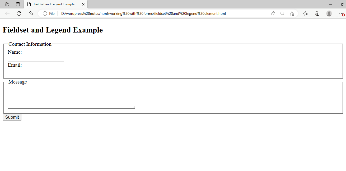
Figure 13 – Displaying the output of the FIELDSET and LEGEND Elements
- In this illustration, there are two <fieldset> elements, each of which contains form components about a distinct area of the form.
- A <legend> element is present in every <fieldset> element, serving as a caption or title for the collection of form elements.
- By assembling related items into groups and defining a visual border around them, the <fieldset> elements aid in the organization of the form and enhance its design.
It is very helpful to use the <fieldset> and <legend> components if your form has several sections or groups of related fields.
Using the BUTTON Element
A clickable button in HTML is made with the <button> element. It can be used to submit forms, start JavaScript processes, or carry out any other JavaScript-capable operation. The following demonstrates the usage of the <button> element:
<!DOCTYPE html>
<html>
<head>
  <title>Button Element Example</title>
  <script>
    function handleClick() {
      alert("Button clicked!");
    }
  </script>
</head>
<body>
  <h2>Button Element Example</h2>
  <p>Click the button below:</p>
  <button type="button" onclick="handleClick()">Click Me</button>

  <p>Or use the button to submit a form:</p>
  <form action="/submit_form" method="post">
    <label for="name">Name:</label><br>
    <input type="text" id="name" name="name"><br>

    <label for="email">Email:</label><br>
    <input type="text" id="email" name="email"><br>

    <button type="submit">Submit</button>
  </form>
</body>
</html>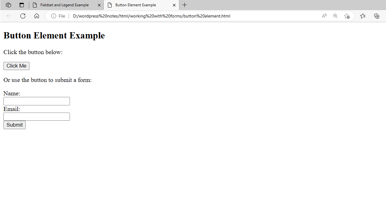
Figure 14 – Displaying the output of the BUTTON Element
- In this example, a <button> element with the word “Click Me” as its content has an onclick property that, when the button is clicked, calls the JavaScript method handleClick(). An alert with the message “Button clicked!” is displayed by this function.
- Moreover, a <form> element has two text input fields for the user’s name and email address. Because it has the type=”submit” attribute, the <button> element inside the form is a submit button. The form is sent to the server listed in the action attribute of the form when this button is pressed.
Two typical uses for the element are shown in this example: submitting a form and starting a JavaScript function when clicked.
<!DOCTYPE html>
<html>
<head>
    <title>Button with Image Example</title>
</head>
<body>
    <h2>Button with Image Example</h2>
    <button type="submit">
        <img src="back.png" width="50" height="50">
    </button>
    <button type="submit">
        <img src="next.png" width="50" height="50">
    </button>
</body>
</html>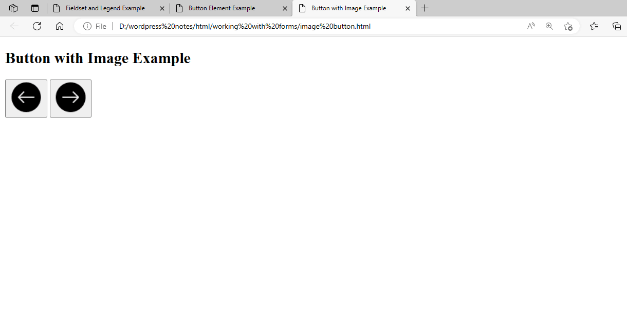
Figure 15 – Showing the Image on the Button Control
- An <img> element and a <button> element are used in this example.
- The <img> element contains an alt attribute that offers alternate text for the picture and a src attribute that indicates the actual image or URL to display.
- The value of the src attribute can be changed to point to the real URL of the picture you wish to see on the button.
Using the DATALIST Element
When an <input> element has the list property, the <datalist> element in HTML is used to supply a predetermined list of alternatives. Users can choose a value from a list of recommended possibilities, and if necessary, they can still enter their value. The following demonstrates the usage of the <datalist> element:
<!DOCTYPE html>
<html>
<head>
    <title>Datalist Element Example</title>
</head>
<body>
    <h2>Datalist Element Example</h2>
    <label for="browser">Choose a browser:</label>
    <input list="browsers" id="browser" name="browser">

    <datalist id="browsers">
        <option value="Chrome">
        <option value="Firefox">
        <option value="Safari">
        <option value="Edge">
        <option value="Opera">
    </datalist>
</body>
</html>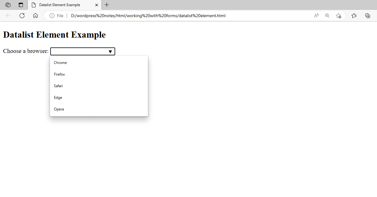
Figure 16 – Displaying the output of the Datalist Element
- In this instance, the list attribute of the <input> element is set to “browsers.” This links the <datalist> element and the input field.
- Each of the <option> components in the list of <datalist> elements represents a proposed choice for the input field. The id of the list of elements is “browsers.” Based on the choices in the <datalist>, a drop-down list of recommended options will appear when the user interacts with the input field. The user has the choice to enter their value or choose one of the options.
When it comes to giving text input fields autocomplete functionality—which allows users to rapidly choose from a list of commonly used values—the <datalist> element is especially helpful
Using the OUTPUT Element
The HTML <output> element is used to display the outcome of a computation or user input. To show dynamic material based on user input or other interactions, it is usually used in conjunction with JavaScript. The following demonstrates the usage of the <output> element:
<!DOCTYPE html>
<html>
<head>
    <title>Output Element Example</title>
</head>
<body>
    <h2>Output Element Example</h2>
    <label for="num1">Enter a number:</label>
    <input type="number" id="num1" name="num1"><br>

    <label for="num2">Enter another number:</label>
    <input type="number" id="num2" name="num2"><br>

    <button onclick="calculate()">Calculate Sum</button><br>

    <output id="result"></output>

    <script>
        function calculate() {
            var num1 = parseInt(document.getElementById("num1").value);
            var num2 = parseInt(document.getElementById("num2").value);
            var sum = num1 + num2;
            document.getElementById("result").textContent = "Sum: " + sum;
        }
    </script>
</body>
</html>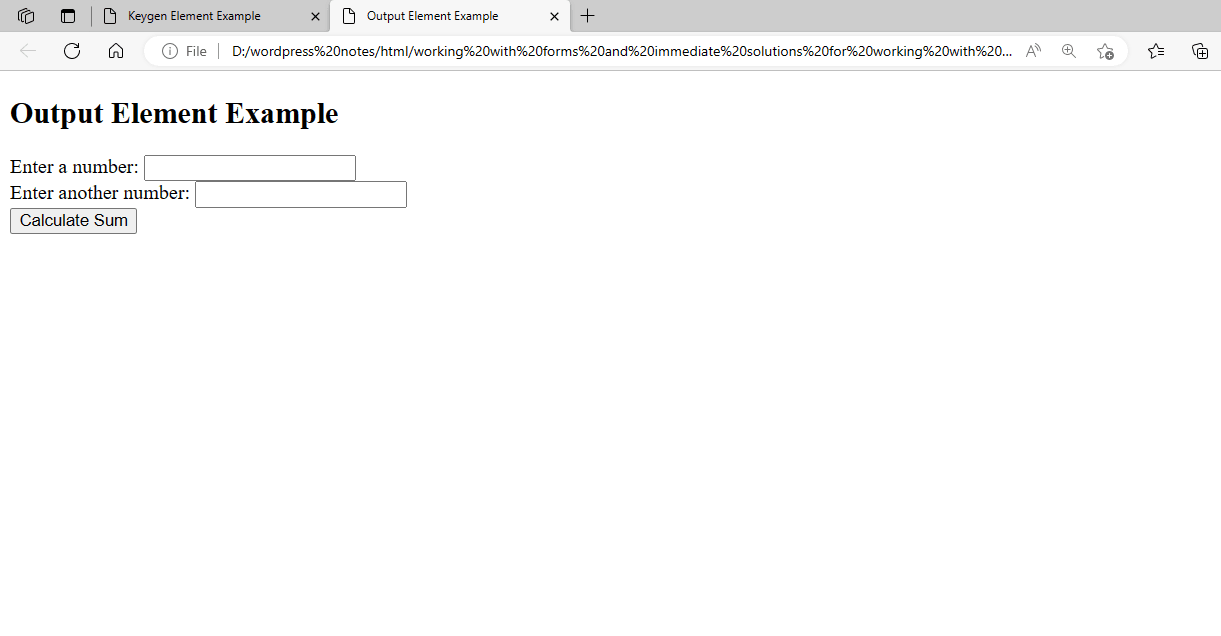
Figure 17 – Displaying the output of the OUTPUT Element
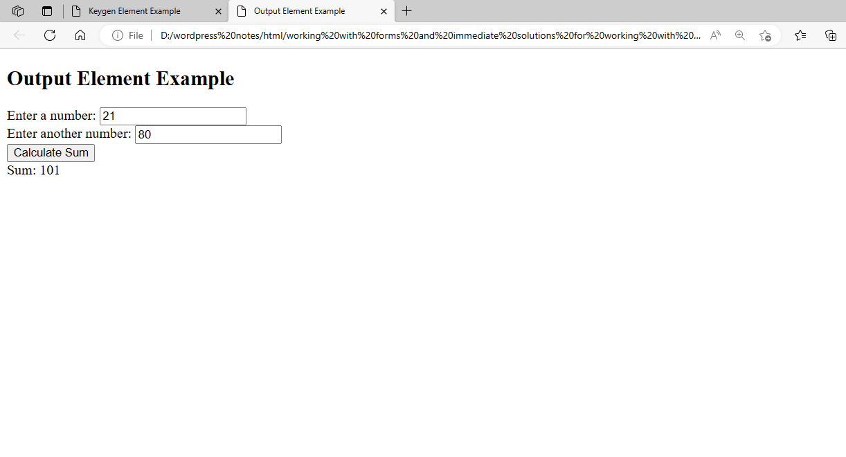
Figure 18 – Showing the output after Adding the Two Numbers
In this example, the <button> element triggers the JavaScript function calculate() when clicked, and there are two <input> elements for entering numbers. The <output> element’s content is set to the result’s id by the calculate() function, which also obtains the values entered in the <input> elements, adds up the numbers, and displays the result.
The total of the numbers entered in the input fields and the “Calculate Sum” button click will be shown in the <output> element.
Using the PROGRESS Element
When a task, like the completion of a download or the submission of a form, is in progress, it is represented using the <progress> element in HTML. To dynamically update the progress value, it is usually used in conjunction with JavaScript.
The following demonstrates the usage of the <progress> element:
<!DOCTYPE html>
<html>
<head>
    <title>Progress Element Example</title>
</head>
<body>
    <h2>Progress Element Example</h2>
    <label for="file">Upload File:</label>
    <input type="file" id="file" name="file"><br>

    <progress id="progress" value="0" max="100"></progress>

    <button onclick="uploadFile()">Start Upload</button>

    <script>
        function uploadFile() {
            var progress = document.getElementById("progress");
            var fileInput = document.getElementById("file");
            var file = fileInput.files[0];
            var fileSize = file.size;
            var chunkSize = 1024; // 1KB chunk size
            var chunks = Math.ceil(fileSize / chunkSize);
            var currentChunk = 0;

            var uploadTimer = setInterval(function() {
                if (currentChunk < chunks) {
                    currentChunk++;
                    progress.value = (currentChunk / chunks) * 100;
                } else {
                    clearInterval(uploadTimer);
                    alert("Upload complete!");
                }
            }, 1000); // Update progress every second
        }
    </script>
</body>
</html>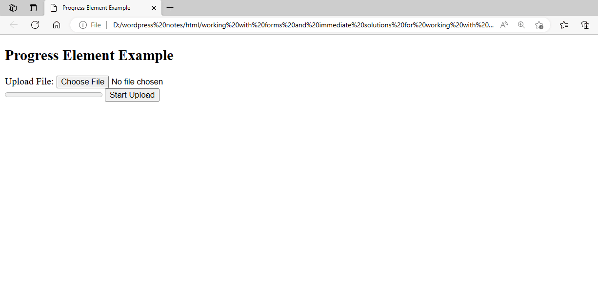
Figure 19 – Displaying the output of the PROGRESS Element.
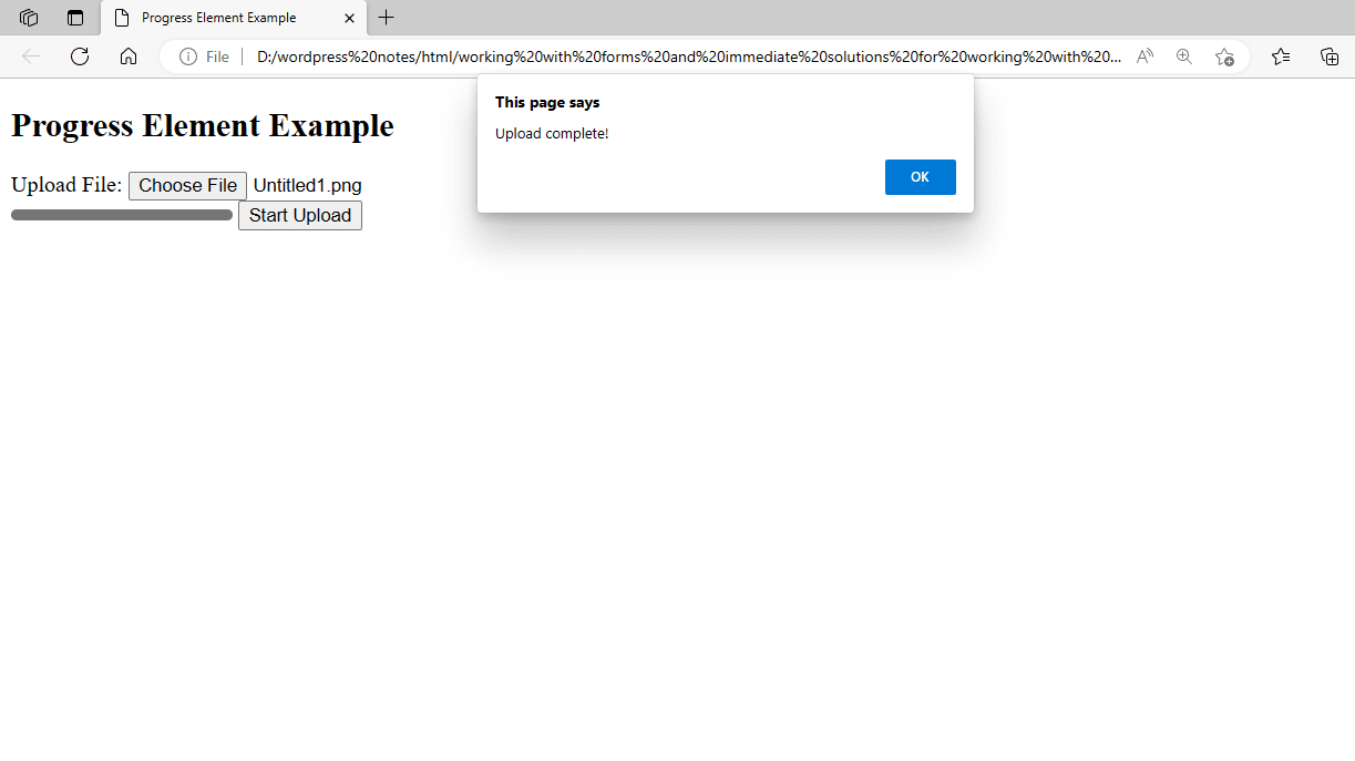
Figure 20 – Showing that the File has been uploaded
In this instance: to choose a file to upload, use the <input> element of type “file.” With the id “progress,” starting value “0” and maximum value “100,” we have an <progress> element. The file upload’s progress is shown by this element. To imitate the file upload procedure, we have a <button> element that, when clicked, launches the JavaScript method uploadFile(). Based on the file size, the uploadFile() function determines how many chunks to upload and modifies the progress value accordingly. The upload progress is updated every second until it is finished.
Please be aware that this sample is just meant to serve as an example; no file is uploaded to a server. You would need to use server-side programming to manage the file upload in a real application.
Using the METER Element
A scalar measurement within a defined range is represented by the <meter> element in HTML. Values like disc usage, completion percentage, and other quantitative data are frequently visualized using it. The following demonstrates the usage of the <meter> element:
<!DOCTYPE html>
<html>
<head>
    <title>Meter Element Example</title>
</head>
<body>
    <h2>Meter Element Example</h2>
    <label for="disk">Disk Usage:</label>
    <meter id="disk" value="0" min="0" max="100">0%</meter>
    <br>
    <button onclick="updateMeter()">Update</button>

    <script>
        function updateMeter() {
            var meter = document.getElementById("disk");
            var newValue = Math.floor(Math.random() * 101); // Generate a random value between 0 and 100
            meter.value = newValue;
            meter.textContent = newValue + "%";
        }
    </script>
</body>
</html>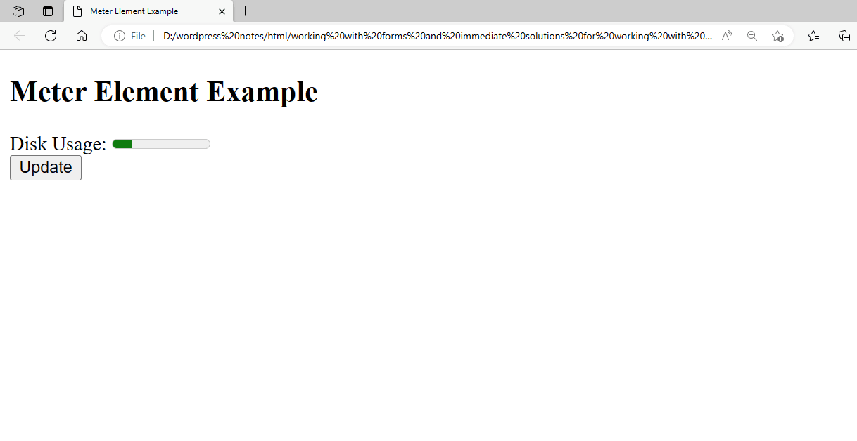
Figure 21 – Displaying the Output of the METER Element
In this case, selecting the “Update” button triggers the JavaScript function updateMeter(), which modifies the <meter> element with id “disc” following a random value between 0 and 100.
Using the Enctype, Action, and Method Attributes
HTML forms use the enctype, action, and method elements to specify how form data is sent to the server.
The encoding type that was used to send the form data to the server is indicated by the enctype attribute. When there are file uploads on the form, it is necessary. Text/plain, multipart/form-data, and application/x-www-form-urlencoded are the most often occurring values. The URL of the server-side script or endpoint that will handle form submission is specified by the action property. The URL may be absolute or relative. The HTTP method used to submit the form data is specified by the method property. Though PUT and DELETE are other viable options, GET and POST are the most often utilized techniques. This form demonstrates how to use these attributes:
<!DOCTYPE html>
<html>
<head>
    <title>Form Example</title>
</head>
<body>
    <h2>Form Example</h2>
    <form action="action.html" method="get" enctype="text/plain">
        <label for="name">Name:</label><br>
        <input type="text" id="name" name="name"><br>

        <label for="email">Email:</label><br>
        <input type="text" id="email" name="email"><br>

        <label for="file">Upload File:</label><br>
        <input type="file" id="file" name="file"><br>

        <input type="submit" value="Submit">
    </form>
</body>
</html>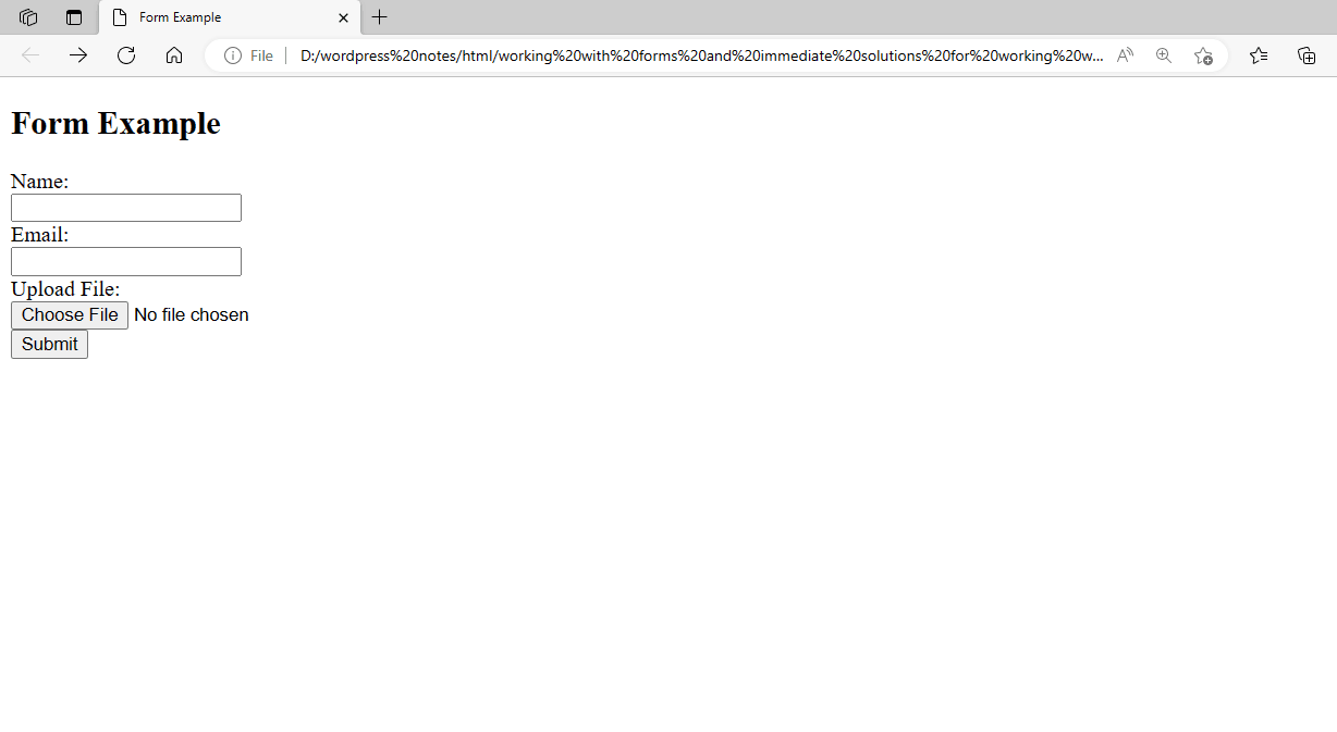
Figure 22 – Displaying the output of using the Enctype, Action, and Method Attributes
Now showing the Code for the action.html File:
<!DOCTYPE HTML>
<HEAD>
<TITLE>Form submitted</TITLE>
</HEAD>
<BODY>
<H1>The Form is Successfully Submitted.</H1>
</BODY>
</HTML>
Figure 23 – Displaying the output of the action.html file
In this case: As indicated in the above graphic, you must develop an HTML page called action.html to be routed to the following form submission. The POST method will be used to submit the form to the server’s /submit_form endpoint. The form data has a file upload input (<input type=”file”>), hence it will be encoded as multipart/form-data. In addition to a file upload area, the form has text input fields for name and email. The data will be passed to the server-side script or endpoint mentioned in the action property for processing after the form is submitted.