Simple Methods of Using Pseudo-Classes and Pseudo-Elements in CSS: To begin, first refer to how-to-make-use-of-pseudo-classes-and-pseudo-elements-in-css
Using Dynamic Pseudo-Classes
CSS’s dynamic pseudo-classes let you style components according to their DOM state or user interactions. By dynamically changing styles, these pseudo-classes enhance the interactivity and appeal of online sites. Let’s explore a few of the most important dynamic pseudo-classes with examples, explanations, and outputs:
- :hover
- The :hover pseudo-class applies styles when the user hovers their mouse over an element.
- :focus
- The :focus pseudo-class styles elements when in focus (e.g., clicked or navigated to using the keyboard).
- :active
- The active pseudo-class applies styles to an element when it is activated (e.g., a button or link is clicked).
- :visited and :link
- :link styles links that haven’t been visited.
- :visited styles links that have already been visited.
- :target
- The :target pseudo-class styles an element when its id matches the URL fragment (e.g., #section1).
- :checked
- The :checked pseudo-class applies styles to selected checkboxes or radio buttons.
Here’s an example that combines multiple dynamic pseudo-classes into a single interactive design:
<!DOCTYPE html>
<html lang="en">
<head>
  <style>
    /* Basic styles */
    body {
      font-family: Arial, sans-serif;
      margin: 20px;
    }
    a {
      text-decoration: none;
      color: blue;
    }
    a:visited {
      color: purple;
    }
    a:active {
      color: red;
    }
    button, input {
      margin-top: 10px;
      padding: 10px;
      border: 1px solid #ccc;
      border-radius: 5px;
      cursor: pointer;
    }
    button:hover {
      background-color: lightblue;
    }
    button:active {
      background-color: blue;
      color: white;
    }
    input {
      border: 2px solid gray;
      padding: 5px;
    }
    input:focus {
      border-color: green;
      outline: none;
    }
    input[type="checkbox"]:checked + label {
      color: green;
    }

    /* Section target styling */
    section {
      margin: 20px 0;
      padding: 20px;
      border: 2px solid #ccc;
      transition: background-color 0.3s ease, border-color 0.3s ease;
    }
    section:target {
      background-color: yellow;
      border-color: orange;
    }
  </style>
</head>
<body>
  <!-- Navigation Links -->
  <nav>
    <a href="#form-section">Go to Form</a> |
    <a href="#info-section">Go to Info</a>
  </nav>

  <!-- Sections -->
  <section id="form-section">
    <h2>Interactive Form</h2>
    <input type="text" placeholder="Focus here to see the effect"><br>
    <input type="checkbox" id="agree">
    <label for="agree">I agree to the terms</label><br>
    <button>Submit</button>
  </section>

  <section id="info-section">
    <h2>Information Section</h2>
    <p>This section is styled dynamically when navigated using the target link above.</p>
  </section>
</body>
</html>
Explanation of Combined Dynamic Pseudo-Classes
- :hover: Hovering over the button modifies its background.
- :active: When pressed, the button turns into a blue background with white text.
- :focus: When focused, the input field displays a green border.
- :checked: The label of the checkbox becomes green when it is chosen.
- :link &:visited: When a navigation link is visited, it turns purple after first appearing blue.
- :target: The target The backdrop of a part turns yellow with an orange border when it is targeted by the navigation links.
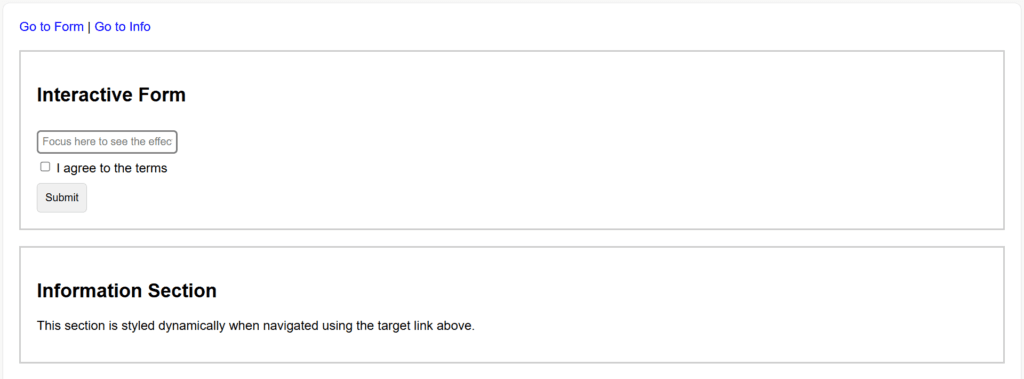
Figure 1 – Displaying the output of using Combined Dynamic Pseudo-Classes in CSS
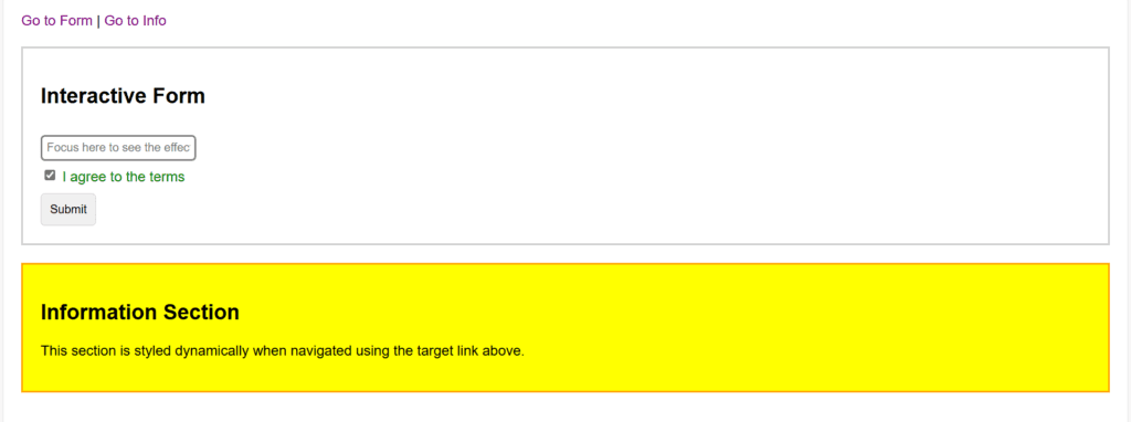
Figure 2 – Click the link “Go to Form” or “Go to Info”: The respective section gets highlighted with a yellow background and orange border.
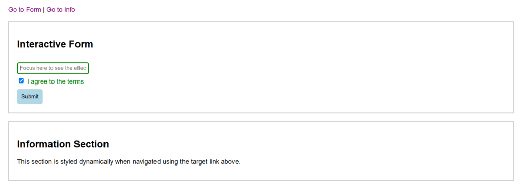
Figure 3 – Hover over the “Submit” button: The button turns light blue.
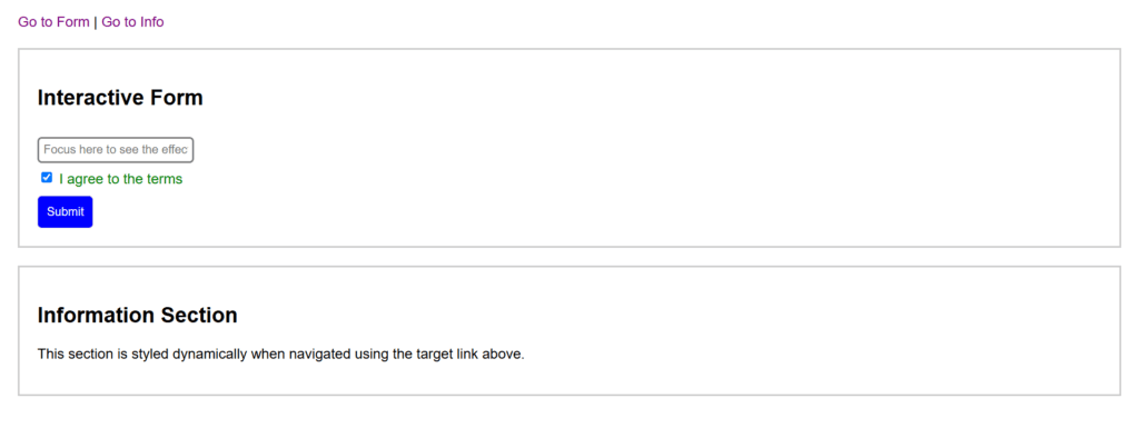
Figure 4 – Click the “Submit” button: The button temporarily changes to blue with white text.
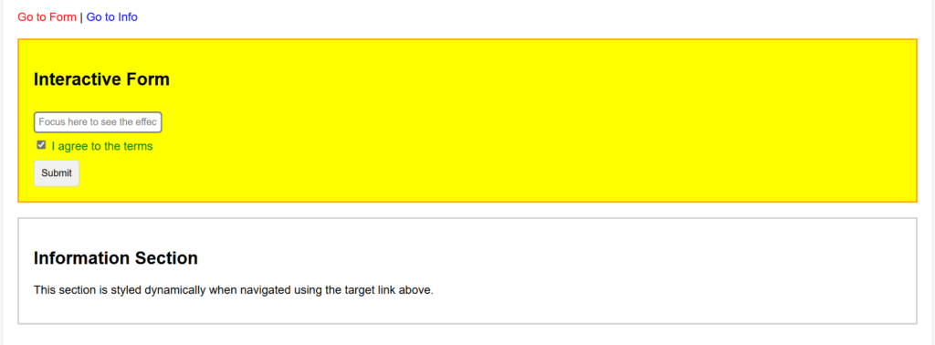
Figure 5 – Focus on the input field: The border changes to green.
Check the checkbox “I agree to the terms.” The label turns green.
Click on navigation links: Links change from blue to red when hovered.
Websites become interactive with dynamic pseudo-classes, which style items according to user states or activities. Among them are:
- User interaction: :focus, :active, :hover
- The link states: :link, :visited
- Special scenarios: :checked, :target
Developers can avoid employing JavaScript by using these pseudo-classes with standard CSS selectors to produce responsive, captivating, and aesthetically dynamic designs.
Using the :target Pseudo-Class
When an element’s id matches the fragment identifier in the current URL, the CSS :target pseudo-class adds styling to the element. When developing interactive components for single-page apps, such as dynamic sections, tabbed content, or navigational highlights, this is especially helpful.
Example: Highlighting Sections
<!DOCTYPE html>
<html lang="en">
<head>
  <style>
    body {
      font-family: Arial, sans-serif;
      margin: 20px;
    }
    ul {
      list-style-type: none;
      padding: 0;
    }
    li {
      margin: 10px 0;
      padding: 10px;
      border: 1px solid #ccc;
      border-radius: 5px;
      transition: background-color 0.3s ease, border-color 0.3s ease;
    }
    li:target {
      background-color: lightyellow;
      border-color: orange;
    }
    a {
      text-decoration: none;
      color: blue;
      margin-right: 10px;
    }
    a:hover {
      text-decoration: underline;
    }
  </style>
</head>
<body>
  <h1>Notifications</h1>
  <nav>
    <a href="#notification1">View Notification 1</a>
    <a href="#notification2">View Notification 2</a>
    <a href="#notification3">View Notification 3</a>
  </nav>

  <ul>
    <li id="notification1">This is Notification 1.</li>
    <li id="notification2">This is Notification 2.</li>
    <li id="notification3">This is Notification 3.</li>
  </ul>
</body>
</html>
Explanation
- HTML Structure:
- Using unique id properties (notification1, notification2, notification3), a list of notifications (li) is generated.
- These IDs are pointed to by href properties in navigation links (e.g., #notification1).
- CSS Styling:
- By default, all list items (li) have a white backdrop and a light gray border.
- To make the backdrop bright yellow and the border orange for the targeted notice, use the :target pseudo-class.
- Behavior:
- The :target pseudo-class is used to highlight the appropriate list item when a navigation link is clicked.
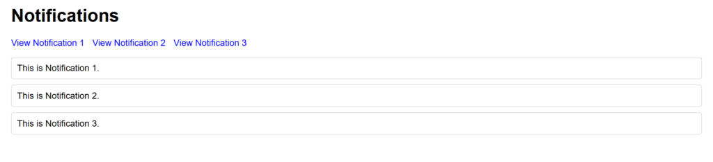
Figure 6 – Displaying the output of Using the :target Pseudo-Class in CSS (All notifications have a plain white background with a gray border.)
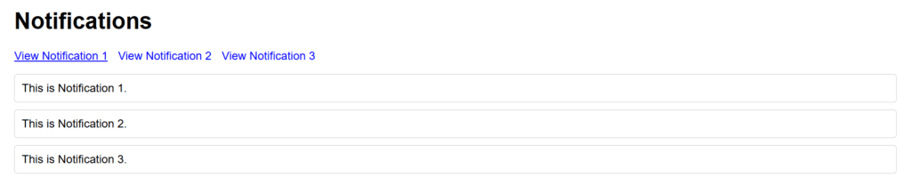
Figure 7 – When hovered, the URL is underlined
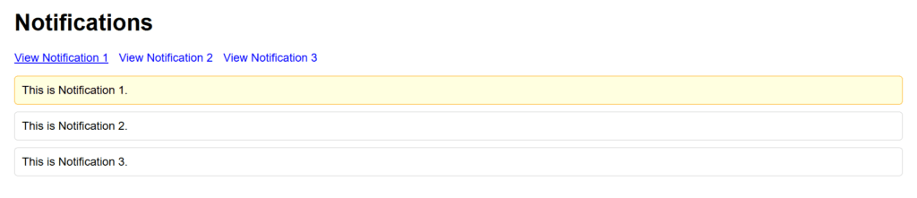
Figure 8 – Notification 1’s background turns light yellow, and its border becomes orange. (The same behavior applies for Notification 2 and Notification 3 when their respective links are clicked.)
Why Use This?
This example makes the :target pseudo-class easier to understand and may be used for interactive message displays, to-do lists, and navigation menus.
Using the Language Pseudo-Class (:lang)
CSS’s :lang pseudo-class styles elements according to the language that the HTML’s lang attribute specifies. This is especially helpful for giving multilingual websites customized designs.
Simple Example: Styling Text Based on Language
<!DOCTYPE html>
<html lang="en">
<head>
  <style>
    /* Default style */
    p {
      font-family: Arial, sans-serif;
      font-size: 16px;
      color: black;
    }
    /* Styling for French */
    p:lang(fr) {
      color: blue;
      font-style: italic;
    }
    /* Styling for Spanish */
    p:lang(es) {
      color: red;
      font-weight: bold;
    }
  </style>
</head>
<body>
  <h1>Language-Specific Styles</h1>
  <p lang="en">This is an English sentence.</p>
  <p lang="fr">Ceci est une phrase en français.</p>
  <p lang="es">Esta es una frase en español.</p>
</body>
</html>
Explanation
- HTML Structure:
- Each <p> element has a lang attribute specifying its language:
- lang=”en” for English
- lang=”fr” for French
- lang=”es” for Spanish
- CSS Styling:
- All <p> elements use the default styles.
- For French, the :lang(fr) pseudo-class applies italic styling and changes the text color to blue.
- For Spanish, the :lang(es) pseudo-class applies bold styling and red text coloration.
- Behavior:
- Depending on the language indicated by the lang parameter, the styles are applied dynamically.
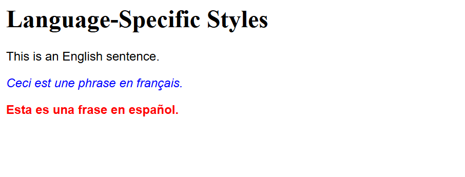
Figure 9 – Displaying the output of Using the Language Pseudo-Class (:lang) in CSS
This example demonstrates how the :lang pseudo-class enables language-specific styles in a straightforward way.
Using the UI Element States Pseudo-Classes
You can use CSS’s UI element state pseudo-classes to style elements according on their interactive states. These include states such as checked, chosen, enabled, and disabled. :enabled, :disabled, :checked, and :indeterminate are typical pseudo-classes for UI element states.
Example: Styling a Form with UI Element States
<!DOCTYPE html>
<html lang="en">
<head>
  <style>
    /* Default input style */
    input, select {
      padding: 10px;
      margin: 10px 0;
      border: 1px solid #ccc;
      border-radius: 5px;
      font-size: 14px;
    }
    /* Enabled input field */
    input:enabled {
      background-color: #f9f9f9;
    }
    /* Disabled input field */
    input:disabled {
      background-color: #e0e0e0;
      color: #888;
      cursor: not-allowed;
    }
    /* Checked checkbox */
    input[type="checkbox"]:checked + label {
      color: green;
      font-weight: bold;
    }
    /* Dropdown menu selected option */
    select:focus {
      border-color: blue;
    }
  </style>
</head>
<body>
  <h1>Form with UI Element States</h1>

  <!-- Input Fields -->
  <input type="text" placeholder="Enabled input (try typing)" enabled>
  <input type="text" placeholder="Disabled input" disabled>

  <!-- Checkbox -->
  <input type="checkbox" id="agree">
  <label for="agree">I agree to the terms</label>

  <!-- Dropdown -->
  <select>
    <option value="none" selected disabled>Choose an option</option>
    <option value="option1">Option 1</option>
    <option value="option2">Option 2</option>
    <option value="option3">Option 3</option>
  </select>
</body>
</html>
Explanation
- HTML Structure:
- The form has a dropdown menu, checkboxes, and text inputs, among other UI components.
- Certain fields display their various states using attributes like enabled, disabled, or checked.
- CSS Styling:
- :enabled: Styles enabled input fields with a white background.
- :disabled: Styles disabled input fields with a gray background and muted text and removed interactivity with the cursor: not-allowed.
- :checked: Styles a label associated with a checked checkbox by changing its color to green and making the text bold.
- :focus: Styles a focused dropdown menu by changing its border color to blue.
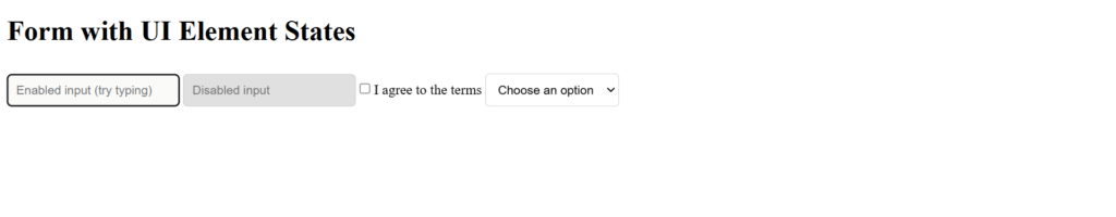
Figure 10 – Displaying the output of Using the UI Element States Pseudo-Classes in CSS
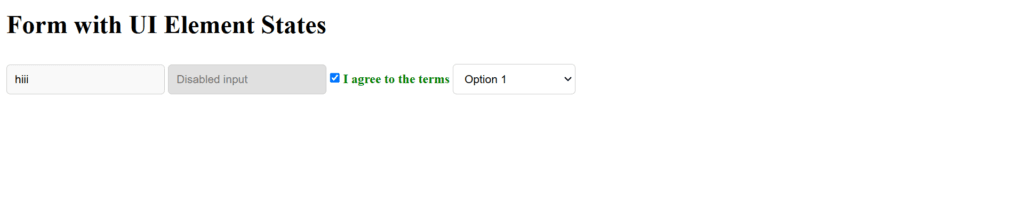
Figure 11 – Checkbox: The label for the checkbox appears normal initially. When the checkbox is checked, the label turns green and bold.
Dropdown Menu: When you click on the dropdown menu, its border color changes to blue, indicating focus.
This example shows how UI state pseudo-classes improve user interactions by applying dynamic styling to items according to their states.
Using Structural Pseudo-Classes
You can style items in CSS according to their relationship or position within the document tree by using structural pseudo-classes. :first-child, :last-child, :nth-child(), :nth-last-child(), :only-child, :empty, and others are examples of common structural pseudo-classes.
Example: Styling List Items Based on Structure
<!DOCTYPE html>
<html lang="en">
<head>
  <style>
    /* Default styling for all list items */
    li {
      padding: 10px;
      border: 1px solid #ccc;
      margin: 5px 0;
      border-radius: 5px;
      list-style-type: none;
    }

    /* Highlight the first item */
    li:first-child {
      background-color: lightblue;
      font-weight: bold;
    }

    /* Highlight the last item */
    li:last-child {
      background-color: lightgreen;
    }

    /* Highlight every even item */
    li:nth-child(even) {
      background-color: #f0f0f0;
    }

    /* Highlight every third item */
    li:nth-child(3n) {
      color: red;
      font-style: italic;
    }

    /* Highlight only children */
    ul.only-child-list > li:only-child {
      background-color: orange;
      font-size: 18px;
    }

    /* Highlight empty list items */
    li:empty {
      border: 1px dashed red;
      font-style: italic;
      color: gray;
    }
  </style>
</head>
<body>
  <h1>Structural Pseudo-Class Example</h1>

  <h2>Regular List</h2>
  <ul>
    <li>First item</li>
    <li>Second item</li>
    <li>Third item</li>
    <li>Fourth item</li>
    <li>Fifth item</li>
    <li></li> <!-- Empty item -->
  </ul>

  <h2>List with Only One Item</h2>
  <ul class="only-child-list">
    <li>Single item</li>
  </ul>
</body>
</html>
Explanation
- HTML Structure:
- There are two lists in the document: one with multiple items and another with just one.
- In order to illustrate the :empty pseudo-class, an empty <li> is added.
- CSS Styling:
- li:first-child: Gives the first list item a light blue background and bold text.
- li:last-child: Gives the final list item a light green background.
- The li:nth-child(even) style applies a light gray background to all even-numbered items.
- li:nth-child(3n): Italicizes and styles every third item with red text.
- li:only-child: Lists items that are the only child in their parent container using a special style.
- li:empty: Styles add gray italic lettering and a dashed red border to items that have no content.
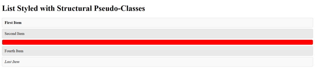
Figure 12 – Displaying the output of Using Structural Pseudo-Classes in CSS
This example shows how structural pseudo-classes can be used to enhance the design and usability of content based on its position or structure in the DOM.
Using the Negation Pseudo-Class (:not())
To prevent particular items from being targeted by a collection of styles, use CSS’s :not() pseudo-class. If an element doesn’t match a particular selector, you can still apply styles to it.
Example: Excluding Specific Elements
<!DOCTYPE html>
<html lang="en">
<head>
  <style>
    /* Default styling for all list items */
    li {
      padding: 10px;
      margin: 5px 0;
      border: 1px solid #ccc;
      border-radius: 5px;
      background-color: #f9f9f9;
      list-style-type: none;
    }

    /* Apply special styling to all items except the first one */
    li:not(:first-child) {
      background-color: lightblue;
    }

    /* Apply styling to all items except those with the class "exclude" */
    li:not(.exclude) {
      font-weight: bold;
    }

    /* Exclude specific nth-child items from having text color red */
    li:not(:nth-child(2)) {
      color: red;
    }
  </style>
</head>
<body>
  <h1>Negation Pseudo-Class Example</h1>
  <ul>
    <li>First item (excluded from lightblue background and bold)</li>
    <li class="exclude">Second item (excluded from bold and red text)</li>
    <li>Third item</li>
    <li>Fourth item</li>
  </ul>
</body>
</html>
Explanation
- HTML Structure:
- The list contains four items.
- The second item has a class exclude to demonstrate how it can be excluded using :not().
- CSS Styling:
- All list items have a light gray background, padding, and a border by default.
- All list items except the first one are given a light blue backdrop by using li:not(:first-child).
- li:not(.exclude): This adds bold text to every item in the list, excluding those that have the class exclude.
- Li:not(:nth-child(2)): Makes all list items—aside from the second one—red in color.
- Behavior:
- Precise stylistic control is possible thanks to the :not() pseudo-class, which dynamically excludes components that match the specified selector.
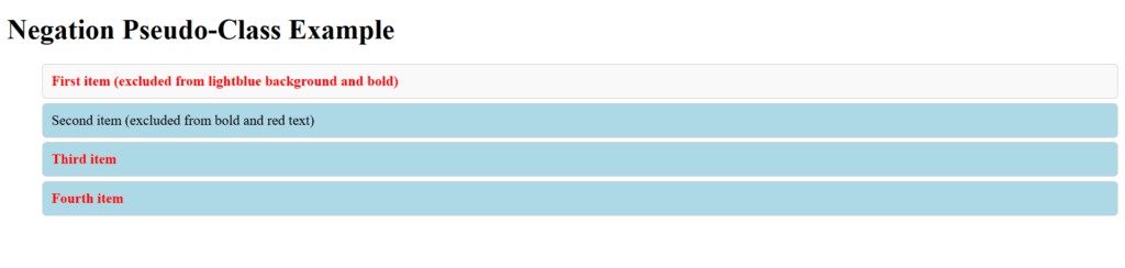
Figure 13 – Displaying the output of Using the Negation Pseudo-Class (:not()) in CSS
This example shows how the :not() pseudo-class is an effective tool for CSS style since it provides fine-grained control over which items are targeted.
Using the ::first-line Pseudo-Element
The first line of text in a block-level element can be styled using CSS’s ::first-line pseudo-element. It is frequently employed to draw attention to or accentuate a paragraph’s opening line.
Example: Styling the First Line of a Paragraph
<!DOCTYPE html>
<html lang="en">
<head>
  <style>
    /* Default styling for paragraphs */
    p {
      font-family: Arial, sans-serif;
      font-size: 16px;
      line-height: 1.5;
      margin: 20px 0;
      color: #333;
    }

    /* Styling for the first line of a paragraph */
    p::first-line {
      font-weight: bold;
      font-size: 18px;
      color: blue;
      text-transform: uppercase;
    }
  </style>
</head>
<body>
  <h1>Example of ::first-line Pseudo-Element</h1>
  <p>
    This is the first line of the paragraph that will appear bold, blue, and uppercase.
    The rest of the paragraph will follow the default styling, maintaining a standard font size and color.
  </p>
  <p>
    Here is another paragraph. The first line will have a unique style, making it stand out from the rest of the text in the paragraph.
  </p>
</body>
</html>
Explanation
- HTML Structure:
- Two <p> elements contain sample text.
- Each paragraph has multiple lines of text to demonstrate how only the first line is styled.
- CSS Styling:
- p: Sets the default font size, font family, line height, and color for the paragraph.
- p::first-line: Targets only the first line of the paragraph and applies:
- Bold font weight.
- Larger font size (18px).
- Blue text color.
- Uppercase text transformation.
- Behavior:
- Each paragraph’s opening line uses the styles specified in the ::first-line pseudo-element.
- The normal paragraph styles are maintained in the remaining lines.
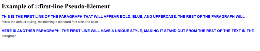
Figure 14 – Displaying the output of Using the ::first-line Pseudo-Element in CSS
This example shows how the ::first-line pseudo-element may be used to style particular text passages in a meaningful and visually unique way.
Using the ::first-letter Pseudo-Element
The first letter of the first line of a block-level element, like a paragraph, can be styled using CSS’s ::first-letter pseudo-element. It is frequently applied to typographic effects like highlighting and drop caps.
Example: Styling the First Letter of a Paragraph
<!DOCTYPE html>
<html lang="en">
<head>
  <style>
    /* Default styling for paragraphs */
    p {
      font-family: Arial, sans-serif;
      font-size: 16px;
      line-height: 1.5;
      margin: 20px 0;
      color: #333;
    }

    /* Styling for the first letter */
    p::first-letter {
      font-size: 36px;
      font-weight: bold;
      color: red;
      float: left;
      margin-right: 10px;
      line-height: 1;
    }
  </style>
</head>
<body>
  <h1>Example of ::first-letter Pseudo-Element</h1>
  <p>
    This is an example paragraph where the first letter has been styled using the `::first-letter` pseudo-element. It creates a drop cap effect, making the first letter larger and more prominent.
  </p>
  <p>
    The first letter in this paragraph is also styled in the same way, giving a consistent visual effect across multiple paragraphs.
  </p>
</body>
</html>
Explanation
- HTML Structure:
- Two <p> elements contain text to demonstrate how the ::first-letter pseudo-element works.
- CSS Styling:
- p: Establishes the paragraphs’ default line height, font family, and font size.
- p::first-letter: focuses on the paragraph’s initial letter and uses:
- 36 pixels is a larger font size to produce a “drop cap” appearance.
- bold font weight to bring emphasis on it.
- To make it stand out, the wording is red.
- To place the letter to the left of the text, use the float: left property.
- a 10-px right margin to leave room between the text and the letter.
- To align the drop cap vertically with the first line of text, use the line-height: 1 attribute.
- Behavior:
- While the rest of the text uses the usual paragraph styles, the first letter of each paragraph is styled using the ::first-letter rules.
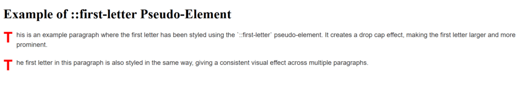
Figure 15 – Displaying the output of Using the ::first-letter Pseudo-Element in CSS
This example shows how the ::first-letter pseudo-element can highlight the first letter in a block of text, improving the text’s readability and visual attractiveness.
Using the ::before Pseudo-Element
In CSS, the ::before pseudo-element is used to place content before the real content of an element. It is frequently used to add text, icons, or decorative components before the primary content of an element without changing the HTML structure.
Example: Adding a Decorative Icon Before a Paragraph
<!DOCTYPE html>
<html lang="en">
<head>
  <style>
    /* Default styling for paragraphs */
    p {
      font-family: Arial, sans-serif;
      font-size: 16px;
      line-height: 1.5;
      margin: 20px 0;
      color: #333;
    }

    /* Add a decorative icon before the paragraph */
    p::before {
      content: "🔹";  /* Insert a bullet symbol */
      font-size: 24px;
      margin-right: 10px;
      vertical-align: middle;
    }
  </style>
</head>
<body>
  <h1>Example of ::before Pseudo-Element</h1>
  <p>
    This paragraph has a decorative icon placed before it using the `::before` pseudo-element.
    It is a simple way to add visual enhancements without modifying HTML content.
  </p>
  <p>
    Another paragraph that demonstrates the same effect of adding an icon before the text.
  </p>
</body>
</html>
Explanation
- HTML Structure:
- Two <p> elements contain text to demonstrate the use of the ::before pseudo-element.
- CSS Styling:
- p: Configures the paragraphs’ default font size, family, line height, and color.
- p::before: Uses the content property to add content before the paragraph text. The content in this instance is a bullet symbol (🔹).
- Font-size: 24 pixels enlarges the icon.
- margin-right: 10px creates a gap between the paragraph text and the icon.
- The icon will align vertically in the center of the line height if vertical-align: middle is used.
- Behavior:
- Each paragraph begins with the icon, and the remainder of the paragraph’s text is styled normally.
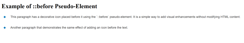
Figure 16 – Displaying the output of Using the ::before Pseudo-Element in CSS
In order to improve presentation without changing the underlying HTML structure, this example shows how to utilize the ::before pseudo-element to inject content before an element’s actual content.
Using the ::After Pseudo-Element
To add content after an element’s real content, use CSS’s ::after pseudo-element. Similar to ::before, it lets you dynamically add material without changing the HTML structure. Adding decorations, icons, or other content after the element is a common application for it.
Example: Adding a Decorative Icon After a Paragraph
<!DOCTYPE html>
<html lang="en">
<head>
  <style>
    /* Default styling for paragraphs */
    p {
      font-family: Arial, sans-serif;
      font-size: 16px;
      line-height: 1.5;
      margin: 20px 0;
      color: #333;
    }

    /* Add a decorative icon after the paragraph */
    p::after {
      content: " ✔";  /* Insert a checkmark symbol */
      font-size: 24px;
      margin-left: 10px;
      color: green;
    }
  </style>
</head>
<body>
  <h1>Example of ::after Pseudo-Element</h1>
  <p>
    This paragraph has a checkmark icon placed after it using the `::after` pseudo-element.
    It is a simple way to add visual enhancements after the content.
  </p>
  <p>
    Another paragraph that demonstrates the same effect of adding a checkmark after the text.
  </p>
</body>
</html>
Explanation
- HTML Structure:
- Two <p> elements contain text to demonstrate the use of the ::after pseudo-element.
- CSS Styling:
- p: Configures the paragraphs’ default font size, family, line height, and color.
- p::after: Uses the content property to add content after the paragraph text. The content in this instance is a checkmark (✔).
- Font-size: 24 pixels enlarges the icon.
- margin-left: adds 10 pixels to the distance between the icon and the paragraph text.
- color: green makes the checkmark icon’s color green.
- Behavior:
- Every paragraph is followed by the checkmark icon, which is spaced 10 pixels from the text.
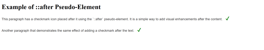
Figure 17 – Displaying the output of Using the ::After Pseudo-Element in CSS
Adding content after an element’s content with the ::after pseudo-element allows you to improve the design without changing the HTML, as this example shows.