Simple Methods of Using List Styles in CSS: To begin, first refer to how-to-make-use-of-list-styles-in-css
Using the list-style-type Property
For list items, the type of marker is specified by the list-style-type property in CSS. You can alter the look of both sorted (<ol>) and unordered (<ul>) lists using this flexible attribute.
Syntax
list-style-type: value;value: Indicates the style of the marker.
Common Values
| Value | Description |
| disc | A solid circle (default for <ul>). |
| circle | A hollow circle. |
| square | A solid square. |
| none | No marker is displayed. |
| decimal | Numbers (1, 2, 3, …, default for <ol>). |
| decimal-leading-zero | Numbers with leading zeros (01, 02, 03, …). |
| lower-roman | Lowercase Roman numerals (i, ii, iii, …). |
| upper-roman | Uppercase Roman numerals (I, II, III, …). |
| lower-alpha | Lowercase letters (a, b, c, …). |
| upper-alpha | Uppercase letters (A, B, C, …). |
| armenian | Armenian numbering. |
| georgian | Georgian numbering. |
| cjk-ideographic | Traditional Chinese-Japanese-Korean ideographic numbering. |
Example 1: Unordered List with Different Markers
<!DOCTYPE html>
<html lang="en">
<head>
  <style>
    ul.default {
      list-style-type: disc;
    }

    ul.hollow {
      list-style-type: circle;
    }

    ul.square {
      list-style-type: square;
    }

    ul.none {
      list-style-type: none;
    }
  </style>
</head>
<body>
  <h3>Default Marker (Disc)</h3>
  <ul class="default">
    <li>Item 1</li>
    <li>Item 2</li>
    <li>Item 3</li>
  </ul>

  <h3>Hollow Circle Marker</h3>
  <ul class="hollow">
    <li>Item 1</li>
    <li>Item 2</li>
    <li>Item 3</li>
  </ul>

  <h3>Square Marker</h3>
  <ul class="square">
    <li>Item 1</li>
    <li>Item 2</li>
    <li>Item 3</li>
  </ul>

  <h3>No Marker</h3>
  <ul class="none">
    <li>Item 1</li>
    <li>Item 2</li>
    <li>Item 3</li>
  </ul>
</body>
</html>
Example 2: Ordered List with Numbering Styles
<!DOCTYPE html>
<html lang="en">
<head>
  <style>
    ol.default {
      list-style-type: decimal;
    }

    ol.leading-zero {
      list-style-type: decimal-leading-zero;
    }

    ol.roman {
      list-style-type: upper-roman;
    }

    ol.alpha {
      list-style-type: lower-alpha;
    }
  </style>
</head>
<body>
  <h3>Default Numbers</h3>
  <ol class="default">
    <li>First item</li>
    <li>Second item</li>
    <li>Third item</li>
  </ol>

  <h3>Numbers with Leading Zeros</h3>
  <ol class="leading-zero">
    <li>First item</li>
    <li>Second item</li>
    <li>Third item</li>
  </ol>

  <h3>Uppercase Roman Numerals</h3>
  <ol class="roman">
    <li>First item</li>
    <li>Second item</li>
    <li>Third item</li>
  </ol>

  <h3>Lowercase Letters</h3>
  <ol class="alpha">
    <li>First item</li>
    <li>Second item</li>
    <li>Third item</li>
  </ol>
</body>
</html>
Explanation
- Unordered Lists:
- Default: Uses the default
discmarker. - Hollow Circle: Change the marker to a hollow circle (
circle). - Square: Uses a square (
square). - No Marker: Removes the marker entirely (
none).
- Default: Uses the default
- Ordered Lists:
- Decimal: Uses standard numbering (
1, 2, 3,...). - Decimal Leading Zero: Numbers with a leading zero (
01, 02, 03,...). - Roman Numerals: Uses uppercase Roman numerals (
I, II, III,...). - Alphabetical: Uses lowercase letters (
a, b, c,...).
- Decimal: Uses standard numbering (
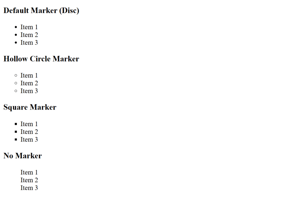
Figure 1 – Displaying the output of an Unordered List with Different Markers
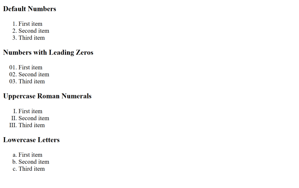
Figure 2 – Displaying the output of an Ordered List with Numbering Styles
In web design, this demonstrates how the list-style-type attribute may be used to create visually appealing and organized lists.
Using the list-style-image Property
List items can have a custom image used as their marker (bullet) thanks to the list-style-image property. By using this, you can substitute your preferred image for the standard marker styles (such as disc, circle, or numerals).
Syntax
list-style-image: url('image-path') | none;- The URL of the picture to be used as the marker is specified by url(‘image-path’).
- none: By default, no picture is specified as the marker.
Default Value
The browser uses the list-style-type by default when the value is zero, indicating that no custom image is used.
Practical Notes
- Image Size: The marker’s size is dictated by the image’s initial measurements. To prevent layout problems, make sure the image is the right size.
- Fallback: In the event that the picture fails to load, always provide a fallback list-style-type.
- Alignment: To align list text with markers, particularly for larger photos, use CSS values like padding-left or margin-left.
Example: Styled List
<!DOCTYPE html>
<html lang="en">
<head>
  <style>
    ul.custom {
      list-style-image: url('square-icon.png'); /* Custom bullet image */
      margin-left: 50px;
    }

    ul.custom li {
      font-size: 1.2em;
      color: #333; /* Custom text styling */
    }
  </style>
</head>
<body>
  <h3>Custom Image Marker</h3>
  <ul class="custom">
    <li>First item with a custom marker</li>
    <li>Second item with a custom marker</li>
    <li>Third item with a custom marker</li>
  </ul>
</body>
</html>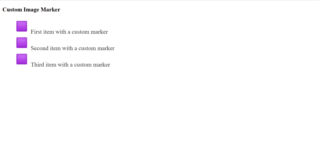
Figure 3 – Displaying the output of using the list-style-image Property
- Make sure the personalized marker image is aesthetically pleasing and does not impede legibility.
- List-style-type can be used to provide a fallback style for accessibility and graceful degradation.
You may make visually beautiful and distinctive list styles that complement your website’s design and improve user experience by utilizing the list-style-image property.
Using the list-style-position property
The list-style-position attribute determines whether a list’s marker—such as a bullet, number, or custom image—is positioned inside or outside the list items’ text flow.
Syntax
list-style-position: inside | outside;- inner: The marker is positioned inside the list item’s content block. The marker is encircled with text.
- outside: By default, the marker is positioned outside the list item’s content block. The margin is in line with the text.
Default Value
The text is indented and the marker appears outside the content block when the default value is outside.
Notes
- Readability: For longer texts or nested lists, use the outdoors for improved readability.
- Use inside to highlight the list markers or for little designs.
- Alignment: When deciding on the marker position, take alignment and design aesthetics into account.
- Accessibility: Verify that the location of the marker does not obstruct the ability to distinguish text from markers.
Example:
<!DOCTYPE html>
<html lang="en">
<head>
  <style>
    ul.outside {
      list-style-type: disc;
      list-style-position: outside;
    }

    ul.inside {
      list-style-type: square;
      list-style-position: inside;
    }
  </style>
</head>
<body>
  <h3>Comparison of Marker Positions</h3>

  <h4>Outside Position:</h4>
  <ul class="outside">
    <li>This is a longer item with an outside marker.</li>
    <li>The text is indented uniformly.</li>
  </ul>

  <h4>Inside Position:</h4>
  <ul class="inside">
    <li>This is a longer item with an inside marker.</li>
    <li>The text aligns with the marker.</li>
  </ul>
</body>
</html>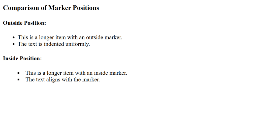
Figure 4 – Displaying the output of using the list-style-position Property
For developers to accomplish desired visual effects in lists, the list-style-position property is a crucial tool for managing the alignment and layout of list markers in relation to the text.
Using the list-style shorthand Property
All of the list-related properties, including list-style-type, list-style-position, and list-style-image, can be specified in a single declaration using the list-style shorthand property. It keeps your code cleaner and makes your CSS simpler.
Syntax
list-style: [list-style-type] || [list-style-position] || [list-style-image];- Although the values can be given in any order,
- The type of marker (such as a disc, circle, square, etc.) is specified by the list-style-type parameter.
- list-style-position: Indicates whether the marker is inside or outside.
- list-style-image: Provides a custom image (such as url(‘image-path’)) as the marker.
Default Value
list-style: disc outside none;Notes
- Order of Properties: In the abbreviated declaration, the order is irrelevant.
- Fallback Behavior: The browser utilizes the default or provided fallback values for list-style-type and list-style-position if one property (such as list-style-image) fails or is not supplied.
- Compactness: Less redundant CSS code is produced by the shorthand declaration.
Example
<!DOCTYPE html>
<html lang="en">
<head>
  <style>
    ul.shorthand {
      list-style: url('square-icon.png') inside square;
    }
  </style>
</head>
<body>
  <h3>Shorthand List Example</h3>
  <ul class="shorthand">
    <li>Custom bullet with image</li>
    <li>Inside position</li>
    <li>Square fallback</li>
  </ul>
</body>
</html>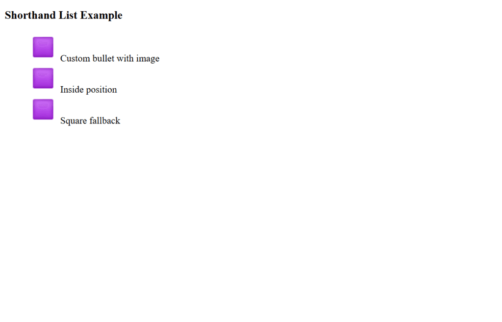
Figure 5 – Displaying the output of using the list-style shorthand Property
You may effectively manage and modify your list styles in a single, tidy declaration by utilizing the list-style shorthand property, which will make your CSS more manageable and concise.
Creating Horizontal List
A horizontal list, as compared to the default vertical arrangement, shows its entries side by side. Using CSS, mainly the display, flexbox, or inline-block properties, the list can be styled to do this.
Steps to Create a Horizontal List
- Remove Default List Styles:
- Browsers automatically apply styles, such as padding and bullets, to lists.
- List-style: none; can be used to get rid of the default markers.
- Make List Items Horizontal:
- For alignment, use CSS Flexbox, display: inline;, or display: inline-block;.
- Adjust Spacing:
- To create space between things, use CSS properties like gap, padding, and margin.
HTML and CSS: Horizontal List Example
<!DOCTYPE html>
<html lang="en">
<head>
  <meta charset="UTF-8">
  <meta name="viewport" content="width=device-width, initial-scale=1.0">
  <title>Horizontal List Example</title>
  <style>
    /* Reset default list styles */
    ul {
      list-style: none;
      padding: 0;
      margin: 0;
    }

    /* Navigation bar styling */
    .navbar {
      display: flex; /* Flexbox for horizontal alignment */
      background-color: #333; /* Dark background */
      padding: 10px 0; /* Top and bottom padding */
      justify-content: center; /* Center items horizontally */
    }

    /* Individual list items */
    .navbar li {
      margin: 0 15px; /* Space between items */
    }

    /* Link styling */
    .navbar a {
      text-decoration: none; /* Remove underline */
      color: white; /* White text color */
      font-size: 18px; /* Font size */
      font-family: Arial, sans-serif; /* Font family */
      padding: 8px 12px; /* Padding inside the link */
      display: block; /* Ensures clickable area spans the link */
      transition: background-color 0.3s ease; /* Smooth hover effect */
    }

    /* Hover effect for links */
    .navbar a:hover {
      background-color: #575757; /* Slightly lighter background on hover */
      border-radius: 5px; /* Rounded corners for hover effect */
    }

    /* Responsive design for smaller screens */
    @media (max-width: 600px) {
      .navbar {
        flex-direction: column; /* Stack items vertically */
        align-items: center; /* Center items */
      }

      .navbar li {
        margin: 10px 0; /* Add vertical spacing */
      }
    }
  </style>
</head>
<body>
  <h3 style="text-align: center;">Responsive Horizontal List</h3>
  <ul class="navbar">
    <li><a href="#">Home</a></li>
    <li><a href="#">About</a></li>
    <li><a href="#">Services</a></li>
    <li><a href="#">Portfolio</a></li>
    <li><a href="#">Contact</a></li>
  </ul>
</body>
</html>
Explanation
- Structure:
- An unordered list is produced using the <ul> element.
- Navigable links are represented by the <a> element that is contained in every <li>.
- Features of CSS:
- Flexbox (display: flex): Horizontally aligns the elements in the list.
- justify-content: the elements are centered.
- When a user hovers over a link, Hover Effects adds rounded corners and modifies the background color.
- When the screen width is less than 600 pixels, the @media query transforms the list into a vertical stack in accordance with responsive design.
- Style:
- list-style: None: eliminates the standard bullet points.
- Padding and margin: Provides distance between objects and guarantees a tidy arrangement.
- transition: Offers a seamless change in backdrop color when hovered over.
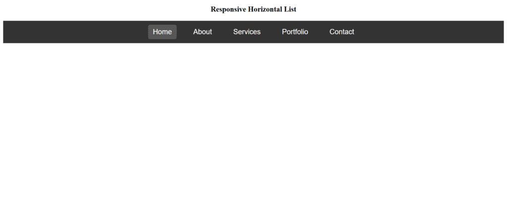
Figure 6 – Displaying the output of creating a horizontal list in CSS
Horizontal lists are flexible and can be designed for several applications, including toolbars, breadcrumbs, and navigation menus. You may make neat, eye-catching horizontal lists that improve user experience by utilizing CSS attributes like display: inline, inline-block, or Flexbox.