Simple Methods of Creating Boxes in CSS: To Begin, first refer to – know-how-to-create-boxes-and-columns-using-css
Working with Padding in CSS
In CSS, padding is the distance between an element’s border and content. It improves layout readability and design attractiveness by creating inner spacing. If the box-sizing property is set to content-box (default), padding adds to the element’s overall dimensions but has no effect on the border or margin’s size.
Example with Explanation
<!DOCTYPE html>
<html lang="en">
<head>
  <meta charset="UTF-8">
  <meta name="viewport" content="width=device-width, initial-scale=1.0">
  <title>Padding Example</title>
  <style>
    .box {
      width: 200px;
      height: 100px;
      background-color: lightblue;
      border: 2px solid navy;
      padding: 20px; /* Adds 20px space inside the box */
    }

    .box-different {
      width: 200px;
      height: 100px;
      background-color: lightgreen;
      border: 2px solid darkgreen;
      padding: 10px 20px 30px 40px; /* Different padding for each side */
    }
  </style>
</head>
<body>
  <div class="box">This box has uniform padding.</div>
  <div class="box-different">This box has varied padding.</div>
</body>
</html>
Explanation
- First Box (.box):
- Padding: 20px on all sides.
- Content has 20px of spacing from the border, making the inner area larger.
- Output: A blue box with text centered inside (due to equal padding).
- Second Box (.box-different):
- Padding: Different values for each side:
- top: 10px
- right: 20px
- bottom: 30px
- left: 40px
- The spacing inside the box varies, making the content shift towards the top-right corner.
- Padding: Different values for each side:
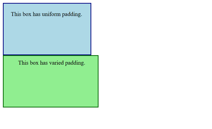
Figure 1 – Displaying the Output of using padding in CSS
Output
- First Box:
- The text is surrounded by a blue, rectangular box with equal spacing.
- Second Box:
- The text appears off-center in a rectangular green box with extra room at the left and bottom.
Practical Notes
Padding and Box Sizing:
- By default, padding increases an element’s size:
box-sizing: content-box; /* Default behavior */- To include padding within the defined dimensions:
box-sizing: border-box;Responsiveness:
- Use relative units like em or % for flexible designs.
CSS Padding Properties
padding (shorthand):
- Sets padding for all sides (top, right, bottom, left) in a single declaration.
- Example
div {
  padding: 20px; /* Applies 20px padding to all sides */
}
padding-top:
- Sets the padding for the top side.
- Example
div {
  padding-top: 20px;
}
padding-right:
- Sets the padding for the right side.
padding-bottom:
- Sets the padding for the bottom side.
padding-left:
- Sets the padding for the left side.
Shorthand Variants:
- One Value: Applies the same padding to all sides
padding: 20px; /* Top, Right, Bottom, Left = 20px */- Two Values: First value applies to top and bottom, second to left and right.
padding: 20px 40px; /* Top/Bottom = 20px, Left/Right = 40px */- Three Values: First value is top, second is left and right, third is bottom.
padding: 20px 40px 10px; /* Top = 20px, Left/Right = 40px, Bottom = 10px */- Four Values: Values apply in clockwise order: top, right, bottom, left.
padding: 20px 40px 10px 5px; /* Top = 20px, Right = 40px, Bottom = 10px, Left = 5px */With its aesthetic and practical advantages, padding is an essential tool for enhancing layout structure and spacing elements.
Working with Border Properties in CSS
You can specify the style, width, and color of an element’s border using CSS’s border properties. In addition to improving an element’s aesthetic appeal, borders can be used to highlight or divide areas of a webpage.
Border Properties:
- border (Shorthand):
- Combines border-width, border-style, and border-color in one declaration.
- Example
div {
  border: 2px solid blue;
}- border-width:
- indicates how thick the border is.
- Values can be thin, medium, thick, or a certain dimension (e.g., 0.5em, 2px).
- Border-style:
- gives details about the border’s style.
- Common designs include inset, outset, none, groove, ridge, solid, dotted, dashed, double, and hidden.
- border color:
- tells you the border’s color.
- accepts RGB or HSL, specified colors, or hex values.
- Individual Sides:
- Manage the border on each side independently:
- The top, right, bottom, and left borders
- Additional Properties:
- border-radius: Rounds an element’s corners.
- border-image: Uses an image to create a border.
Example with Explanation
<!DOCTYPE html>
<html lang="en">
<head>
  <meta charset="UTF-8">
  <meta name="viewport" content="width=device-width, initial-scale=1.0">
  <title>Border Properties Example</title>
  <style>
    /* Basic Border */
    .basic-border {
      width: 300px;
      height: 100px;
      background-color: lightyellow;
      border: 2px solid black; /* Shorthand for width, style, and color */
    }

    /* Different Styles */
    .dashed-border {
      width: 300px;
      height: 100px;
      background-color: lightblue;
      border: 3px dashed blue;
    }

    /* Border with Rounded Corners */
    .rounded-border {
      width: 300px;
      height: 100px;
      background-color: lightgreen;
      border: 4px solid green;
      border-radius: 15px; /* Rounds the corners */
    }

    /* Individual Sides */
    .custom-border {
      width: 300px;
      height: 100px;
      background-color: lightpink;
      border-top: 5px solid red;
      border-right: 3px dashed purple;
      border-bottom: 4px double orange;
      border-left: 2px solid brown;
    }
  </style>
</head>
<body>
  <h2>Border Examples</h2>
  <div class="basic-border">This is a basic border.</div>
  <br>
  <div class="dashed-border">This border is dashed.</div>
  <br>
  <div class="rounded-border">This border has rounded corners.</div>
  <br>
  <div class="custom-border">This border has custom styles for each side.</div>
</body>
</html>
Explanation
- Basic Border (.basic-border):
- A black border with 2px width and solid style is applied.
- Output: A rectangle with a clean black border surrounding the yellow background.
- Dashed Border (.dashed-border):
- A 3px wide border with a dashed style and blue color.
- Output: A rectangle with dashed blue lines around the light blue background.
- Rounded Border (.rounded-border):
- Adds border-radius: 15px to round the corners.
- Output: A green-bordered rectangle with smooth, rounded corners.
- Custom Sides (.custom-border):
- Applies different border styles, colors, and widths to each side:
- Top: 5px solid red
- Right: 3px dashed purple
- Bottom: 4px double orange
- Left: 2px solid brown
- Output: A pink box with unique border styles on each side.
- Applies different border styles, colors, and widths to each side:
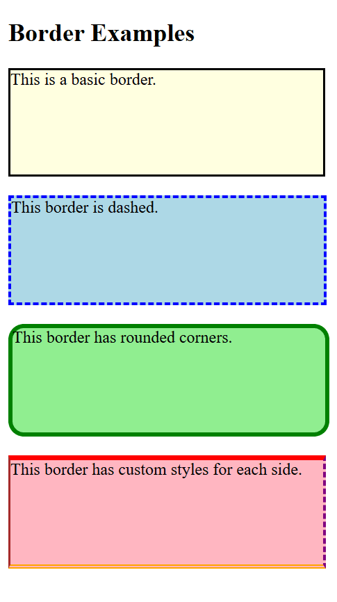
Figure 2 – Displaying the Output of using borders in CSS
Key Points
- For simple borders, use border shorthand; for more precise control, use border-*.
- For rounder designs, combine border-radius.
- To make borders that stand out, use the border-style options.
- For flexibility, responsive designs can employ percentage-based values for attributes like border-radius.
Borders are an essential CSS design feature because they give structure and visual difference to web elements.
Working with Margin
To effectively separate an element from its neighbors, the margin property in CSS is used to create space outside the element’s border. In order to arrange items and manage layout spacing, margins are essential.
CSS Margin Properties
margin (Shorthand):
- Defines the margin for all four sides (top, right, bottom, left) in a single declaration.
- Example
div {
  margin: 20px; /* Adds 20px margin to all sides */
}
Individual Side Margins:
- Manage each side separately: margin-top, margin-right, margin-bottom, and margin-left, for example.
div {
  margin-top: 10px;
  margin-right: 20px;
  margin-bottom: 15px;
  margin-left: 25px;
}
Shorthand Variants:
- One Value: Applies the same margin to all sides
margin: 20px; /* Top, Right, Bottom, Left = 20px */- Two Values: First value applies to top and bottom, second to left and right.
margin: 10px 20px; /* Top/Bottom = 10px, Left/Right = 20px */- Three Values: First value is top, second is left and right, third is bottom.
margin: 10px 20px 30px; /* Top = 10px, Left/Right = 20px, Bottom = 30px */- Four Values: Values apply in clockwise order: top, right, bottom, left.
margin: 10px 20px 30px 40px; /* Top = 10px, Right = 20px, Bottom = 30px, Left = 40px */Auto Margin:
- Used to center elements horizontally within a container.
- Example
div {
  width: 50%;
  margin: 0 auto; /* Center the element horizontally */
}
Negative Margins:
- Pulls the element closer to its neighbors, potentially overlapping.
- Example
div {
  margin-top: -10px;
}
Example with Explanation
<!DOCTYPE html>
<html lang="en">
<head>
  <meta charset="UTF-8">
  <meta name="viewport" content="width=device-width, initial-scale=1.0">
  <title>CSS Margin Example</title>
  <style>
    /* Default margin for demonstration */
    .box {
      width: 200px;
      height: 100px;
      background-color: lightblue;
    }

    /* Uniform margin */
    .margin-uniform {
      margin: 20px;
    }

    /* Different margins for each side */
    .margin-different {
      margin: 10px 15px 20px 25px; /* Top, Right, Bottom, Left */
    }

    /* Centered horizontally */
    .margin-auto {
      margin: 20px auto;
    }

    /* Negative margin */
    .margin-negative {
      margin-top: -10px;
    }
  </style>
</head>
<body>
  <h2>Margin Examples</h2>
  <div class="box margin-uniform">Uniform Margin</div>
  <div class="box margin-different">Different Margins</div>
  <div class="box margin-auto">Centered Horizontally</div>
  <div class="box margin-negative">Negative Margin</div>
</body>
</html>
Explanation
- (.margin-uniform) Uniform Margin:
- margin: 20px; adds 20px of space to the element’s sides.
- The output shows that the box is 20 pixels apart from other items.
- Different Margins (.margin-different):
- 10px 15px 20px 25px margin; applies:
- Bottom: 20px, Right: 15px, Top: 10px, Left: 25px
- Output: The box is not evenly spaced.
- 10px 15px 20px 25px margin; applies:
- Horizontally Centered (.margin-auto):
- The element is horizontally centered within its container with a margin of 20px auto.
- Output: There are 20 pixels between the top and bottom of the box, which is horizontally centered.
- Margin-negative (.margin-negative):
- margin-top: -10px; causes the element to overlap the preceding element by reducing the space above it.
- The box moves 10 pixels closer to the piece above it.
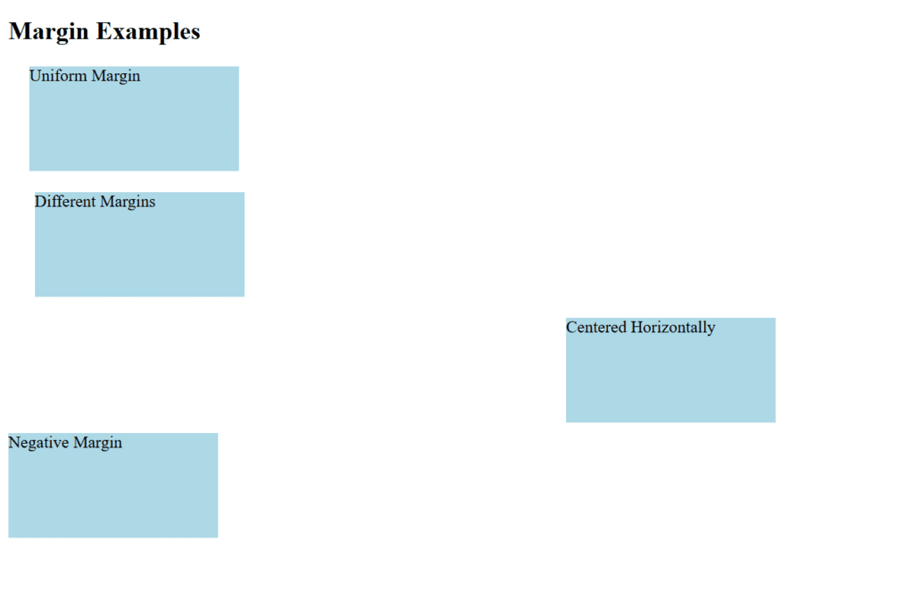
Figure 3 – Displaying the Output of using margins in CSS
Key Points
- The outward spacing of an element is defined by its margins.
- To horizontally center block-level components, use auto.
- Combine with additional box model attributes (borders, padding) to create layouts that work.
- Although negative margins have a lot of power, they should be used carefully to prevent overlapping problems.
In web layouts, margins are crucial for producing designs that are neat, well-spaced, and visually appealing.
Working with Rounded Corners
The border-radius attribute in CSS is used to create rounded corners. By adjusting the radius of an element’s corners, you can give them a rounded rather than harsh appearance.
border-radius Property
Several values can be entered into the border-radius property to adjust how round the corners are:
Single Value:
- Applies the same radius to all four corners.
- Example
border-radius: 10px;Two Values:
- First value applies to top-left and bottom-right.
- Second value applies to top-right and bottom-left.
- Example
border-radius: 10px 20px;Four Values:
- Values apply in clockwise order: top-left, top-right, bottom-right, bottom-left.
- Example
border-radius: 10px 20px 30px 40px;Elliptical Corners:
- You can specify horizontal and vertical radii using /.
- Example
border-radius: 50px / 25px;Example with Explanation
<!DOCTYPE html>
<html lang="en">
<head>
  <meta charset="UTF-8">
  <meta name="viewport" content="width=device-width, initial-scale=1.0">
  <title>Rounded Corners Example</title>
  <style>
    /* Basic Rounded Corners */
    .box-basic {
      width: 200px;
      height: 100px;
      background-color: lightblue;
      border: 2px solid navy;
      border-radius: 15px; /* Same radius for all corners */
    }

    /* Different Corner Radius */
    .box-different {
      width: 200px;
      height: 100px;
      background-color: lightgreen;
      border: 2px solid green;
      border-radius: 20px 10px 30px 5px; /* Different radius for each corner */
    }

    /* Elliptical Corners */
    .box-elliptical {
      width: 200px;
      height: 100px;
      background-color: lightcoral;
      border: 2px solid darkred;
      border-radius: 50px / 25px; /* Elliptical corners */
    }

    /* Circular Shape */
    .circle {
      width: 100px;
      height: 100px;
      background-color: lightyellow;
      border: 2px solid goldenrod;
      border-radius: 50%; /* Perfect circle */
    }
  </style>
</head>
<body>
  <h2>Rounded Corners Examples</h2>
  <div class="box-basic">Basic Rounded Corners</div>
  <br>
  <div class="box-different">Different Corner Radius</div>
  <br>
  <div class="box-elliptical">Elliptical Corners</div>
  <br>
  <div class="circle"></div>
</body>
</html>
Explanation
Basic Rounded Corners (.box-basic):
- border-radius: 15px; applies a uniform 15px rounding to all four corners.
- Output: A rectangular box with smooth, rounded corners.
Different Corner Radius (.box-different):
- border-radius: 20px 10px 30px 5px; creates:
- top-left: 20px, top-right: 10px, bottom-right: 30px, bottom-left: 5px
- Output: A rectangular box with uniquely rounded corners.
Elliptical Corners (.box-elliptical):
- Using the border radius of 50px/25px, elliptical corners with distinct horizontal (50px) and vertical (25px) radii are produced.
- The output is a box with elliptical corners stretched.
Circular Shape (.circle):
- transforms a square element into a perfect circle with a border-radius of 50%.
- A yellow, round box is the output.
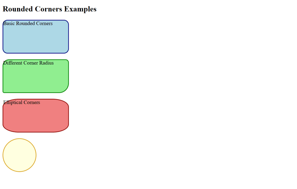
Figure 4 – Displaying the Output of using Rounded Corners in CSS
Key Points
- For visually pleasing designs such as buttons or card layouts, use border-radius.
- For interactive features, combine with hover effects.
- For making circular elements, a border-radius of 50% works well.
By reducing sharp edges in layouts, rounded corners improve user experience and the aesthetics of online designs.
Creating Borders with Images and Shadows in CSS
With CSS, you can use images and shadows to improve the borders’ visual appeal. The box-shadow property adds depth to your elements by creating shadow effects, while the border-image property allows you to utilize an image as a border.
Border with Images: border-image
An image can be defined as a border using the border-image property. It divides the picture into parts and repeats, tiles, or stretches them around the object.
Key Properties:
- border-image-source: Indicates the picture that will be used as the border.
- border-image-slice: Creates slices out of the image.
- border-image-repeat: Controls the border’s repetition (e.g., round, stretch, repeat).
Shadows with box-shadow
An element’s box can have shadows applied to it using the box-shadow attribute. For a single element, it can produce many shadows as well as inner or outer shadows.
Key Values:
- The shadow is moved horizontally using the horizontal offset.
- The shadow is moved vertically with vertical offset.
- Blur Radius: Regulates how crisp the shadow is.
- The spread radius causes the shadow to enlarge or contract.
- Shadow Color: Indicates the shadow’s color.
Example with Explanation
<!DOCTYPE html>
<html lang="en">
<head>
  <meta charset="UTF-8">
  <meta name="viewport" content="width=device-width, initial-scale=1.0">
  <title>CSS Border Image and Shadow</title>
  <style>
    /* Basic Image Border */
    .border-image-box {
      width: 300px;
      height: 150px;
      border: 20px solid transparent; /* Reserve space for the border image */
      border-image-source: url('https://via.placeholder.com/150'); /* Image URL */
      border-image-slice: 30; /* Divide the image into slices */
      border-image-repeat: round; /* Repeat the slices to fill the border */
    }

    /* Shadow Example */
    .shadow-box {
      width: 300px;
      height: 150px;
      background-color: lightblue;
      border: 2px solid navy;
      box-shadow: 10px 10px 15px rgba(0, 0, 0, 0.5); /* Outer shadow */
    }

    /* Image Border and Shadow */
    .image-shadow-box {
      width: 300px;
      height: 150px;
      border: 15px solid transparent;
      border-image-source: url('https://via.placeholder.com/150');
      border-image-slice: 20;
      border-image-repeat: stretch;
      box-shadow: 10px 10px 15px rgba(0, 0, 0, 0.5); /* Add shadow effect */
    }
  </style>
</head>
<body>
  <h2>CSS Border with Image and Shadows</h2>

  <h3>Border with Image</h3>
  <div class="border-image-box">Image Border</div>
  <br>

  <h3>Box with Shadow</h3>
  <div class="shadow-box">Shadowed Box</div>
  <br>

  <h3>Image Border with Shadow</h3>
  <div class="image-shadow-box">Image Border + Shadow</div>
</body>
</html>
Explanation
Border with Image (.border-image-box):
- order-image-source: Indicates the picture that will be used as the border.
- border-image-slice: This function divides the picture into parts for the borders.
- border-image-repeat: round: Assures that the image is uniformly repeated along the edge.
- The result is a box with a custom image border.
Shadow Example (.shadow-box):
- box-shadow: Produces a shadow with a rightward-moving 10px horizontal offset.
- 10px vertical offset (downward movement).
- Blur radius of 15 pixels (soft edges).
- color rgba (0, 0, 0, 0.5) (black that is semi-transparent).
- A light blue box with a subtle shadow is the result.
Image Border with Shadow (.image-shadow-box):
- creates a stylish appearance by combining box-shadow with border-image.
- Output: A box with a shadow and a custom image border that gives it a visually distinct.
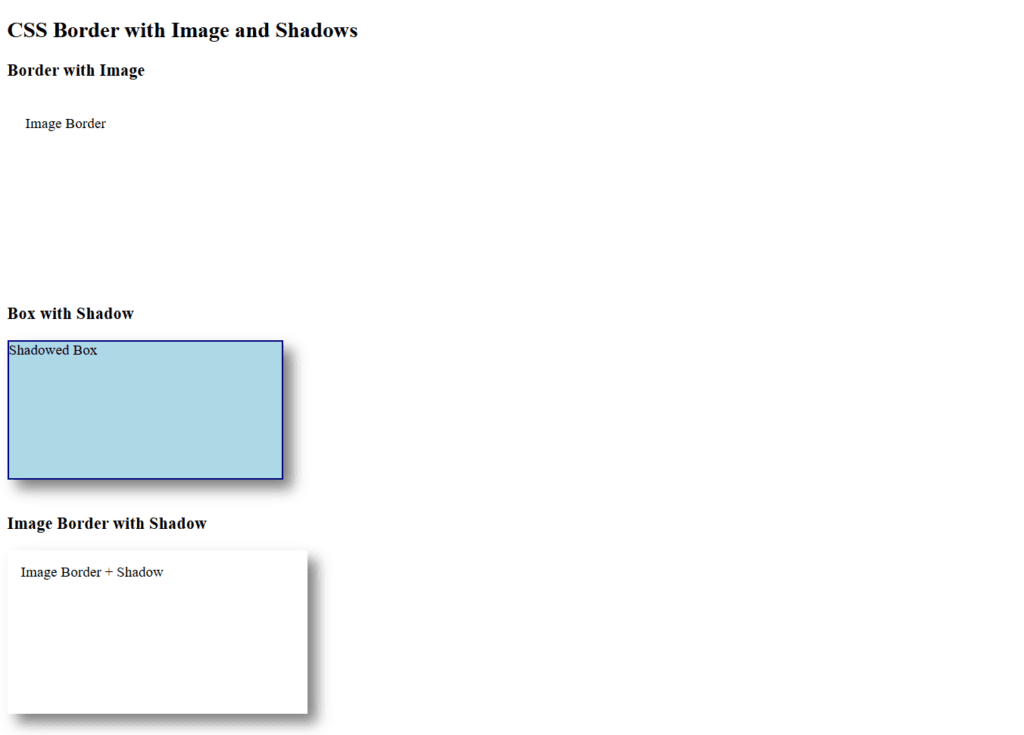
Figure 5 – Displaying the Output of Creating Borders with Images and Shadows in CSS
Key Points
- Although border pictures produce distinctive designs, they must be carefully chosen.
- Box-shadow gives things depth and dimension, which improves them.
- Combining both techniques can produce modern, visually appealing designs.
These properties are perfect for creating standout cards, containers, or decorative elements in your web designs. For more examples click here