Simple Methods of Using Text Styles in CSS: To begin, First, refer to know-what-text-styles-are-in-css
Using the text-transform property
The text-transform CSS property controls the capitalization of text, allowing you to change the appearance of text without altering its underlying content. This is really helpful for styling headlines, titles, or particular textual parts.
Values of text-transform
- none:
- Default value. No transformation is applied.
- Text appears as it is in the source.
- capitalize:
- Capitalizes the first letter of each word.
- uppercase:
- Converts all letters to uppercase.
- lowercase:
- Converts all letters to lowercase.
- initial:
- Resets the property to its default value (none).
- inherit:
- Inherits the value from the parent element.
Syntax
text-transform: value;Example
<!DOCTYPE html>
<html lang="en">
<head>
    <meta charset="UTF-8">
    <meta name="viewport" content="width=device-width, initial-scale=1.0">
    <title>Text Transform Example</title>
    <style>
        body {
            font-family: Arial, sans-serif;
            font-size: 16px;
        }
        .none {
            text-transform: none;
        }
        .capitalize {
            text-transform: capitalize;
        }
        .uppercase {
            text-transform: uppercase;
        }
        .lowercase {
            text-transform: lowercase;
        }
    </style>
</head>
<body>
    <h1>Using Text Transform</h1>
    <p class="none">This text uses the default setting (none).</p>
    <p class="capitalize">this text uses capitalize.</p>
    <p class="uppercase">This text uses uppercase.</p>
    <p class="lowercase">THIS TEXT USES LOWERCASE.</p>
</body>
</html>
Explanation
- None:
- The.none class preserves the text exactly as it is found in the HTML source.
- Capitalize:
- Every word’s initial letter is capitalized by the .capitalize class.
- Uppercase:
- All of the text’s letters are changed to uppercase by the .uppercase class.
- Lowercase:
- Every letter in the text is changed to lowercase using the .lowercase class.
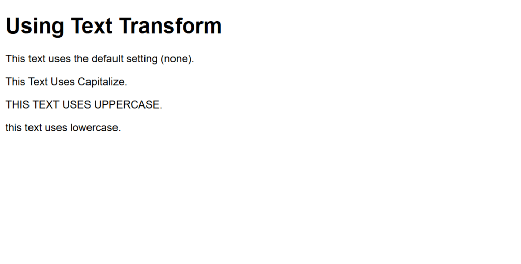
Figure 1 – Displaying the output of using the text-transform property
Output
When viewed in a browser:
The first paragraph appears exactly as written in the source: “This text uses the default setting (none).”
The second paragraph transforms to: “This Text Uses Capitalize.”
The third paragraph transforms to: “THIS TEXT USES UPPERCASE.”
The fourth paragraph transforms to: “this text uses lowercase.”
This illustrates how text-transform property can be used to style text case without changing the content itself.
Using the text-indent property
The amount of space (or indentation) that should be given to a block-level element’s initial line is specified by the text-indent CSS property. It is frequently employed to adhere to typographic norms or produce visually appealing paragraphs.
Syntax
text-indent: <length> | <percentage>;- <length>: Specifies the indentation in units like px, em, rem, etc.
- <percentage>: Specifies the indentation as a percentage of the width of the containing block.
- Negative values are allowed, which cause the first line to be indented in the opposite direction.
Example
<!DOCTYPE html>
<html lang="en">
<head>
    <meta charset="UTF-8">
    <meta name="viewport" content="width=device-width, initial-scale=1.0">
    <title>Text Indent Example</title>
    <style>
        body {
            font-family: Arial, sans-serif;
            font-size: 16px;
            line-height: 1.6;
            margin: 20px;
        }
        .no-indent {
            text-indent: 0;
        }
        .indent-20px {
            text-indent: 20px;
        }
        .indent-5-percent {
            text-indent: 5%;
        }
        .negative-indent {
            text-indent: -20px;
        }
    </style>
</head>
<body>
    <h1>Using the Text-Indent Property</h1>
    <p class="no-indent">
        This paragraph has no text indentation. It aligns the first line flush with the left margin.
    </p>
    <p class="indent-20px">
        This paragraph has a text indentation of 20px. The first line is indented by 20 pixels from the left margin.
    </p>
    <p class="indent-5-percent">
        This paragraph has a text indentation of 5%. The first line is indented by 5% of the width of the containing block.
    </p>
    <p class="negative-indent">
        This paragraph has a negative text indentation of -20px. The first line is indented 20 pixels to the left of the left margin.
    </p>
</body>
</html>
Explanation
- Text-indent: 0 indicates no indentation:
- The paragraph begins flush with the left margin by default, thanks to the .no-indent class.
- Text-indent fixed at 20 pixels:
- The paragraph’s first line is indented by 20 pixels using the .indent-20px class.
- Indentation by Percentage (text-indent: 5%):
- The first line is indented by 5% of the container width using the .indent-5-percent class. This adapts to the width of the containing block and is responsive.
- Indentation that is negative (text-indent: -20px):
- The “hanging indent” effect is produced by indenting the first line 20 pixels to the left of the left margin using the .negative-indent class.
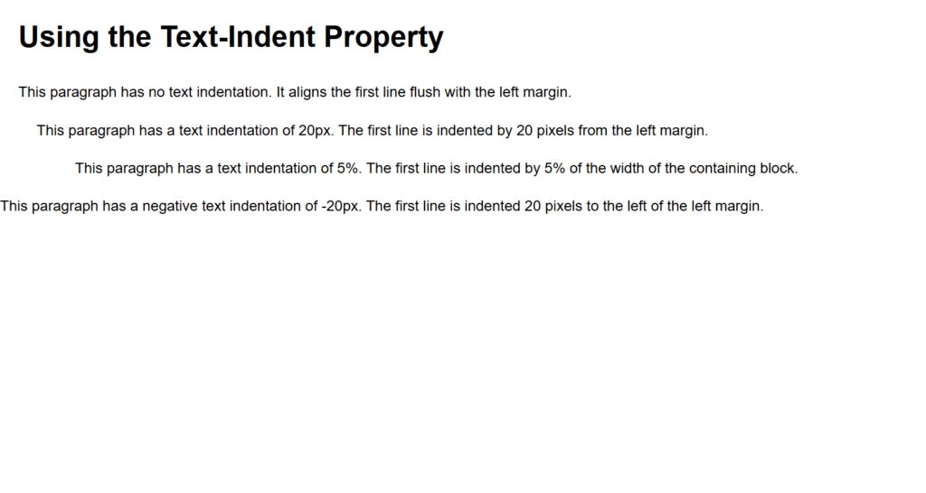
Figure 2 – Displaying the output of using text-indent property
Output
When rendered in a browser:
- The first paragraph starts at the left margin with no indentation.
- The second paragraph’s first line is indented by 20 pixels.
- The third paragraph’s first line is indented by 5% of the container’s width, making it responsive.
- The fourth paragraph’s first line is indented negatively by 20 pixels, sticking out to the left.
This illustrates the range of text styles that can be achieved with text-indent, from conventional paragraph formatting to the creation of unusual layouts like hanging indents.
Using the text-decoration property
In the text-decoration property, text can have visual embellishments like underlining, overlining, or striking through text applied to it using the CSS property. It can also be applied to elements such as links to remove text decorations.
Syntax
text-decoration: <decoration-line> || <decoration-color> || <decoration-style>;Components of text-decoration
- text-decoration-line:
- Specifies the type of line decoration applied to the text.
- Values: none, underline, overline, line-through, blink (rarely supported).
- text-decoration-color:
- Specifies the color of the decoration line.
- Accepts any valid CSS color value.
- text-decoration-style:
- Specifies the style of the line.
- Values: solid, double, dotted, dashed, wavy.
- Shorthand Property:
- Combines all the above in one declaration: text-decoration: line color style;.
Example
<!DOCTYPE html>
<html lang="en">
<head>
    <meta charset="UTF-8">
    <meta name="viewport" content="width=device-width, initial-scale=1.0">
    <title>Text Decoration Example</title>
    <style>
        body {
            font-family: Arial, sans-serif;
            font-size: 16px;
            line-height: 1.6;
            margin: 20px;
        }
        .none {
            text-decoration: none;
        }
        .underline {
            text-decoration: underline;
        }
        .overline {
            text-decoration: overline;
        }
        .line-through {
            text-decoration: line-through;
        }
        .custom-decoration {
            text-decoration: underline wavy red;
        }
    </style>
</head>
<body>
    <h1>Using the Text-Decoration Property</h1>
    <p class="none">
        This text has no decoration. The <code>text-decoration: none;</code> removes any default decoration, such as underlines on links.
    </p>
    <p class="underline">
        This text is underlined using <code>text-decoration: underline;</code>.
    </p>
    <p class="overline">
        This text has an overline using <code>text-decoration: overline;</code>.
    </p>
    <p class="line-through">
        This text has a line-through using <code>text-decoration: line-through;</code>.
    </p>
    <p class="custom-decoration">
        This text has a wavy red underline using <code>text-decoration: underline wavy red;</code>.
    </p>
</body>
</html>
Explanation
- No Decoration (text-decoration: none):
- The .none class removes any default text decorations, such as underlines on links.
- Underline (text-decoration: underline):
- The .underline class applies a single line under the text.
- Overline (text-decoration: overline):
- The .overline class applies a single line above the text.
- Line-Through (text-decoration: line-through):
- The .line-through class applies a line across the text, often used for strikethrough effects.
- Custom Decoration (text-decoration: underline wavy red):
- The .custom-decoration class demonstrates a more stylized approach with a wavy, red underline.
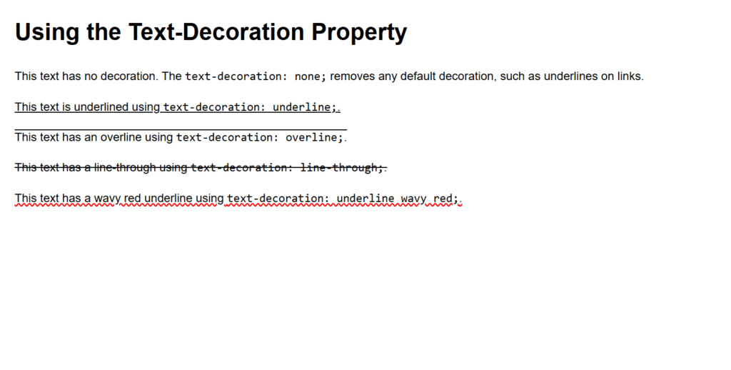
Figure 3 – Displaying the output of using text-decoration property
Output
When viewed in a browser:
- The first paragraph displays no decorations, appearing clean.
- The second paragraph has a single underline.
- The third paragraph has an overline.
- The fourth paragraph has a line striking through the text.
- The fifth paragraph showcases a wavy red underline.
This illustrates how text-decoration is a flexible property for improving typography, allowing for both simple and complex text styling.
Using the text-shadow property
Text can have shadow effects added to it using the text-shadow CSS property. By adding depth, shine, or other artistic elements, it improves the text’s visual appeal.
Syntax
text-shadow: offset-x offset-y blur-radius color;Parameters
- offset-x:
- specifies the offset for the horizontal shadow.
- The shadow is moved to the right by positive values and to the left by negative ones.
- offset-y:
- specifies the offset for the vertical shadow.
- The shadow is moved downward by positive values and upward by negative ones.
- blur-radius (Optional):
- specifies the shadow’s blur effect.
- The blurriness of the shadow increases with the value. No blur is indicated by a value of 0.
- color:
- indicates the shadow’s color.
- Any valid CSS color value is accepted.
Example
<!DOCTYPE html>
<html lang="en">
<head>
    <meta charset="UTF-8">
    <meta name="viewport" content="width=device-width, initial-scale=1.0">
    <title>Text Shadow Example</title>
    <style>
        body {
            font-family: Arial, sans-serif;
            font-size: 16px;
            line-height: 1.6;
            margin: 20px;
            background-color: #f4f4f4;
        }
        h1 {
            font-size: 36px;
        }
        .no-shadow {
            text-shadow: none;
        }
        .basic-shadow {
            text-shadow: 2px 2px 4px gray;
        }
        .glow-effect {
            text-shadow: 0 0 8px blue;
            color: #000;
        }
        .multiple-shadows {
            text-shadow: 2px 2px 4px gray, -2px -2px 3px lightblue;
        }
    </style>
</head>
<body>
    <h1>Using the Text-Shadow Property</h1>
    <p class="no-shadow">This text has no shadow (default).</p>
    <p class="basic-shadow">This text has a basic shadow with <code>text-shadow: 2px 2px 4px gray;</code>.</p>
    <p class="glow-effect">This text has a glowing effect with <code>text-shadow: 0 0 8px blue;</code>.</p>
    <p class="multiple-shadows">This text has multiple shadows with <code>text-shadow: 2px 2px 4px gray, -2px -2px 3px lightblue;</code>.</p>
</body>
</html>
Explanation
- (text-shadow: none) No Shadow:
- Any shadow effects are turned off using the .no-shadow class.
- Text-shadow: 2px 2px 4px gray; Basic Shadow:
- The .basic-shadow class utilizes a gray color and applies a shadow 2px down and right with a 4px blur.
- (text-shadow: 0 0 8px blue) Glow Effect:
- The .glow-effect class uses a high blur radius with blue color and 0px offsets to produce a glowing effect.
- Multiple Shadows:
- Combining shadows to create a layered look is demonstrated by the .multiple-shadows class. Two shadows are added here:
- Offset to the bottom-right is a gray shadow.
- To the top-left is a shadow of pale blue.
- Combining shadows to create a layered look is demonstrated by the .multiple-shadows class. Two shadows are added here:
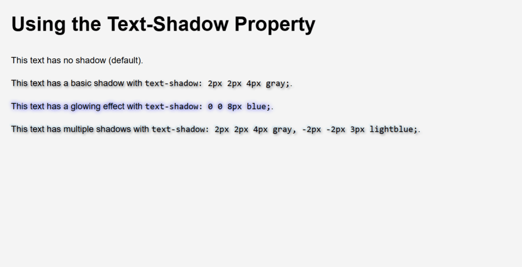
Figure 4 – Displaying the output of using text-shadow property
Output
When viewed in a browser:
- The first paragraph appears without any shadow.
- The second paragraph has a soft shadow that adds depth.
- The third paragraph displays a glowing blue effect around the text.
- The fourth paragraph uses multiple shadows for a dynamic, layered appearance.
The text-shadow property’s versatility is demonstrated in this example, which ranges from delicate depth effects to striking text styling like glows and layered shadows.
Using the text-stroke property
An outline (stroke) can be added to text using the non-standard CSS property -webkit-text-stroke. It is not commonly standardized, even though WebKit-based browsers (such as Chrome and Safari) support it. You can specify the width and color of the text’s stroke with this attribute, which gives it a distinctive and striking look.
Syntax
-webkit-text-stroke: <width> <color>;Parameters
- width:
- Specifies the width of the text stroke.
- Measured in units like px, em, etc.
- color:
- Specifies the color of the stroke.
- Accepts any valid CSS color value.
Important Notes
- The color or -webkit-text-fill-color must be set correctly in order for the text stroke to be visible.
- The text’s fill color is defined by the -webkit-text-fill-color property; it might be transparent to show just the stroke.
Example
<!DOCTYPE html>
<html lang="en">
<head>
    <meta charset="UTF-8">
    <meta name="viewport" content="width=device-width, initial-scale=1.0">
    <title>Text Stroke Example</title>
    <style>
        body {
            font-family: Arial, sans-serif;
            text-align: center;
            background-color: #f4f4f4;
            margin: 20px;
        }

        h1 {
            font-size: 48px;
            margin-bottom: 20px;
        }

        .no-stroke {
            -webkit-text-stroke: 0;
        }

        .basic-stroke {
            -webkit-text-stroke: 2px black;
            color: red;
        }

        .stroke-only {
            -webkit-text-stroke: 3px blue;
            -webkit-text-fill-color: transparent;
        }

        .gradient-stroke {
            -webkit-text-stroke: 2px green;
            -webkit-text-fill-color: linear-gradient(to right, orange, pink);
            color: transparent; /* Fallback for older browsers */
        }
    </style>
</head>
<body>
    <h1 class="no-stroke">No Stroke</h1>
    <h1 class="basic-stroke">Basic Stroke</h1>
    <h1 class="stroke-only">Stroke Only</h1>
    <h1 class="gradient-stroke">Gradient Stroke</h1>
</body>
</html>
Explanation
- (-webkit-text-stroke: 0) No Stroke:
- By default, the .no-stroke class makes sure that the text is not stroked.
- (-webkit-text-stroke: 2px black) Basic Stroke:
- The text with a red fill color is given a 2px black stroke by the .basic-stroke class.
- (-webkit-text-stroke: 3px blue) Stroke Only:
- A 3px blue stroke is applied by the .stroke-only class.
- Only the stroke is visible because the -webkit-text-fill-color is set to transparent.
- Gradient Stroke:
- Although utilizing a gradient fill with a stroke is attempted to be demonstrated in the gradient-stroke example, browser compatibility for linear-gradient with -webkit-text-fill-color may differ.
- It sets color: transparent as a fallback.
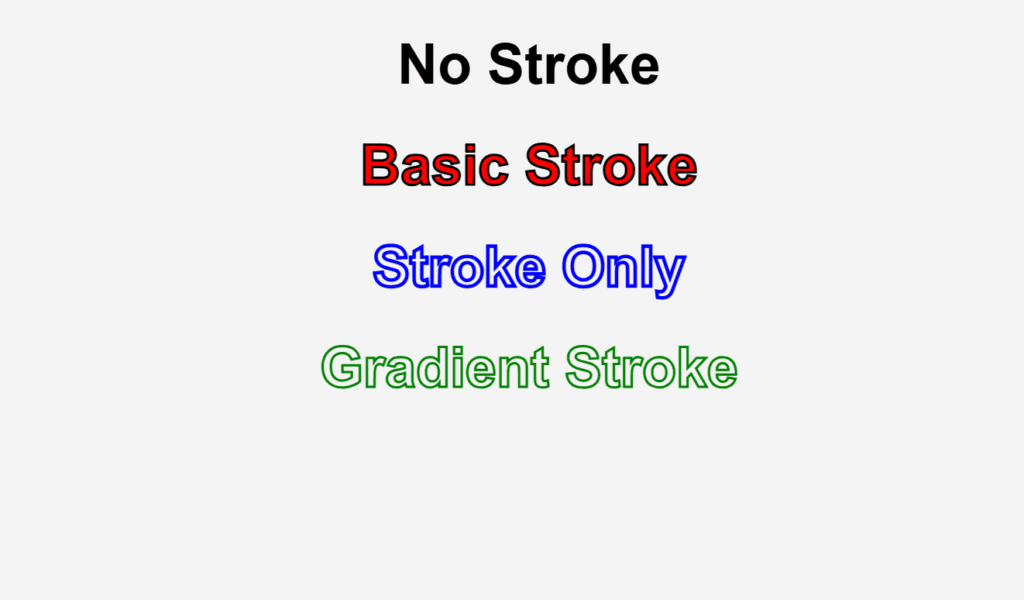
Figure 5 – Displaying the output of using text-stroke property
Output
When viewed in a WebKit-based browser:
- The first heading appears without any stroke.
- The second heading has a black stroke around red text.
- The third heading displays only a blue outline (no fill).
- The fourth heading attempts a gradient fill with a green stroke, but support for this feature may vary.
This illustrates how to use -webkit-text-stroke for bold and artistic text effects, which are perfect for modern web design’s creative typography.
Using Wrapping text
When text approaches the edge of its container, it automatically advances to the next line, a practice known as wrapping text. Although text wrapping is a fundamental component of HTML and CSS, you may manage and modify it to create the layouts you want, including inside containers, pictures, or particular columns.
Key Properties for Wrapping Text
- Word-wrap:
- Words that are wider than the container’s width are broken according to this property.
- Normal and break-word values.
- White-space:
- describes the treatment of white space inside an element.
- Values include pre, pre-wrap, nowrap, regular, and so forth.
- overflow-wrap (alternative to word-wrap):
- explains how a word that is too long for a line should be broken by the browser.
- Normal and break-word values.
- Word-break:
- regulates the way that words, when needed, cross lines.
- Normal, break-all, and keep-all are the values.
Example
<!DOCTYPE html>
<html lang="en">
<head>
    <meta charset="UTF-8">
    <meta name="viewport" content="width=device-width, initial-scale=1.0">
    <title>Text Wrapping Example</title>
    <style>
        body {
            font-family: Arial, sans-serif;
            margin: 20px;
        }

        .normal-wrap {
            width: 300px;
            border: 1px solid #ccc;
            padding: 10px;
            word-wrap: normal; /* Default: allows wrapping on word boundaries */
        }

        .break-word-wrap {
            width: 300px;
            border: 1px solid #ccc;
            padding: 10px;
            word-wrap: break-word; /* Breaks long words if needed */
        }

        .white-space-normal {
            width: 300px;
            border: 1px solid #ccc;
            padding: 10px;
            white-space: normal; /* Normal wrapping with multiple lines */
        }

        .white-space-nowrap {
            width: 300px;
            border: 1px solid #ccc;
            padding: 10px;
            white-space: nowrap; /* Prevents text wrapping */
            overflow: hidden; /* Prevents overflow of content */
        }

        .overflow-wrap {
            width: 300px;
            border: 1px solid #ccc;
            padding: 10px;
            overflow-wrap: break-word; /* Forces long words to break */
        }

        .word-break {
            width: 300px;
            border: 1px solid #ccc;
            padding: 10px;
            word-break: break-all; /* Breaks words at any point if needed */
        }
    </style>
</head>
<body>

    <h2>Text Wrapping Examples</h2>

    <h3>Normal Wrap</h3>
    <p class="normal-wrap">
        This is an example of text that wraps normally. It will break lines at word boundaries, such as spaces or punctuation.
    </p>

    <h3>Break Word Wrap</h3>
    <p class="break-word-wrap">
        This is a longwordthatneedstobreak to demonstrate how the text wraps when a word exceeds the container width. The word will break to the next line.
    </p>

    <h3>White-Space Normal</h3>
    <p class="white-space-normal">
        This text wraps normally and will respect any whitespace between words. This is the default behavior.
    </p>

    <h3>White-Space No Wrap</h3>
    <p class="white-space-nowrap">
        This text will not wrap and will stay in a single line, causing overflow if it exceeds the container width.
    </p>

    <h3>Overflow Wrap</h3>
    <p class="overflow-wrap">
        This is a longwordthatwillbreakinside the container and demonstrate how to break a long word if it doesn't fit.
    </p>

    <h3>Word Break</h3>
    <p class="word-break">
        This is a longwordthatwillbreakanywhere and it will break at any point along the word if it doesn't fit in the container.
    </p>

</body>
</html>
Explanation
- Normal Wrap (word-wrap: normal):
- Text wraps organically at word boundaries (spaces and punctuation) in this default mode.
- Break Word Wrap (word-wrap: break-word):
- Words that are too long to fit in the container are broken into the following line thanks to the.break-word-wrap class.
- White-Space Normal (white-space: normal):
- With breaks at punctuation or spaces, the.white-space-normal class uses standard wrapping behavior.
- White-Space No Wrap (white-space: nowrap):
- Text stays in a single line and overflows when the content is too broad for the container because the.white-space-nowrap class prohibits wrapping.
- Overflow Wrap (overflow-wrap: break-word):
- If a big word doesn’t fit inside the container, the.overflow-wrap class makes sure it gets broken into the next line.
- Word Break (word-break: break-all):
- The .word-break class breaks the word at any point, even between characters, if necessary to prevent overflow.
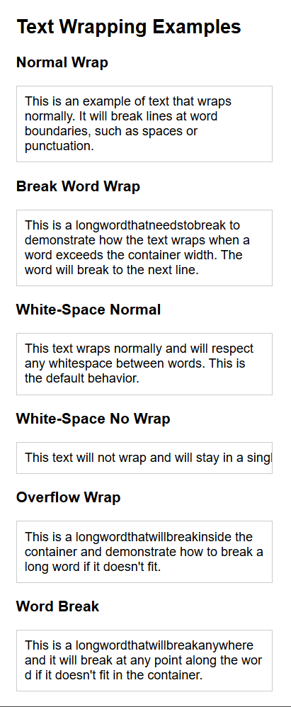
Figure 6 – Displaying the output of using text wrapping
Output
When viewed in a browser:
- Normal Wrap: The text breaks at spaces or punctuation.
- Break Word Wrap: Long words are broken to fit the container.
- White-Space Normal: Text wraps normally with spaces between words.
- White-Space No Wrap: The text stays in a single line and overflows if the content is too wide.
- Overflow Wrap: Long words break and fit within the container.
- Word Break: Long words break arbitrarily when necessary to avoid overflow.
This illustrates several methods for managing the way text wraps inside a container, providing responsive design flexibility and avoiding content overflow.